Protobi provides a number of ways to summarize location data in geographic maps.
Geographic maps
The most direct method is a chloropleth map, which shows geographic regions in a map projection and colors the regions according to a metric:
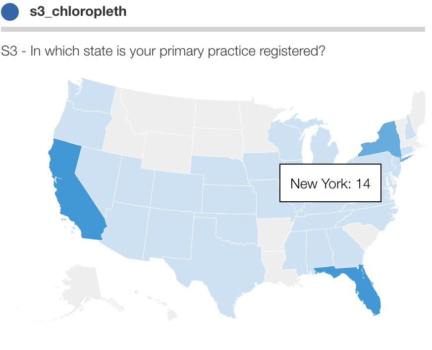
The above map shows US states, but it’s also possible to show other divisions such as country, county or ZIP.
Stylized maps
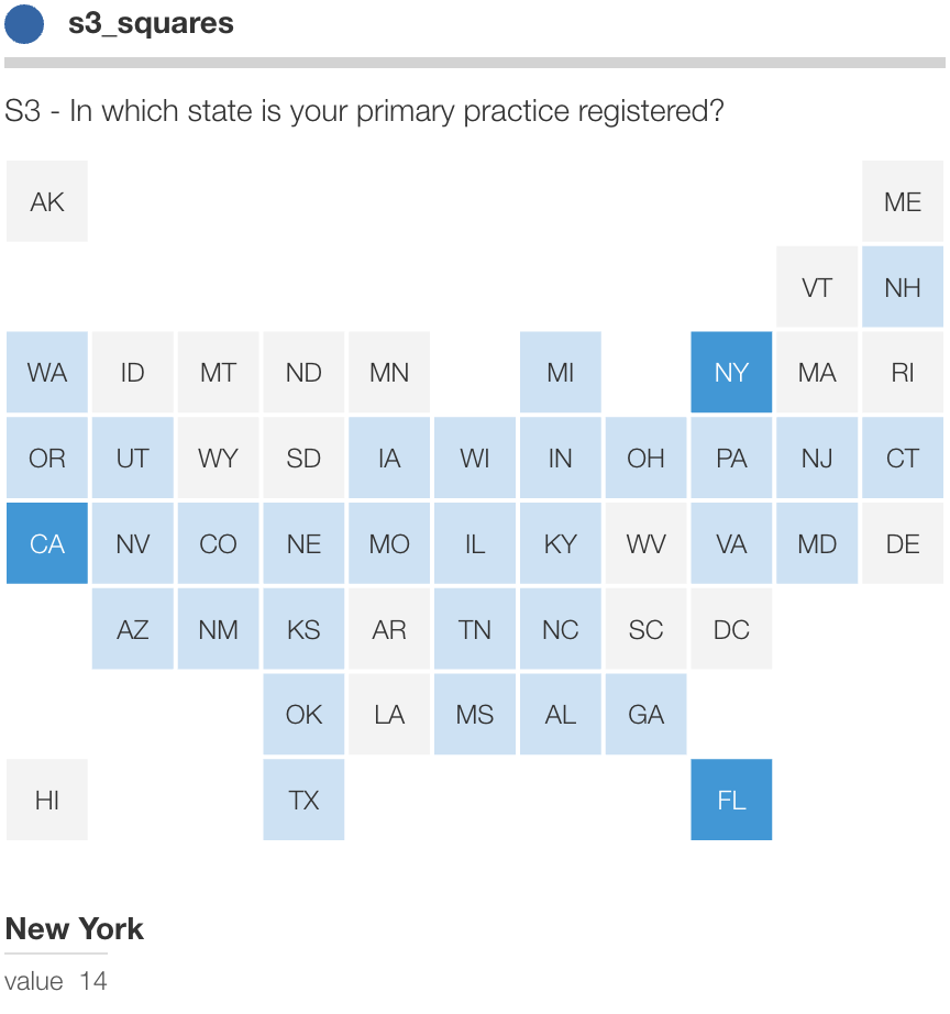
The challenge with using actual geo projections is that small populous states like Rhode Island appear tiny compared to large rural states like Wyoming.
A cool approach is to equalize states and display each as a uniform square or hexagon, aligned roughly corresponding to the geography.
The following uses Wall Street Journal’s Squaire algorithm:
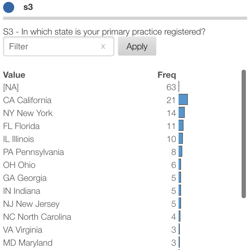
Bar charts
Of course for simplicity there’s always the simple bar chart which clearly
shows relative frequency for each geographical region:
Google maps
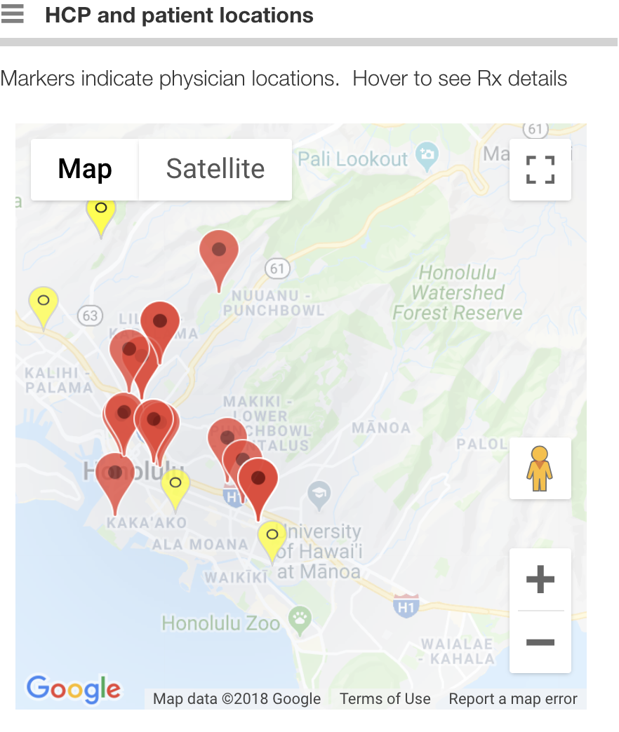
Sometimes respondent geo data is very micro. Universities often need to see student data from countries down to specific high schools.
For instance, maybe you have street addresses and want to display them on a map as clickable markers with detailed information on hover.
You can write a process in Protobi that uses Google Location API to geocode street addresses into lat/long locations, and display them in Protobi as an interactive Google map.
Advanced custom maps
With geo data, the way you need to show the data may be very specific to your project. Here’s a visualization of longest flight times by Jacob Wasilkowski. It’s possible to create interactive visualizations like this within your Protobi project.
Contact us
Geography might be just one question in your survey. But chances are there’s something unique about your specific goal – from the way locations are represented to what information you want to show.
Contact us at support@protobi.com to discuss your design goal. Our support team can help you quickly set that up.