Perceptual maps can be a useful way to concisely visualize associations among multiple variables. Protobi can create a perceptual map based on principal components analysis for many types of crosstabs.
Algorithm
The algorithm uses principal components analysis to project the columns as axes onto a two dimensional chart, and plot the row values with a minimum of distortion.
Principal components attempts to preserve the absolute not just the relative values. For instance an attribute where brands are all rated equally highly will be considered quite different from an attribute where brands are all rated equally poorly.
Protobi automatically rotates the axes of the axes to your preferred orientation, shows the exact details in a tooltip when you hover, and draws the projection lines.
Applicability
Perceptual Maps can be calculated for crosstabs where the rows are defined by an individual categorical variable, or by a compact group of variables summarized by their mean or top-box percentages.
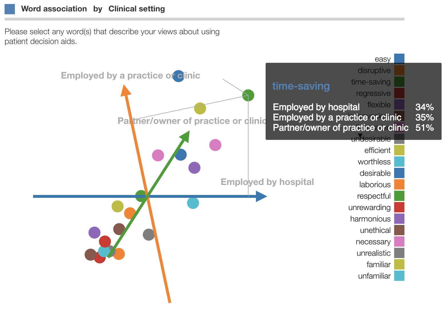
Here the perceptual map is created for this crosstab

To specify a Perceptual Map for a crosstab, select “More properties…” from the context menu and under “Chart Type” choose “PMap”.
Chart options
Some customization may be useful, for instance:
- setting filters to exclude columns with small N sizes
- exclude certain rows with outlier values, like “Other (specify)”
Under the JSON, you can select additional options:
rotateAxis: (default0) Specify which axis to rotate the graph.0is the first column,1is the second, etc.rotateAngle: (default0) Specify angle the axis should be rotated, in degrees.0is horizontal to the right,90is one quarter turn counterclockwise.flip: (defaultfalse) Whether to flip chart into mirror image.showLabels: (default `true’) Whether to show labels next to pointsshowLegend: (default `true’) Whether to to show the legendlegendWidth: (default `200’) Width of legend
Reference
See J. Gowert, P. Groenen, M. Van de Velden (2010) “Perceptual maps: the good, the bad and the ugly”, Erasmus School of Economics, Erasmus University, Rotteradam. John Gower (http://statistics.open.ac.uk/802576CB00593013/(httpInfoFiles)/F8DD66935DE1C1218025778900364290/$file/perceptual5.pdf)
Beta availability
Perceptual maps are available under the Chart types dialog.