The Van Westendorp Price Sensitivity Meter (PSM) is a non-parametric chart used to summarize stated consumer price preferences. It allows product managers to see the intersection between prices customers perceive as good value versus prices customers perceive as expensive.
Here's how to create it in Protobi using cumulative line charts...
Methodology
In order to gauge customers willingness to pay participants are asked "At what price do you think the product/service ..."- "is priced so low that it makes you question its quality?" (Too cheap)
- "is a bargain?" (Good value)
- "begins to seem expensive?" (Expensive but would consider)
- "is too expensive?" (Too expensive)
The responses to each of these questions are plotted. The intersection of these questions at certain points can give marketers and analysts information on respondents perception of price.
Below is a chart from the original paper [1]

Van Westendorp analysis identifies four intersections:
- OPP "Optimal Price Point", too cheap & Too expensive to consider intersect
- IPP "Indifference Price": Good value & Expensive but would consider intersect
- MGP "Marginal Point (cheap)": Too cheap & Expensive but would consider intersect
- MEP "Marginal Point (expensive)": Good value & Too expensive to consider intersect
According to this methodology, the "Range of acceptable prices" is from PMC to PMC.
Caveats
Van Westendorp is a way to visualize stated perceptions of price. Despite the name, the "Optimal Price Point" is not necessarily optimal in a microeconomic sense of mathematically optimizing profits or other metrics. As even the original article points out, "There is certainly not yet a well developed theory behind PSM".Van Westendorp plot in Protobi
Identify the four questions in your survey corresponding to the four pricing questions and put them into a single group:

Press the edit icon for the group and from the context menu select "Chart type...". In the chart dialog choose the cumulative line chart and show the legend:

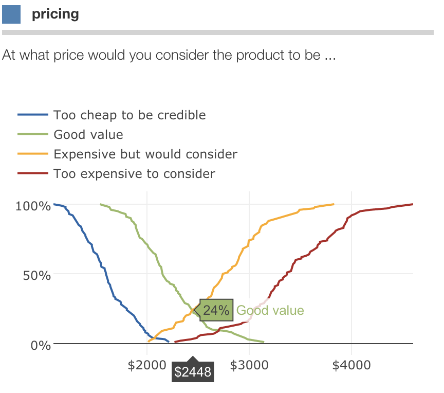
We now have the cumulative distribution for the four questions in a single chart:

Now we need to reverse two of the lines so they are descending. Press the edit icon and from the context
menu choose "Edit JSON...".
In this dialog, add a new special attribute "reverse" and specify the keys corresponding to
"Too cheap" and "Good value":

Voilá! You now have a Van Westendorp chart:

You can hover over the intersections to get the corresponding prices:
[1]: VanWestendorp, P. (1976), “NSS-Price Sensitivity Meter (PSM) – a new approach to study consumer perception of price,” Proceedings of the ESOMAR Congress, Venice. https://rwconnect.esomar.org/a-new-approach-to-study-consumer-perception-of-price