
You’ve fielded a survey and now want to see the data. To see it yourself, find the story, clean the data, and write an insightful analysis. To share it with your client, who really wants to see the data they bet a good part of their research budget to collect. To answer followup questions and spark new insights.
Protobi is a useful tool to see and explore survey data. To see data as distributions, and run comparisons, contrasts and crosstabs. It’s specifically designed for surveys and handles a lot of the practical routine cases.
As much as we’ve designed the tool for you, it’s really the tool that we wanted for ourselves, to fit the space between spreadsheets on one hand and statistical packages on the other.
Once you get familiar with it, it’s a totally new way of seeing the data and a sharp tool in your hands. You’ll find new “Aha!” moments in the data, catch more outliers that might have slipped through, and have a lot more fun with the followup questions that good answers inevitably generate.
This tutorial shows you everything you need to know to use Protobi, as a viewer, a designer or an administrator.
To sign in via email, enter your email address and click “Sign in via email”. You’ll receive an email with a link that will sign you in, and keep you signed in for 24 hours (or until you sign out).
It’s like the “Forgot my password” link in many other websites, except that we never require you to remember one. This helps us keep your account information secure.
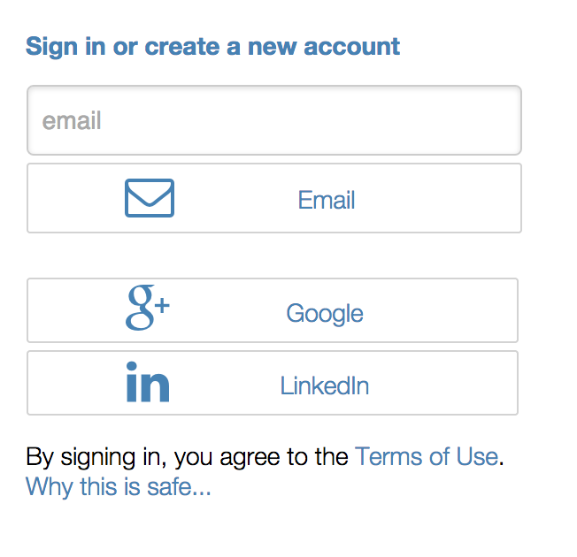
Alternatively, use Open ID for single-click sign-in. If your email is a Google email (i.e. either Google Apps for Business or Gmail) or if your email account is associated with your Linked In account, then these offer secure and convenient ways to sign in.
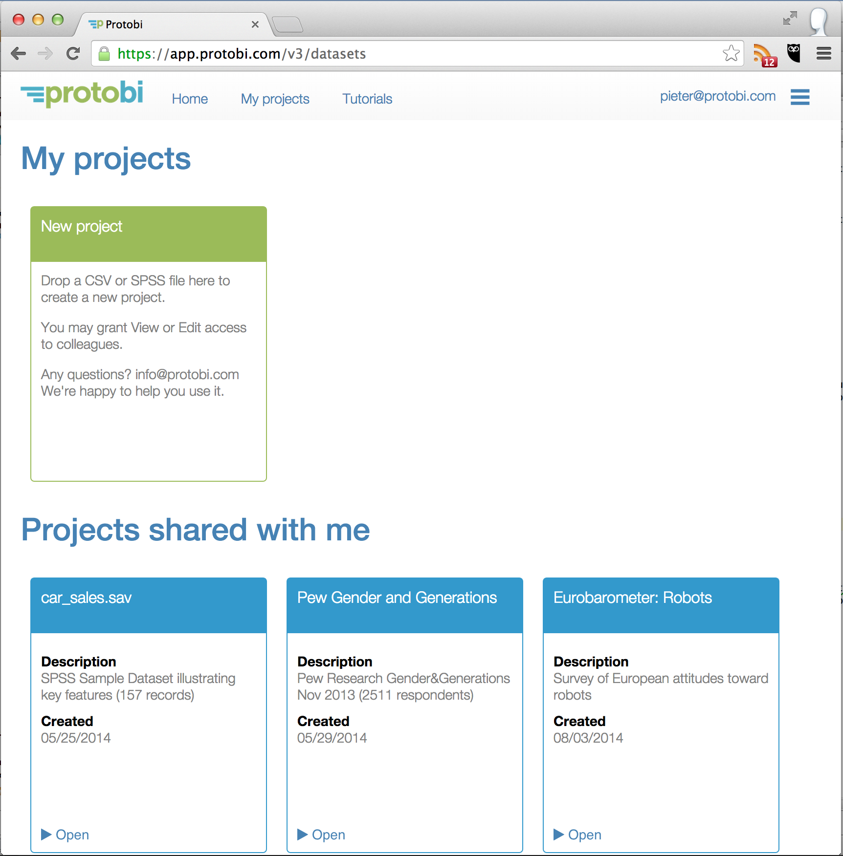
When you login to Protobi, you’ll see a list of your projects, and a list of projects that others have shared with you. (“Your” projects are those where you have admin privileges, and “Shared” projects are those where you have view/edit privileges).
A few public projects are automatically shared with you when you first login to serve as examples. We’ll be using the Gender and Generations Survey from Pew Research as the basis for examples in this tutorial.
The Protobi interface has three main areas:
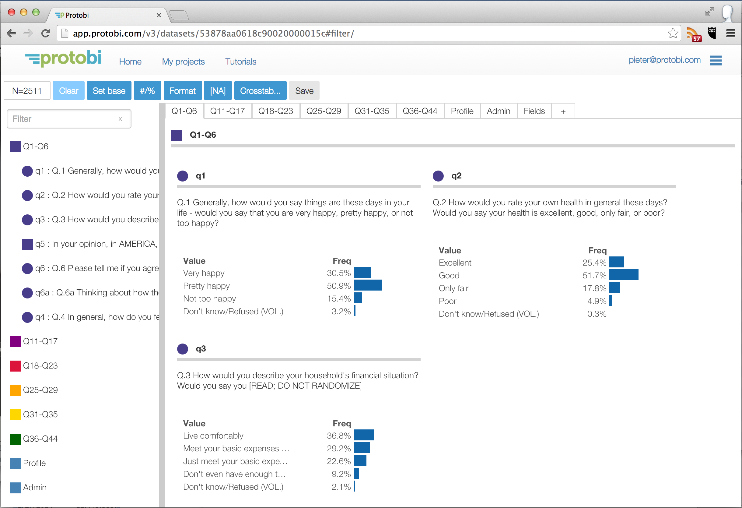
The Tree organizes data hierarchically into conceptual groups. The circle icons represent individual fields or “elements”. The square icons represent collections of elements or “groups”.
In the example here, the first group “Q1 - Q6” contains the first ten questions in the survey, and is shown expanded. Most of these are individual elements, shown with circle icons. But “Q5” is itself a collection of subquestions and is shown as a square icon.
Note that these groupings are driven by the survey content. Another survey may have groups for “S. Screener”, “A. Demographics” and so on.
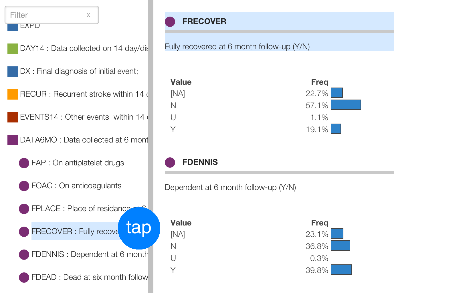
These icons are clickable. In the Tree, click on the icons to expand/collapse groups, or right-click to bring up the context menu for editing options.
You can minimize the Tree by clicking on the border between the Tree and the Panel.
Use the search feature to quickly find elements by text. For instance, you can find any question that has the word “happy” or “work” in the title.
In addition to browsing and searching elements and groups, you can also quickly focus on one. With hundreds or even thousands of questions in a survey, you want to quickly navigate the data.
Double-click on an item in the tree to focus on it on the right hand side.
The Panel displays the data graphically as interactive charts. This is the main interface designed to see and explore the data.
The panels are organized into tabs. Each top-level group in the Tree is also a tab in the Panel. Typically these will be logical associations by content, like sections of a survey.
The Toolbar has a number of buttons to help navigate the data:

Hover over any of the toolbars to see its function and keyboard shortcut.
Explore the data by clicking on any value to subset the data and see visual comparisons.
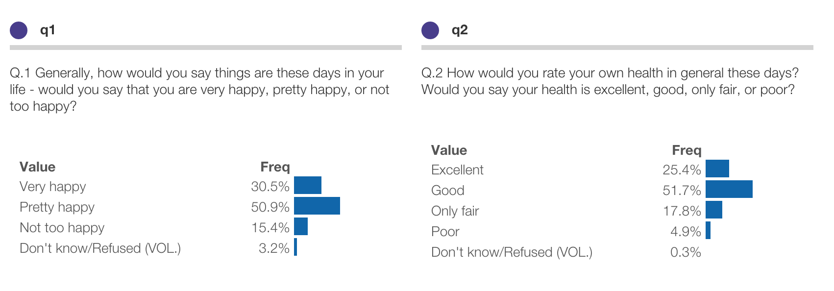
Here are elements showing values for the first two questions in the Gender and Generations survey. Here we can see that 30.5% of respondents rate themselves as “Very happy”, and 25.4% rate themselves as being in “Excellent” health:
Below shows results for q1 and q2 after clicking on “Excellent” under q2:
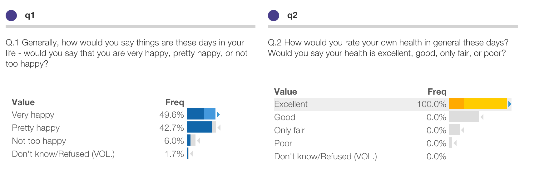
In this view, we’re drilled into a subset of respondents, 100% of whom selected “Excellent” to q2. This is highlighted in gold because this is an active filter.
When you create a filter, all elements throughout the map update to reflect this subset. For instance, we can see that 49.6% of these respondents selected “Very happy” to q1. This is much higher than the overall response of 30.5% for all respondents.
The baseline distribution is shown as a light grey shadow, so you can easily see what’s different. Baselines and statistical comparisons are discussed below.
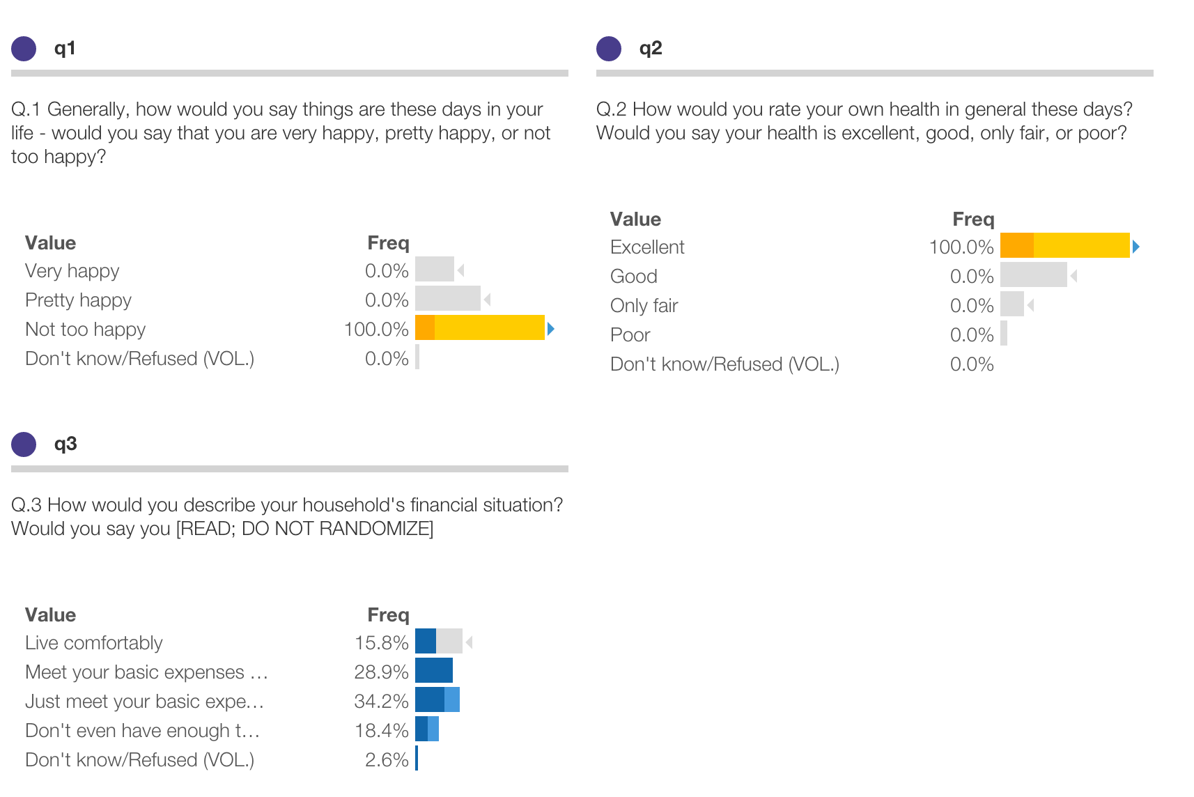
You can make multiple simultaneous filters. For instance, you can click on both “Excellent health” in q2 and “Not too happy” in q1 and see that these respondents are much less likely to have enough income to “Live comfortably” in q3:
The “N=” button in the Toolbar shows the size of the currently selected samle turns green when there are active filters. Click the “N=” button in the Toolbar to enumerate all current filters:
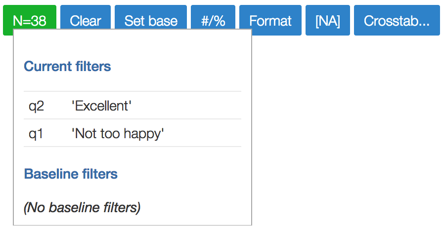
In the example here, we’re filtering for those 38 respondents who answered both “Excellent health” in q2 and “Not too happy” in *q1
Ordinary clicks select a specific value, which we call ‘Is’ filters. For instance, here we’ve selected respondents where q2 IS ‘Excellent’:
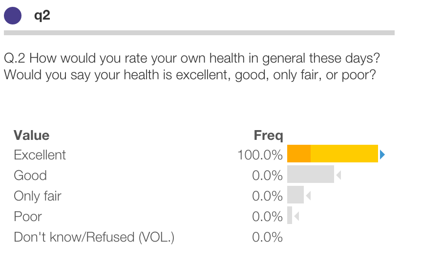
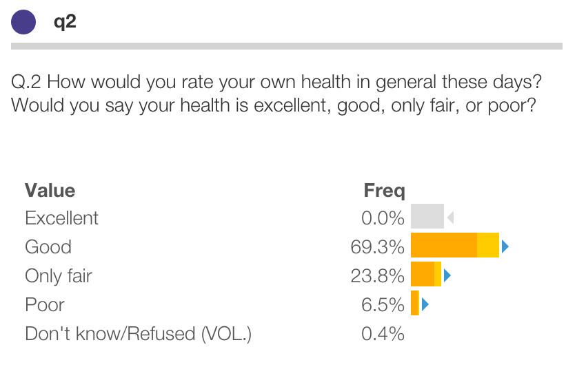
Hold the Shift key while clicking to do the opposite and exclude specific values, which we call ‘Not’ filters. For instance, here we’ve selected respondents where q2 is NOT ‘Excellent’:
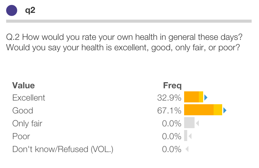
Hold the Option (OSX) or Ctrl+Alt (Windows) key while clicking to select multiple values within an element, which we call ‘Or’ filters. For instance, here we’ve selected respondents where q2 is ‘Excellent’ or ‘Good’:
You can clear specific filters by clicking again on the value in the Panel. Or click the button in the Toolbar to clear all filters.
A powerful feature of Protobi is the ability to visually and statistically compare and contrast subsets of the data. You can set up one subset as a baseline, and compare another subset to it, and easily see the major differences.
The baseline distribution is shown as a light grey shadow for reference, to allow easy visual comparisons:
In the prior example, we can see that of respondents who rate themselves in “Excellent health” in q2, 49.6% rate themselves as “Very happy” in q1.
We can easily see that this is quite a bit higher than the baseline (which right now is all respondents) as there is quite a bit of bright blue extending past the baseline. We may further say that this difference appears statistically significant, as indicated by the blue triangle .

Triangle icons indicate statistically significant differences from baseline, at the 0.05 confidence level.
Thus, in this example, we may say that respondents who rate themselves in “Excellent health” in q2 appear significantly more likely to rate themselves as “Very happy” in q1.
Similarly, these respondents appear signficantly less likely to rate themselves as “Not too happy.”
If the current scenario a strict subset of the baseline scenario, Protobi intelligently subtracts the two populations to calculate a stronger significance test.
This allows you to make strong contrasts and comparisons. A good practice is to ensure that the current and baseline distributions are disjoint (i.e. they don’t overlap). You can set the baseline to the current filters at any time by pressing the button .
For instance, we may wish to compare people whose health in q2 IS “Excellent” versus those health is NOT “Excellent”. This is a stronger contrast than in example at the start of this chapter, where the baseline includes all respondents, including some whose health is “Excellent”.)
We can do that in a short sequence of steps:
We demonstrated step (1) in an earlier example by holding the Shift key while clicking on “Excellent” in q2. After clicking “Set base” in step (2) the distribution will look as below. Note that all the bars are dark blue and dark gold because the current scenario now equals the baseline scenario:
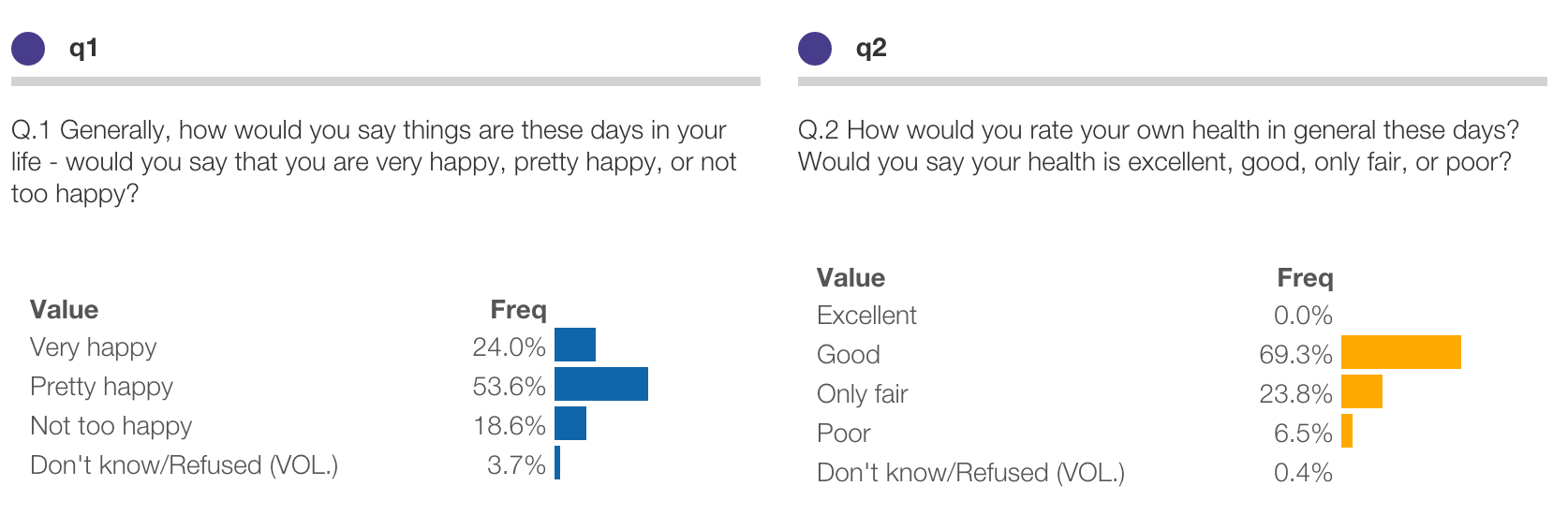
Finally, after clicking “Exellent” in step (3) the comparison will appear as follows.
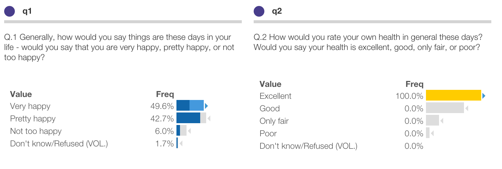
Note that the current distribution is the same as before (i.e. 49.6% of respondents in “Excellent” health are “Very happy”) but the baseline distribution is different, and there are larger differences shown in bright blue or grey.
Further notice we get the same set of triangle icons indicating significant differences here as before. This is because Protobi had intelligently subtracted the two populations to calculate a stronger significance test.
Caution: Statistical significance is a famously tricky concept. As used here it is a narrow technical term, which means simply that this difference is large enough that it appears unlikely to happen by chance. So if this study were fielded with a different set of respondents from the same population, we’d likely see this difference again.
We keep using the word “appears” here because statistical hypothesis testing has strong limitations. Strictly, the test we’re using here applies only to hypotheses you specify before looking at the data. Thus if you had hypothesized in advance that people in ‘Excellent’ health are more likely to be ‘Very happy’, this would be strong evidence in support of that hypothesis.
However, if you click to create a filter, and go scanning for “significant” differences, this test is less meaningful. By definition, we’d expect 5% of comparisons to appear as “significant”. If we’re scanning only for those differences that appear as “significant” after drilling in, and making up hypotheses the findings might support, many of these are likely to be false positives. It can still be instructive to do so, just not as strong evidence.
By analogy, consider the game of pool. If you call “9 ball into the side pocket off the bank” and then make a shot and that outcome happens, that’s pretty impressive – it’s likely you could do make that shot again in the same situation. On the other hand, if you just made the same shot without calling it ahead of time, that’s not so impressive – it’s not at all clear you could do that again.
Further, just because a difference is statistically significant doesn’t mean that you as a manager must make a decision to act. Even small numeric differences can be statistically significant with a large sample.
Net net: Use statistical significance as a qualitative way to quickly identify differences worth your attention.
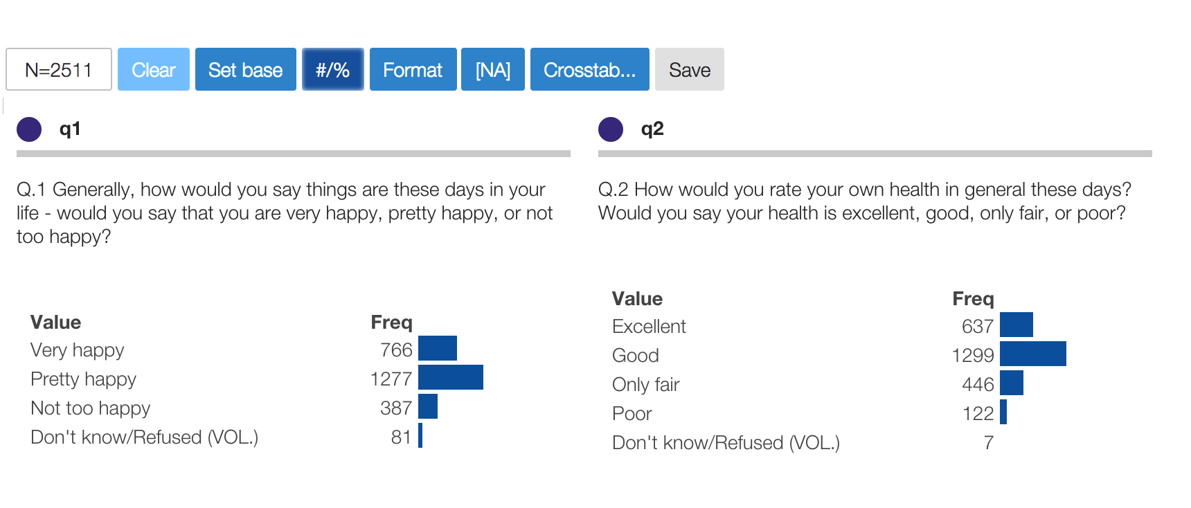
For example, click the #/% button to show frequencies as counts rather than percentages. Here we can see
that 766 respondents answered “Very happy” to q1:
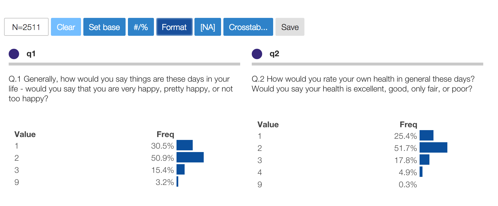
Alternately, click the Format button to show the raw unformatted values rather than the value labels.
In this example the raw data has values 1, 2, 3 and 9 for q1 and the data file specifies
value formats such as {"1":"Very happy", "2":"Pretty happy", ...}:
NA is a special value which represents “Not available”, “Not applicable”, or “No answer”. It can occur when:
Sometimes we want to explicitly consider [NA] as meaningful values, other times we may wish to exclude them from analysis.
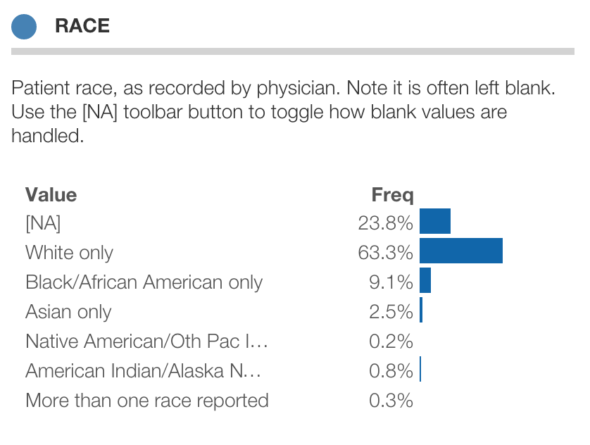
Below is the distribution of patient race as recorded by US physicians in outpatient visits. Here can see that race is not recorded for 23.8% of patient visits:
Click the button in the toolbar to toggle display of missing values:
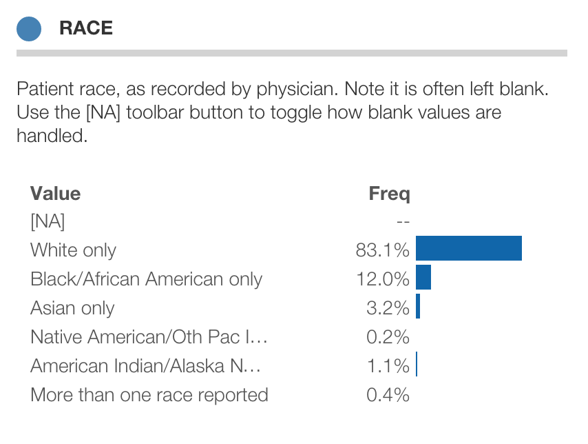
In the latter view, the percentages are normalized over all non-missing values. (Note that this does not affect frequency counts, just the percentages and bar length)
Protobi is great in the moment to explore hypotheses and look at interesting contrasts. But sometimes you want to bookmark certain scenarios as interesting … for your own analyses or for colleagues.
The toolbar button Scenarios allows you to select an existing scenario or define a new one based on your current filters.
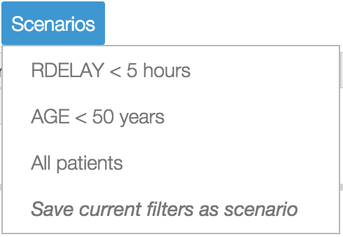
Click the Toolbar button to see a list of existing scenarios. To save your current filters as a new scenario, first drill into create the filters you want, and select “Save current filters as a new scenario“.
Scenarios are saved to a special element Scenarios that you can use in your analysis like any other element .. for marginals, crosstabs, and filters.
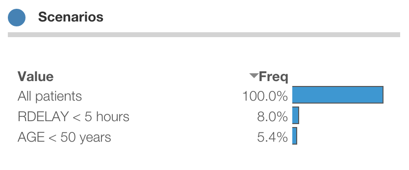
Note that these states reference more than one variable (e.g. AGE and RDELAY) and overlap in definition (i.e. patients under 50 is a subset of all patients).
Protobi automatically bins numeric variables into ranges for analysis. The default is to automatically choose bin sizes based on the standard deviation, and snapping it to a “nice” number that makes sense to those used to counting on two hands of five fingers each:
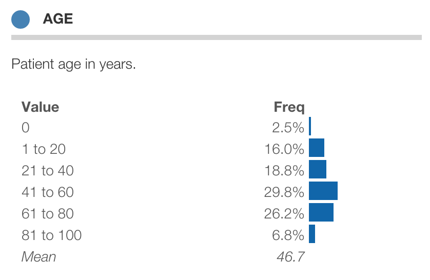
You can change the bin size by clicking on the circle icon and selecting “Round by…”
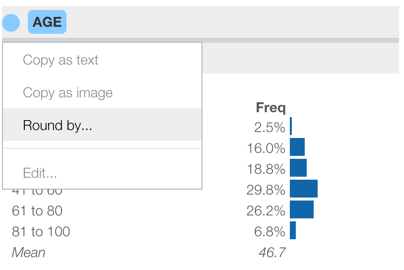
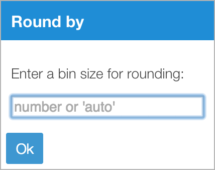
In the dialog you can enter a linear bin size such as ‘15’. You can also choose ‘auto’ to automatically choose a bin size, or ‘log’ to choose logarithmic bins, or choose ‘0’ to show the individual values:
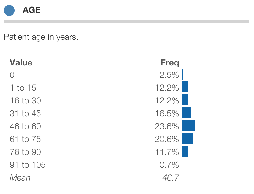
Here is the distribution of age with bin size set to 15:
Many variables such as income, book sales, frequent flier miles, etc. have “heavy-tail” or “long-tail” distributions. These are distributions where the range of values spans multiple orders of magnitude, with many smaller values at the lower end of the range but also many large numbers.
Linear bin ranges make sense for variables that are normally distributed. But for long-tail distributions, the standard deviation is so large as to obscure important differences at the low end. For long-tail distributions, logarithmic ranges can make more sense, compressing the larger values into a bell-shape.
Below is a distribution for income shown with linear ranges (left) and logarithmic ranges (right):
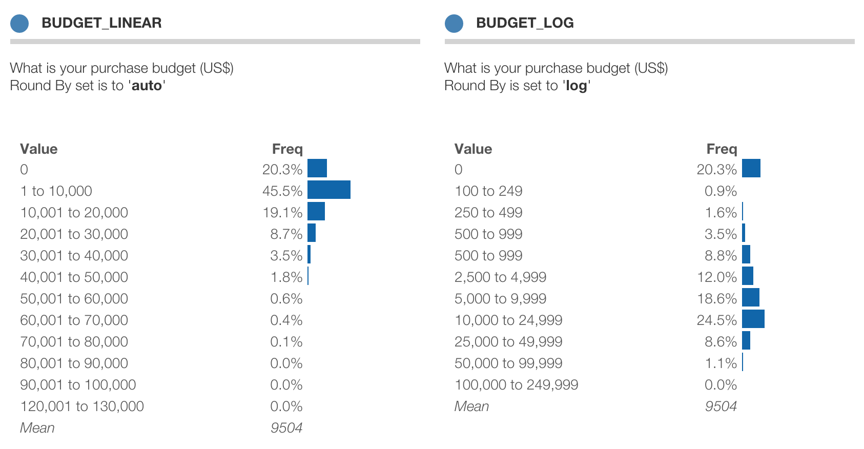
Protobi explicitly breaks out ‘0’and negative values, for which the logarithm is undefined.
Often questions come as collections of related items on a common scale. This is common for ratings, rankings “check-all-that-apply” and other kinds of questions.
In this survey, q5 is a set of responses to the question “In your opinion, in AMERICA, how much conflict is there between…”. Respondents rated each question on a scale from “Very strong conflicts” to “Don’t know”. The individual questions Q5a, Q5b, Q5c, Q5d, and Q5e are organized into a group q5. By default, each question is displayed as its own independent distribution.
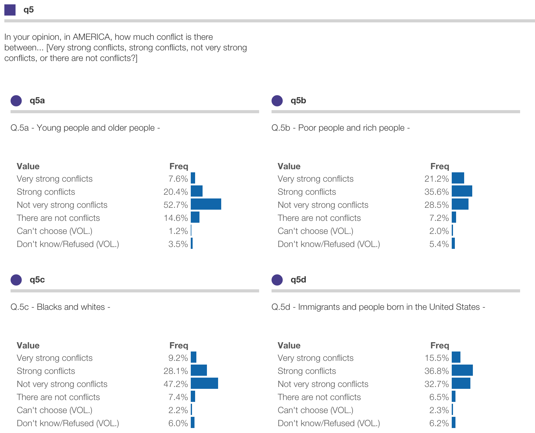
These can be displayed in compact form in a number of ways. You can compact the collection variables to show just the mean, the sum or the top-box percentages.
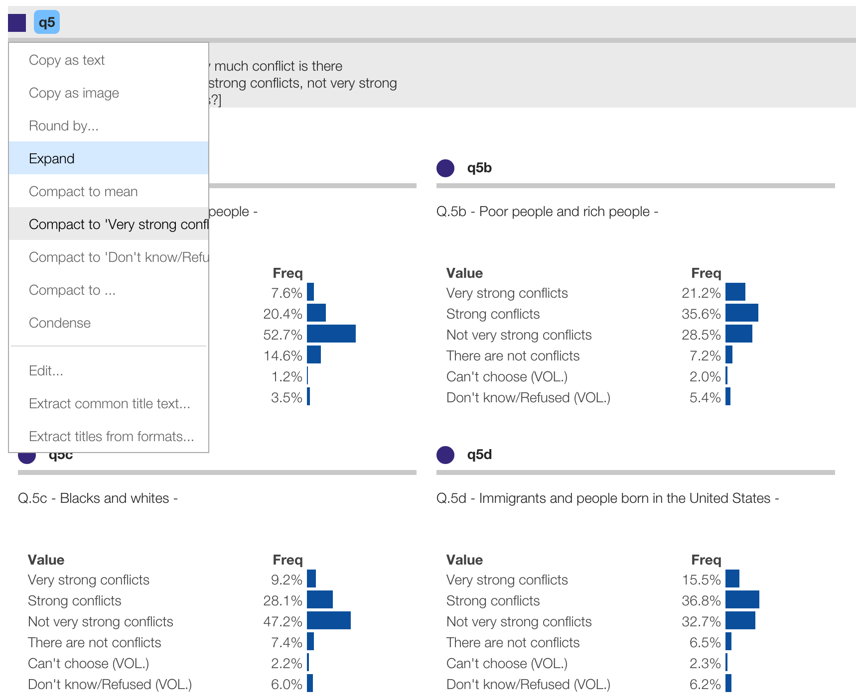
To compact a group to to-box percentages, click the square icon for the group and select “Compact to: ‘Very strong conflicts’”, as shown below. To expand the display back to showing distributions for each element, select “Expand” from the menu.
The distributions are now concisely shown as just the top-box percentages for the specified value.
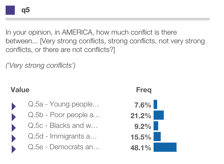
You can click these as any binary variable. Click the triangle icon to see the entire distribution.
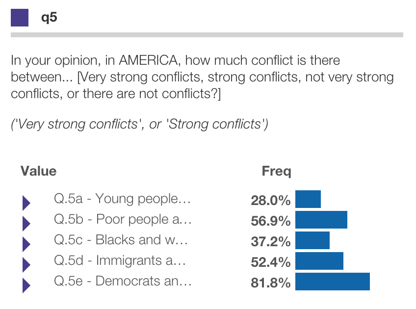
Protobi shows the first and last category as options. You can select others by choosing “Compact to…” and entering specific values to compact to. Recognized values include:
1[1,2]$mean$sumBelow shows the top-two-box percentages by specifying [1,2] under “Compact to…”:
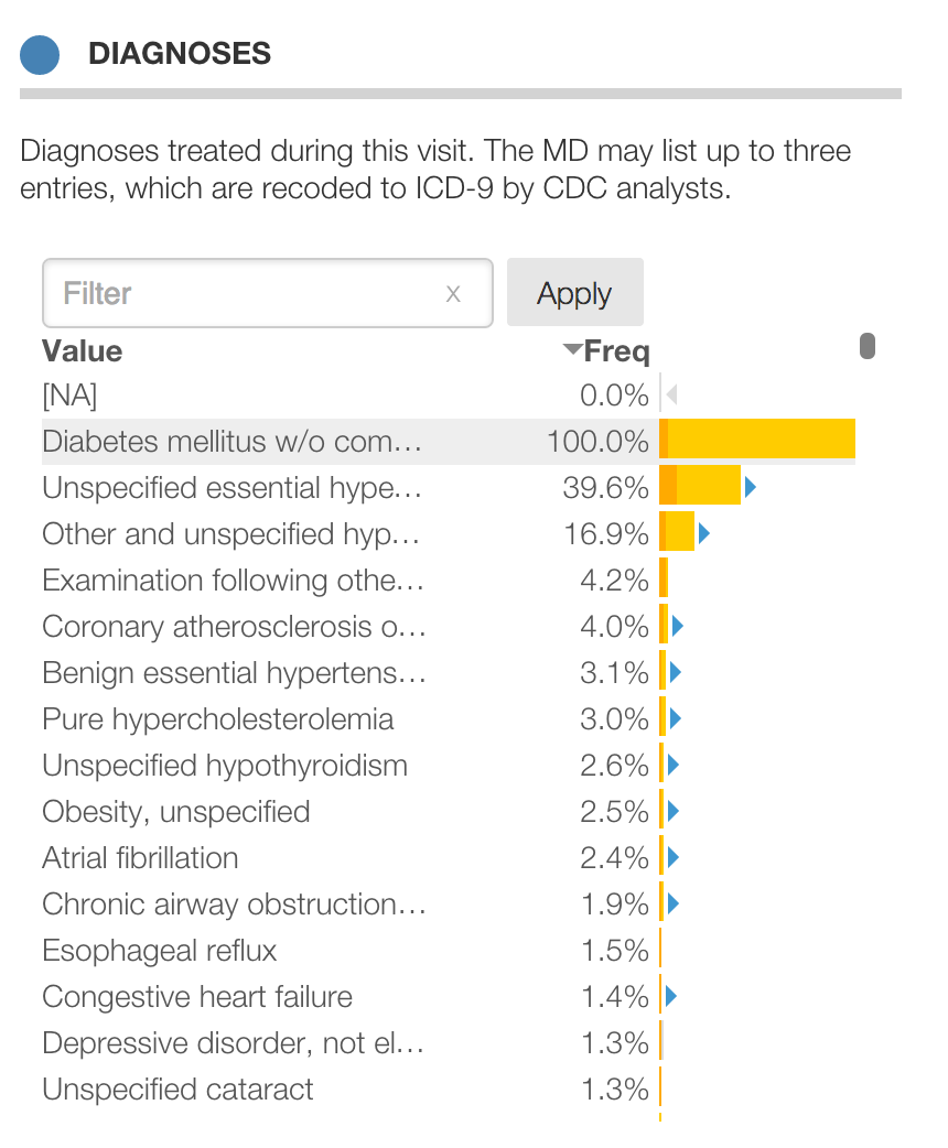
Protobi can handle text verbatim responses elegantly. Here MDs were asked to specify up to three diagnoses for each patient visit in a given period. Collectively this spans thousands of diagnoses for tens of thousands of patient visits.
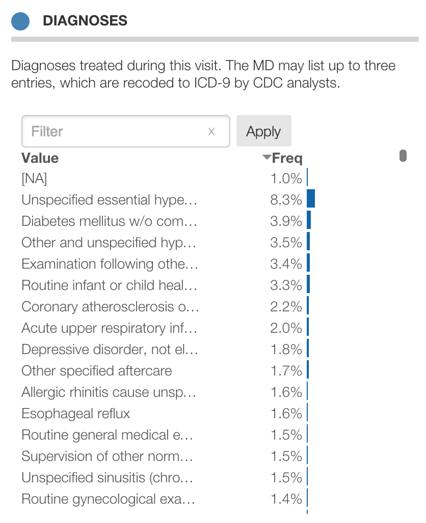
By default, Protobi sorts text responses in by frequency (rather than value) when there are more than 12 values and the values are either formatted or not numeric.
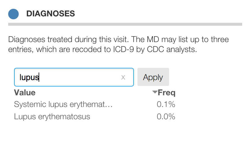
You can screen values for visibility by typing in the “filter” input. Here only values that have the text “lupus” are shown, which is either “Lupus erythematosus” or “Systemic lupus erythematosus”:
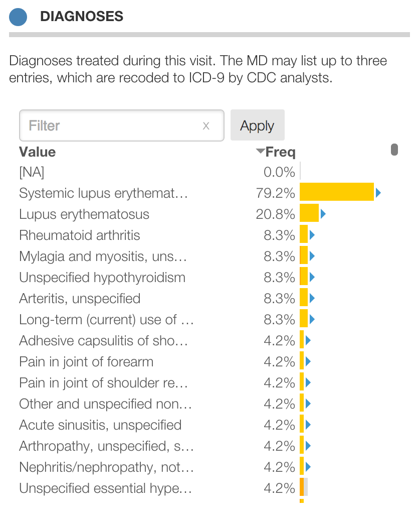
Click the “Apply” button to make this search an actual filter which subsets the data and updates distributions for all the other elements. Note that MDs were allowed to enter multiple diagnoses. The distribution below includes only patients who have a diagnosis including “Lupus” but they may also have other diagnoses too:
Protobi search is very powerful as it is based on Regular Expressions. For instance:
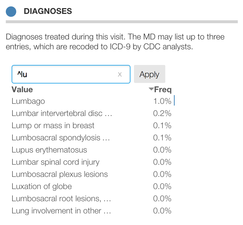
lupus matches any element containing the string lupusitis$ matches any element ending with the string itis$^lu matches any string starting with luitis|algia matches any string containing itis or `algiaBelow is a search for ^lu which matches entries that begin with lu, and thus matches “Lupus erythematosus”
but does not match “Systemic lupus erythematosus”:
Sometimes surveys will ask respondents for multiple open ended answers. For instance, “What are the key strengths of this new product? Please list up to three”.
Rather than see them as three separate fields, we might wish to combine them into one multiple-response category. You can do that by putting the elements into a single group. Then click the square icon for the group and select “Condense” from the context menu. This “squishes” the data horizontally into a single multi-response variables.
Here’s an example using Diagnoses from the CDC NAMCS survey, where MDs list up to three diagnoses for each patient. In this view, we’ve drill into patients with diabetes to highlight that a record may have more than one value at a time, so the percentages sum to more than 100%:
Protobi allows you to easily crosstab elements against each other.
To create an individual crosstab, drag one variable which defines the columns (or “banner”) and drop it onto another variable which will will define the rows (or “stub”). In the example below, q2 is dropped onto q1 to create this crosstab:
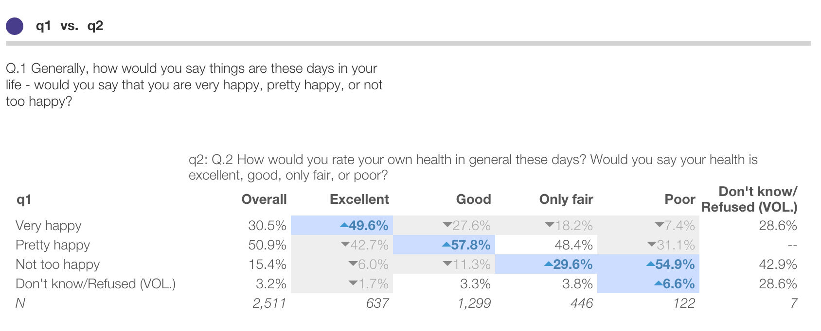
Here we can see that of respondents who entered ‘Extremely’ to q2, 49.6% answered “Very happy” to q1.
Shading and arrows indicate statistically significant differences from the set of all other columns.
You can create crosstabs using collections of variables as the stub. For instance below we can see that respondents who answer “Not to happy” in q1 are significantly more likely to select “Very strong conflicts” for many of the subquestions in q5:
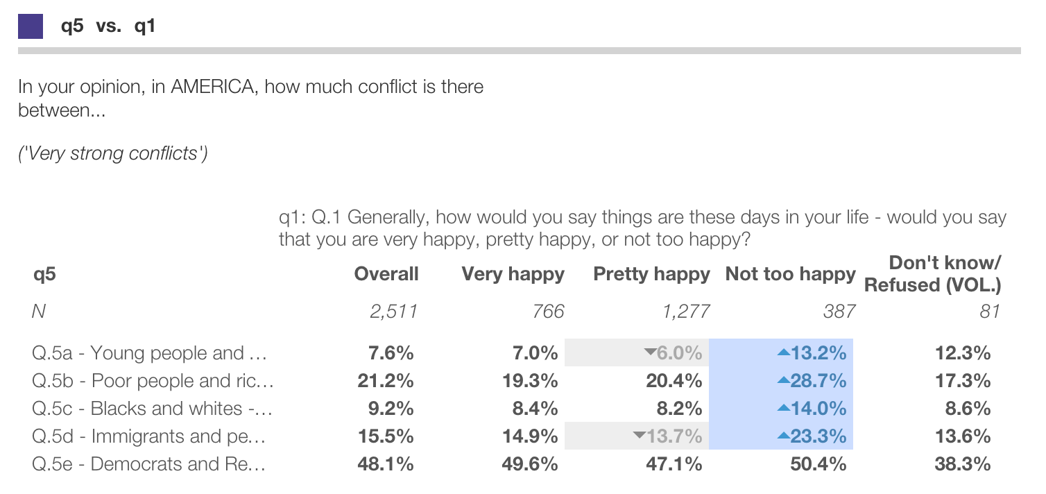
Any element can be used to define the rows (or “stubs”) in a crosstab. Only individual fields (i.e. the ones with circle icons) can be used to define crosstab columns (or “banner”)
You can crosstab all the elements in the research
There are several ways to export data from Protobi. Protobi is principally designed as a tool to find insights and interesting subsets, and makes it easy to get data into PowerPoint for a quick summary or into Excel for more detailed charting and analysis.
You can export Protobi visualizations as PowerPoint presentations:

We’ve kept the interface minimal:
The presentation mirrors your online view:
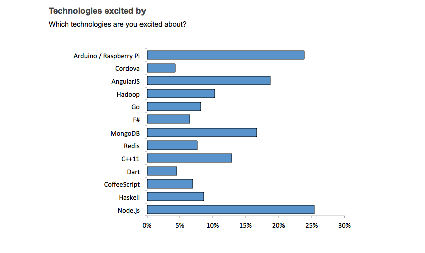
This works for marginal distributions and for crosstabs as well.
Footnotes show the current/baseline scenarios and provide a hyperlink to the online view.
The look and feel of the graphics parallel the Protobi online style but are their own native graphics, so we’ve taken a few liberties to make them feel like PowerPoint charts in their own right. For instance, numeric values are plotted on the horizontal axis, and baselines get their own bars.
The charts are “theme friendly”. You can copy the slides into your own presentation, and the charts will use the colors in your template.
Click the circle icon and select “Copy as image”. This will bring up a dialog with the element as an image. Right click and select “Copy as image…” to copy it to your clipboard or “Save image as…” to save it to your computer.
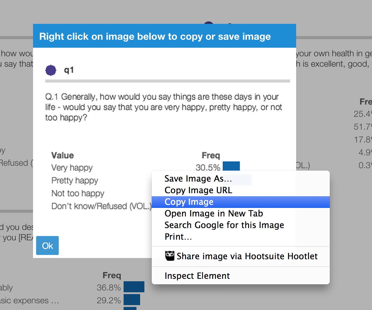
This two-step process is necessary as browser security restrictions prevent programs from putting information onto your clipboard or computer without your direct action.
You can save the entire project as a PDF by selecting “Print…” from the browser’s File menu, and selecting “Print to PDF”. Note: This works best in Chrome and Firefox.
Alternative, click the circle icon and select “Copy as text”. This will select the element in the browser:
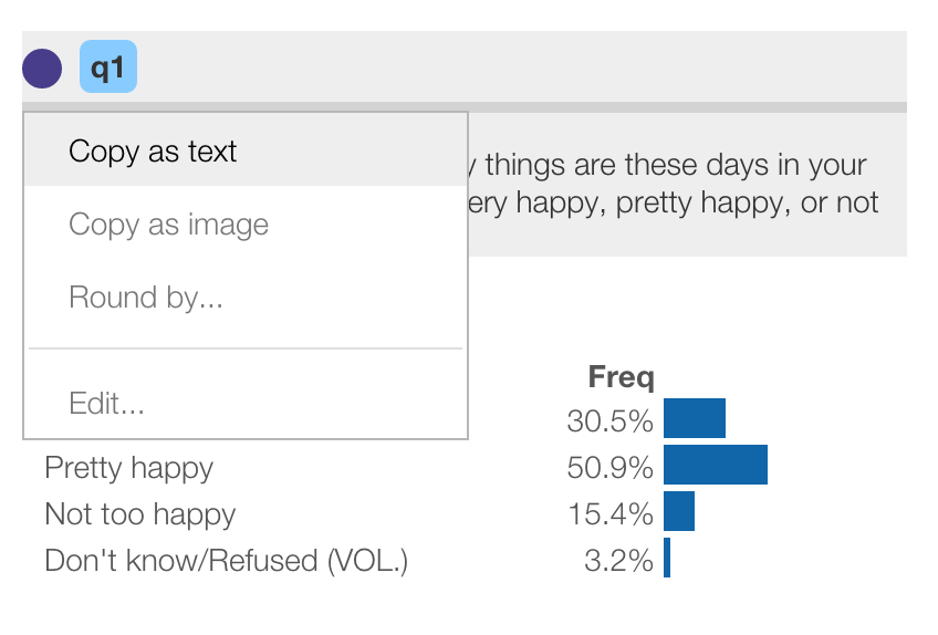
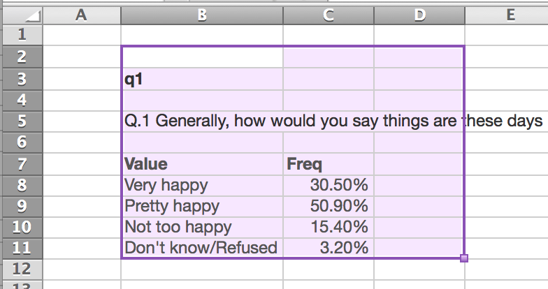
You can then use the browser to copy/paste the data to Excel (or use the Ctrl+C / Ctrl+V keyboard shortcuts) to create your own custom charts:
You can create a new Protobi project simply by importing a datafile.
Click the “New project” widget under your welcome screen and use the File dialog to select a SAV or CSV datafile. Or drag-and-drop the data file from Windows Explorer or Mac OSX Finder on to the “New project” widget.
For this example, we’ll use the Gender and Generations survey which you can download from Pew Research at http://www.pewsocialtrends.org/2014/01/07/gender-and-generations/ . The download includes a formatted SPSS datafile
After a few seconds, the new project will appear as a new widget in your welcome page, and automatically open.
When you first create a project, all the fields are placed in a group called “Fields” which is also the main tab:
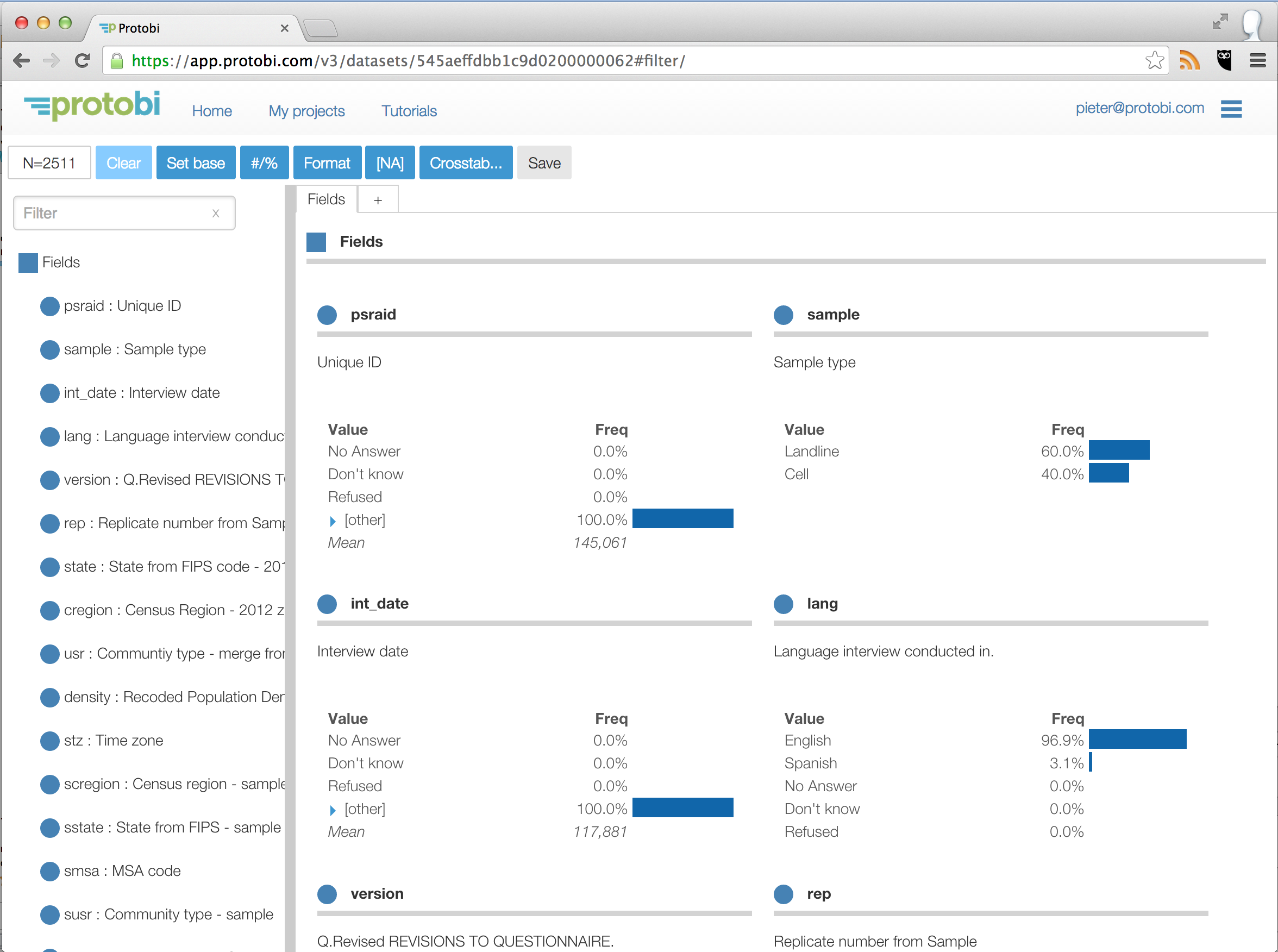
Voila! You now have an interactive view of all the fields in your dataset. It has the variable labels and
value formats and other hints from the SPSS file. Numeric fields are automatically binned. You can start exploring!
Protobi reads rectangular “flat” datafiles, that have rows representing observations and columns representing attributes. It can currently read two formats:
CSV files must have a first row with column names. It must also be RFC 4180 IETF compliant, which means that text values with embedded commas, line breaks or quotes must be enclosed in double quotes, and any double quotes must be escaped as double double-double quotes. Fortunately, this is the standard CSV that Excel and most applications use.
SPSS datafiles are great for many reasons. They are standard output from most survey platforms. The datafile includes a lot of metadata, including
If you have the option of receiving your data in SPSS format, that will make it very easy to work with Protobi.
When you first create a project, all the fields are placed in a group called “Fields”. You can use this view immediately, and that might be enough. Often you’ll wish to organize it a bit further.
Click the + icon on the row of tabs to create new tab. You’ll be prompted to provide a name, let;s call it “Intro”.
You can drag elements into this view from the left:
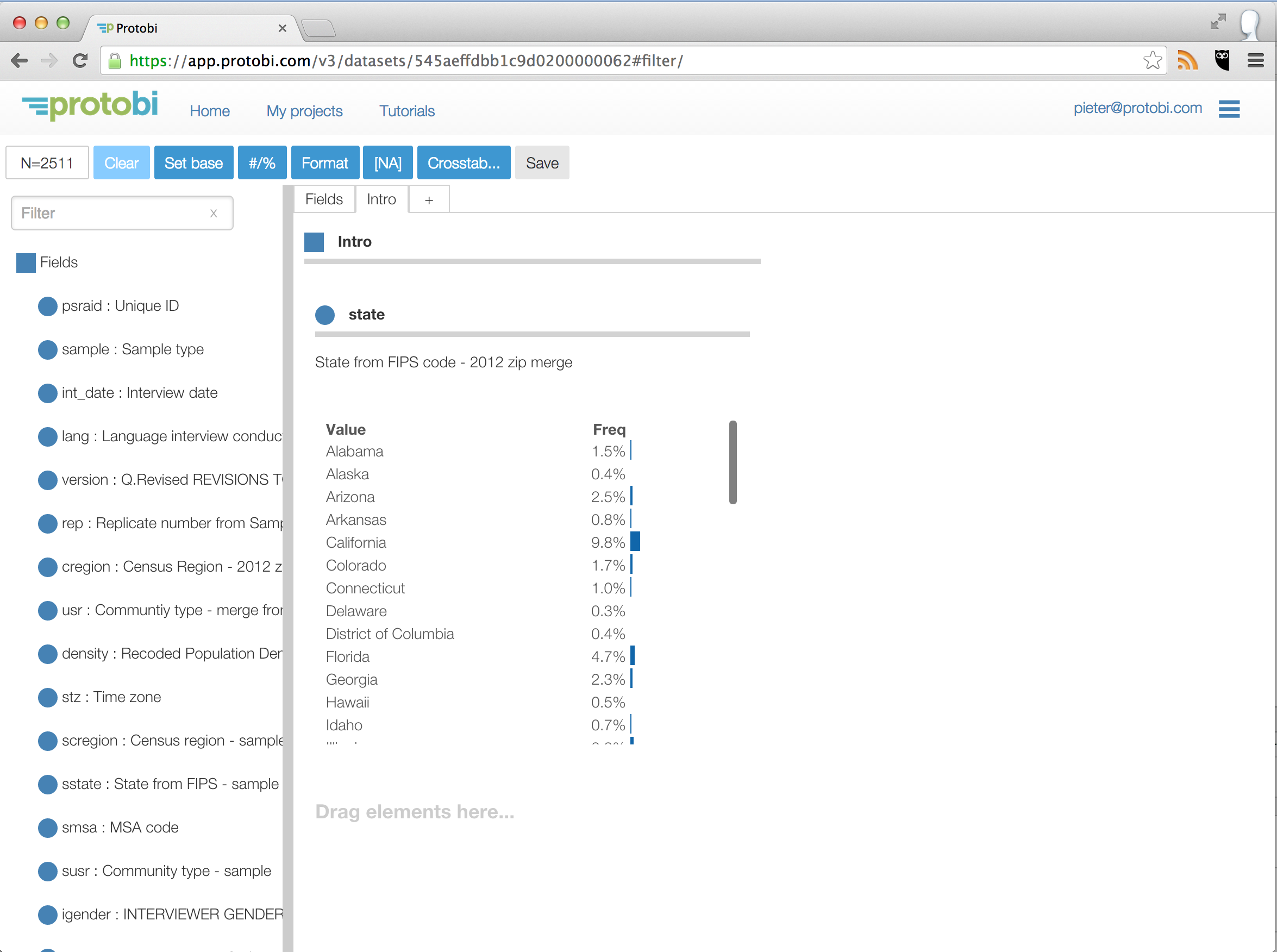
Survey datasets often have structure to them, and you may wish to organize the elements into groups to reflect that.
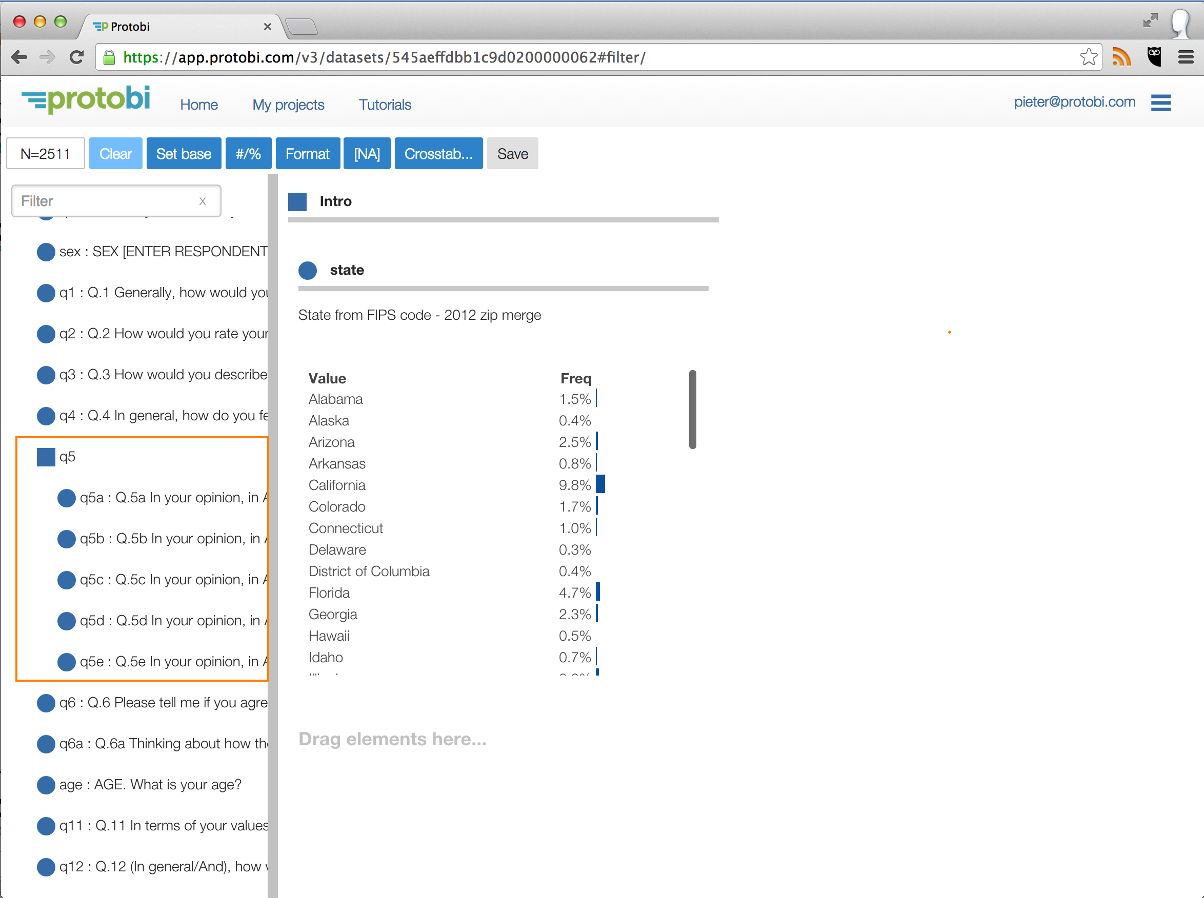
In this example, scroll down in the Tree to questions ‘q5a’, ‘q5b’, ‘q5c’, ‘q5d’, and ‘q5e’. We might wish to place these into a group, say q5.
To create a group, select them by clicking on them in the Tree. Then use the keyboard shortcut “Shift+G”.
Protobi prompts you for the name of the group and suggests one using the longest common prefix among the selected elements. Here it suggests ‘q5’ which we’ll accept.
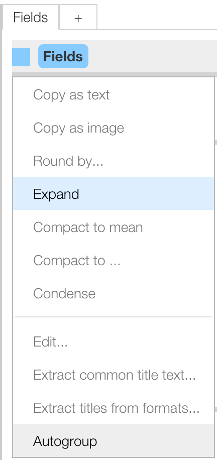
Surveys often have not just one group to define, but dozens or even hundreds. Protobi can intelligently autogroup elements based on their name.
Select the group from the Panel, in this case “Fields”, click the square icon and select “Autogroup” from the context menu:
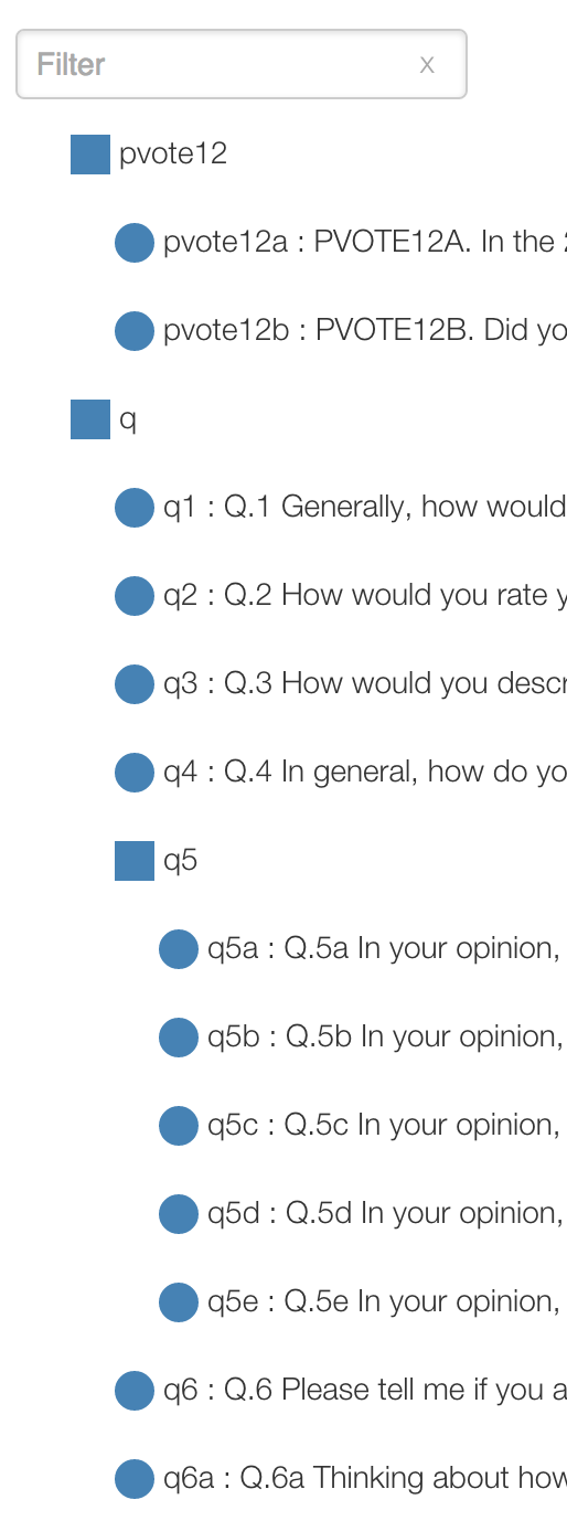
This may take a while, but after a few seconds or maybe 60 seconds will yield a message box indicating success. The elements are now organized into groups based on careful parsing of the name, intelligently sorting numerals numerically and other characters alphabetically.
The results for this example are below (these appear after scrolling a bit down to the elements starting with ‘q’), as these are now arranged alphabetically):
Tip: Now is a good time to click the “Save” button to keep your work!
You can drag-drop elements:
Here we dragged the element q to the tab panel area (after the ‘+’, highlighted in gold) to make it a new tab. Note that this also makes it a top-level group in the Tree, parallel with ‘Fields’:
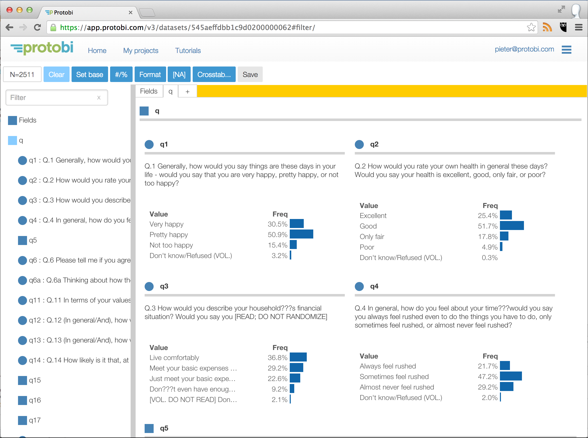
Ordinarily when you drag an element from one group/tab to another, Protobi removes it from one and adds it to the other. This is just what you want most of the time when organizing elements.
But sometimes you may want to put the same element in multiple places. For instance, to create microviews centered around certain fields. If you Shift+Drag (i.e. hold the Shift key while dragging) then Protobi will copy it to the new group/tab and not remove it from the first place.
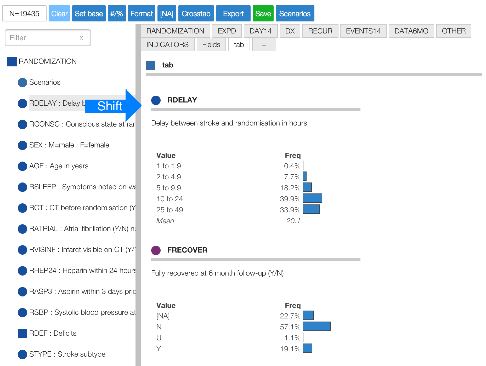
# Edit titles As an editor, you can edit the title text of elements by clicking on it. It will automatically turn into an editable text area.
For instance, the survey had a character in q3 that got converted to ‘???’ somewhere in creating the data file. You can change that to an apostrophe by clicking and editing.
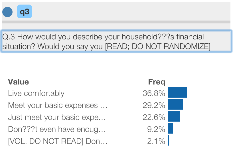
The change is immediate, but only within your session. To make it permanent and visible to other users, hit the “Save” button.
Note: To change the key that identifies the element (e.g. “q3”), use the Advanced Properties editor (described below) to change the displayKey property.
A common pattern in surveys is for collections of related questions to appear in a battery with common text. While the individual subquestions have data values and get columns in the data file, the common text isn’t associated with a data field. So the survey platform will include that text in the variable labels for the subquestions.
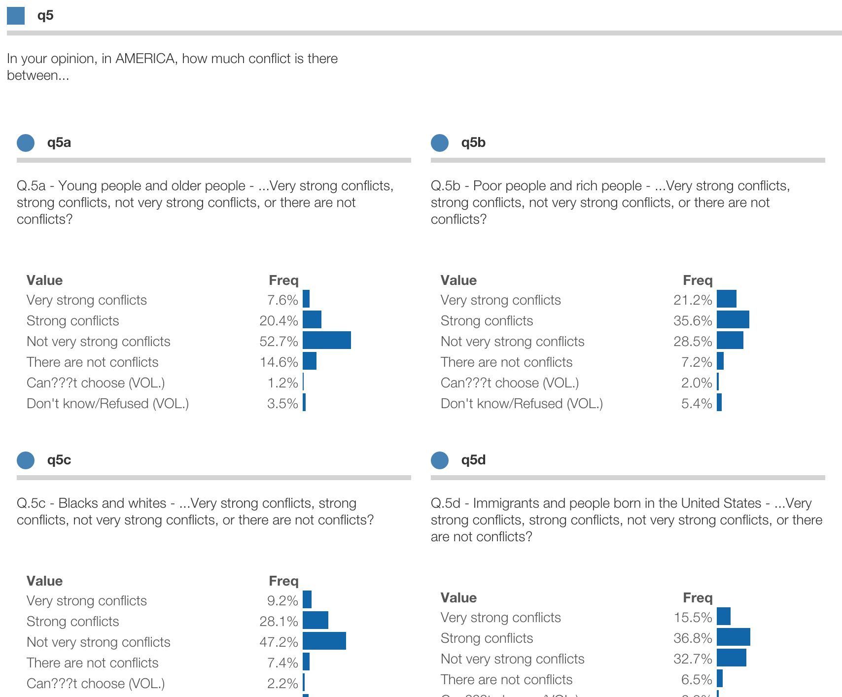
For instance, in q5 we see that they all have the common text “In your opinion, in AMERICA, how much conflict is there between… “ and “…Very strong conflicts, strong conflicts, not very strong conflicts, or there are not conflicts?”
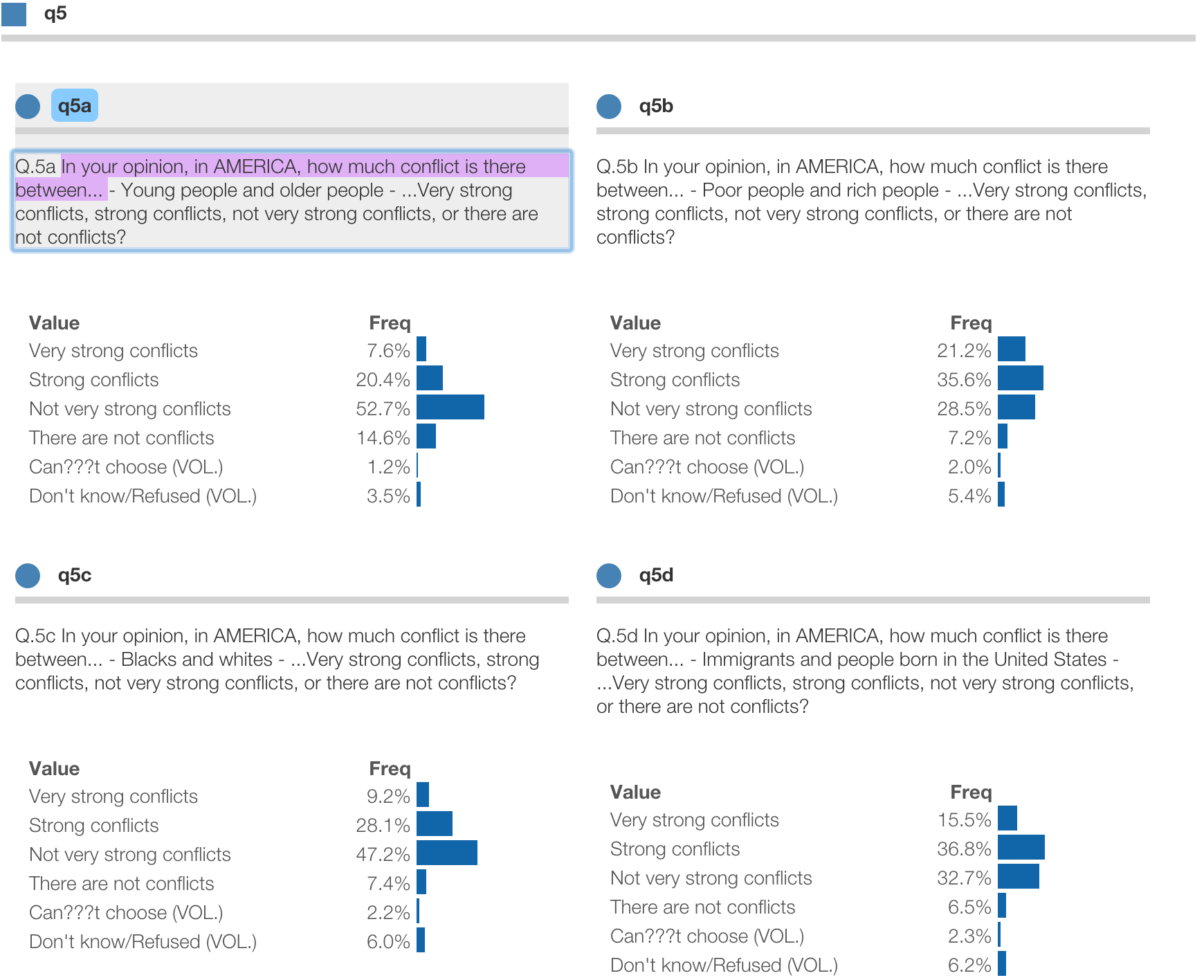
Protobi can extract that common text into the parent group. Click the square icon for the group and select “Extract common text…” from the context menu.
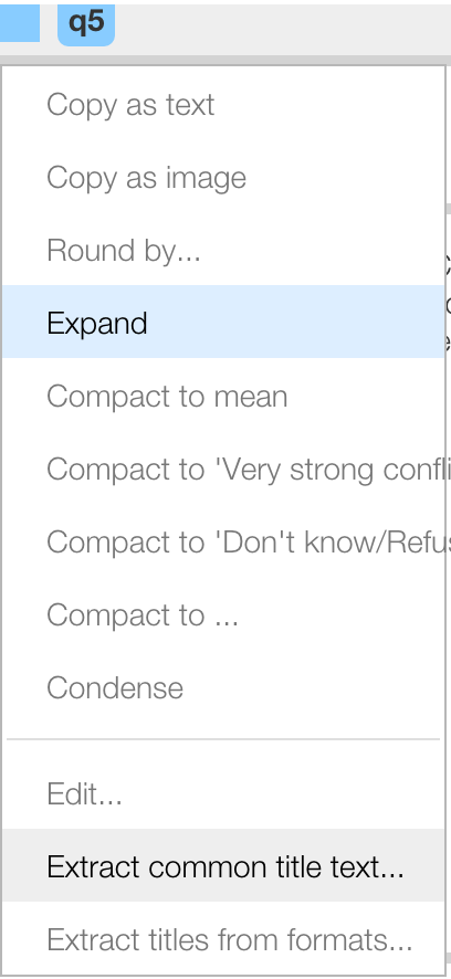
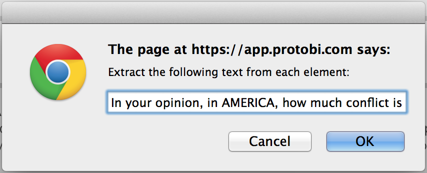
Protobi will prompt you for the text to extract, and suggest a guess based on the longest common prefix. Here they don’t have a common prefix, so highlight the text yourself, and copy/paste it to the dialog:
Protobi removes that text from each element and places it in the parent group:
This particular question is a hassle as it has two fragments of common text, separated by variable text. We can repeat the process with the other fragment:
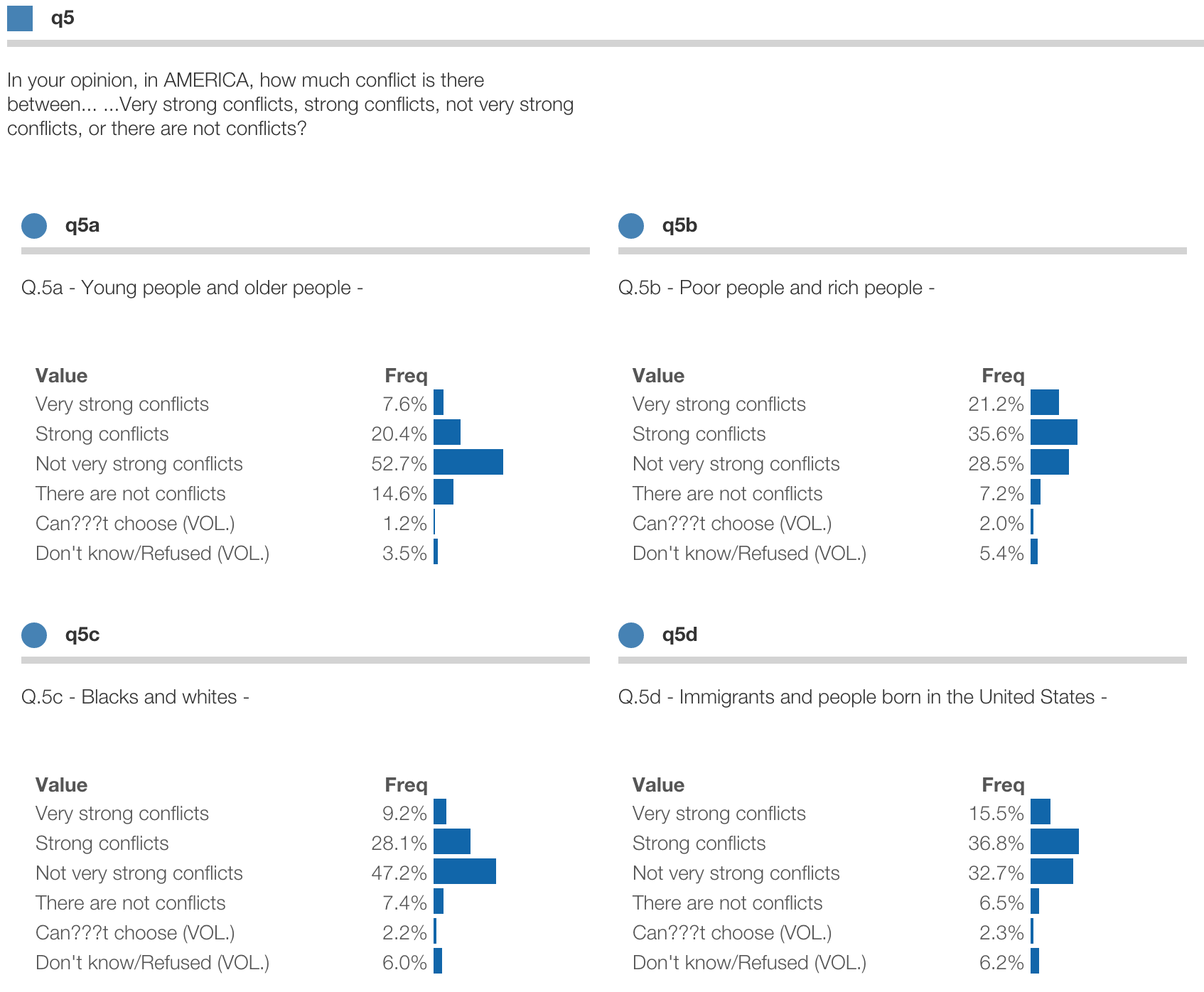
At this point, it might be nice to compact the display to top-box percentages:
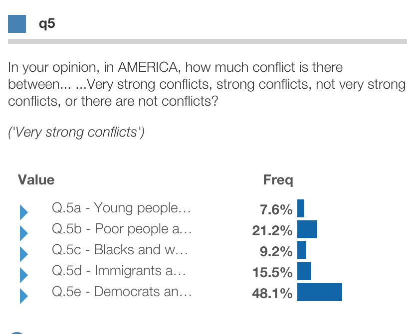
Tip: Now is a good time to click the “Save” button to keep your work!
You can edit advanced properties for any element or group by selecting “Edit…” from the context menu. This will bring up an editor, which allows you to modify all the properties directly.
This uses JSON syntax, which has the advantage of handling nearly any property, but requires care. The editor highlights your syntax after you type, to help do it correctly.
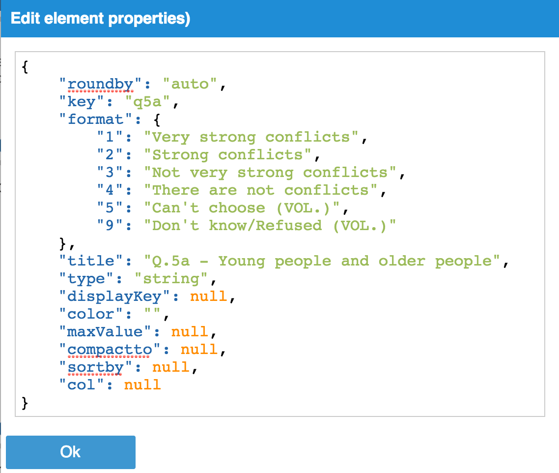
The following properties are recognized:
key unique identifier for elementfield name of data field, if different from keydisplayKey identifier to display, if different from keytitle longer text descriptiontype type of data, may be "number", "string", or "empty" or nullroundby bin size for numbers, maybe 0, "auto", "log" or a positive numbersortby either "value" or "freq" or nullcolor any CSS color, either named (e.g. “gold”) or hexadecimal (e.g. “#FA0”)compactto a single raw value (e.g. 5), an array (e.g. [4,5]), "$mean" or "$sum"maxValue to scale bar lengths when compacting to $mean, e.g. 100 for percentagesformat map of raw values to value formats, e.g. {“1”: “Strongly agree”, …}`children array of keys defining a group, e.g. ["q5a", "q5b", "q5c", "q5d"]Typically in Protobi each element represents one column in the dataset. However you can define an arbitrarily complex
element, using the recode attribute to define each state as any subset of the data you wish.This is really useful
to define and analyze new segmentations of the data.
Protobi uses MongoDB query syntax for logical constraints. The syntax may look different at first, particularly if you’re coming from SPSS, SAS or SQL. But it’s a surprisingly simple and powerful way to express constraints.
To define states dynamically, select “Edit…” and specify an attribute named recode.
For each state, specify a constraint that defines the filters you want.
Below is the edit dialog for the special element Scenarios described earlier. Each saved scenario is defined as a state, with the corresponding filters. For instance, there are three states, based on the patient age and randomization delay:

Note that these states reference more than one variable (e.g. AGE and RDELAY) and overlap in definition (i.e. patients under 50 is a subset of all patients).
You can also define an element in Protobi as an arbitrarily complex expression using Javascript. This is really useful for mathematical transformations.
For instance, let’s say your survey elicits a patient’s age in years and/or months as a two part question:
  Q3.  What is the patient's age?
       a.   ________ years
       b.   ________ months
We can define an element as a function of these columns by defining an attribute called transform which specifies a
function, e.g.: "transform": "$.Q3a + $.Q3b/12" as in the example below:
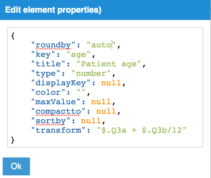
Here, the special variable $ represents a single row of the dataset, and columns are referenced using dots. Note that Javascript is
case sensitive, so you need to match the casing in the datafile.
You can share the URL to a project. The URL encodes the current scenario as you click, so pasting the URL into the browser recovers your application state.
For instance, the dataset used for many of the examples in this tutorial can be found at: http://app.protobi.com/v3/datasets/53878aa0618c90020000015c
If your project is public, then anyone with the URL can access the project. If the project is private, the user must be signed in and specified as a permitted user.
You have the ability to open, share and delete projects that you create.
If you have Admin privileges to the project (which is the default for projects you create), you can mange user permissions. Click the trigram icon in the upper right of the project application and select “Project permissions…”
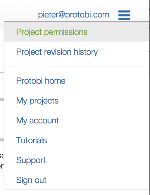
There are four levels of permission:
You will need to notify your colleagues that you have added them to the project. Protobi does not automatically email users when permissions change.
Try Protobi yourself, using a dataset of your own, or the car_sales.sav example dataset:box-sizing: border-box;
Sign in to Protobi at https://app.protobi.com
Create a new project by dragging the above file to the “New project” widget
Group all the standardized “z” variables into a group called “Z”
Create a tab by dragging the group “Z” from the Tree to the tabs above the Panel
Find an element “Type” in the Panel by looking in the tab “Fields”
Toggle display from percentages to counts by pressing the “#/%” button in the Toolbar
Toggle display of formatted values by pressing the “Format” button in the Toolbar
Create a filter by clicking “Trucks” within the element “Type”
Find significant differences between cars and trucks by scanning
Crosstab vehicle MPG by vehicle Type by dragging “Type” onto “Vehicle”
Crosstab all elements by dragging “Type” to the Crosstab button in the Toolbar
Change bins for “MPG” by clicking the circle icon and selecting “Round by…”
Edit format for the element “Type”, perhaps change “Truck” to “Truck/SUV”
Compact the group “Z” to the mean (these are standardized, so the means are zero)
Copy and element as an Image to PowerPoint
Copy an element as Text to Excel
We like to help you make the most of Protobi for your data, and make it part of your favorite toolset. If you have questions or ideas, please contact us at support@protobi.com.