A new take on Perceptual Maps
March 6, 2015
"Hey, is there any way we can see this data as a perceptual map? I'd love to show this to the marketing team tomorrow." Thus was the question posed by a smart client who likes to present synthesized findings rather than just raw data.
The next question was "How can we make this easier to see?" Together we worked out a new take on Perceptual Maps to make more fun...
Data
The survey had collected a set of ratings for a number of brands on various attributes. The data looked like this. The question was basically "For which patient type(s) do you think each brand is best?"
| Brand | ||||||
|---|---|---|---|---|---|---|
| Patient type | Z | A | X | G | Y | B |
| Early/First line | 5% | 17% | 0% | 0% | 0% | 0% |
| Refractory/late-line | 32% | 29% | 13% | 3% | 3% | 4% |
| General use | 18% | 24% | 13% | 20% | 15% | 28% |
| Convenient | 12% | 0% | 0% | 0% | 0% | 0% |
| Unfamiliar | 13% | 3% | 0% | 0% | 0% | 0% |
| Non-compliant | 12% | 0% | 3% | 4% | 23% | 6% |
| Physical symptoms | 0% | 3% | 0% | 14% | 11% | 3% |
| Cognitive symptoms | 1% | 0% | 2% | 33% | 2% | 2% |
Challenge
The challenge is that there are a lots of brands and lots of attributes (this is a subset of the actual data) so its not easy to see it at glance, unless you're one of those people who like tables. Shading the table (as we did above) helps a lot. But big tables can be hard to grok.
Create a perceptual map biplot in R
It's can be quick to create a perceptual map in R:
install.packages("psych")
library("psych")
df <- read.csv(url("http://protobi.com/examples/pca/brand.csv"),
   header=TRUE, row.names=1)
pc.cr <- princomp(df, cor=TRUE)
summary(pc.cr)
biplot(pc.cr)
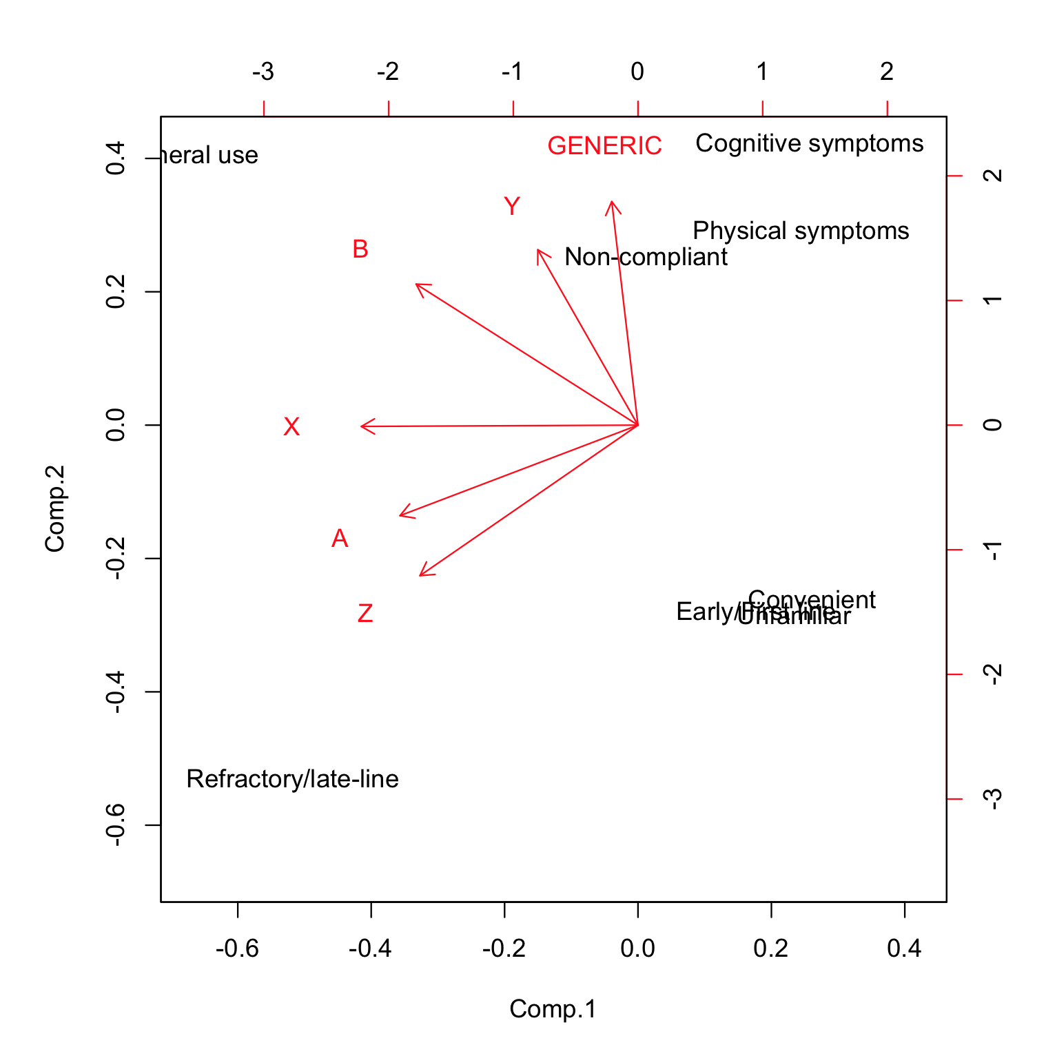
Below is how the resulting biplot looks in R. Easy to create, but static and offline:

Interpreting perceptual maps
Every time I've seen PMaps in business presentations, they're invariably introduced as "the most misunderstood plot in market research." So here's a brief intro.
Perceptual maps reduce lots of brand dimensions to just two so we can plot them on a page. Like plotting an actual map, flattening a 3-dimensional globe to 2 dimensions results in some approximation. But we find the best possible fit for the aspect of interest.
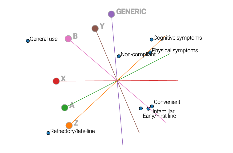
Each product is drawn as an axis. To see how each product scores on an attribute, imagine an orthogonal line from the attribute point to the brand axis. Where that point intersects the brand axis indicates how that brand scores on that attribute.
...Lost you there, right? Client presentations easily go off track when we ask executives to imagine orthogonal lines. Why don't we just draw the lines for the reader?
Interactive perceptual map
Below is the same graph calculated dynamically. Hover over any point or axis. The tracer lines are automatically drawn, and the underlying data is neatly summarized in a hover tip.
This is not only a lot more fun to read and to show, but it easier to trace the lines visually.
Note that the above Perceptual Map is calculated directly in the browser from the raw data, not simply plotting points calculated in R. You can access the source code for this example here. The uses an elegant implementation of PCA from ktnaneishi's Principal Component Analysis post on bl.ocks.org

