Toggle navigation
Home
▼ Details
Products and pricing
Chart gallery
User stories
Text analytics
CDC NAMCS Library
Blog
Tutorials
Contact
Sign in
Protobi Blogs
Search results for “
”
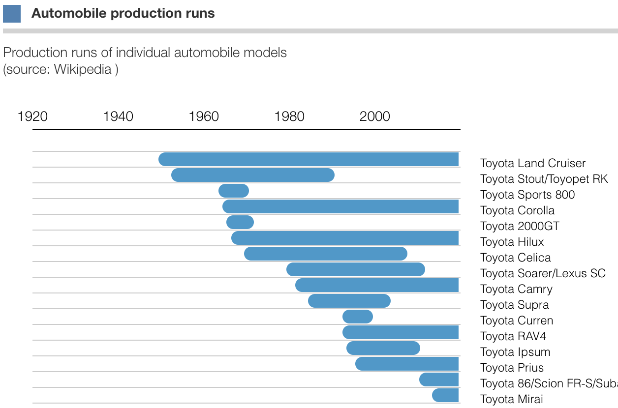
How to create your own new chart type in Protobi
Jun 16, 2025
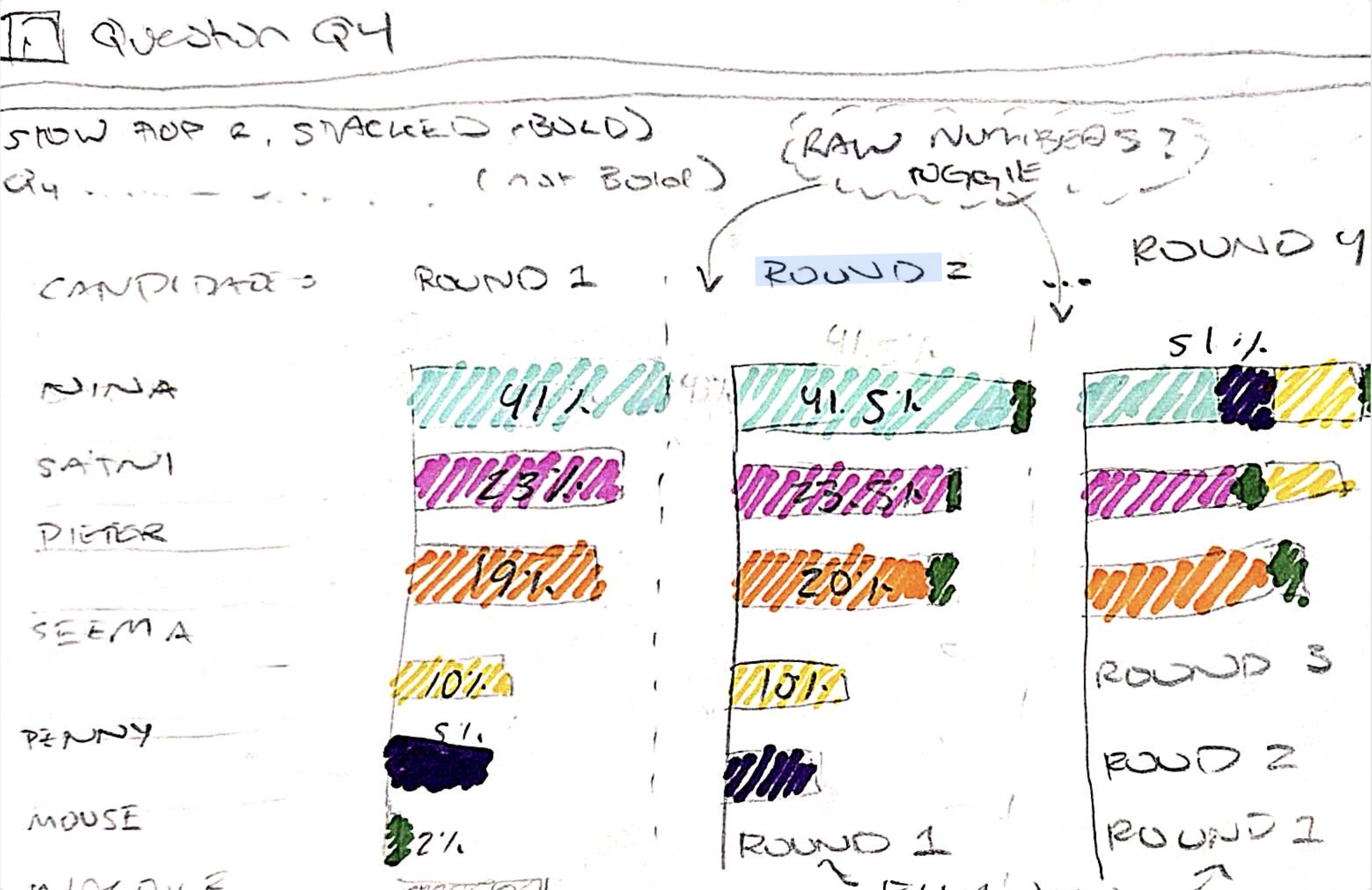
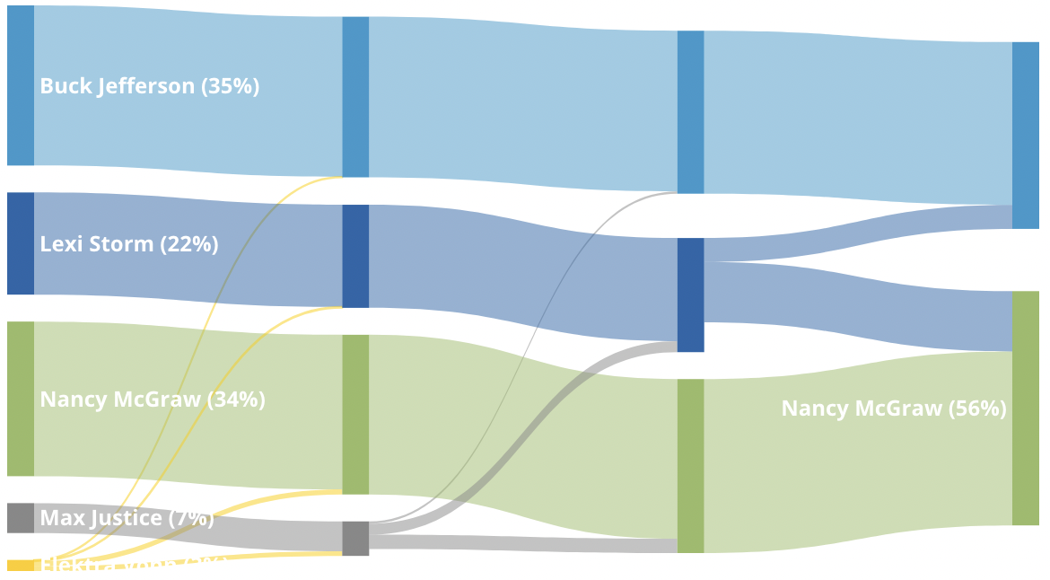
Ranked choice voting analysis
Jun 11, 2025
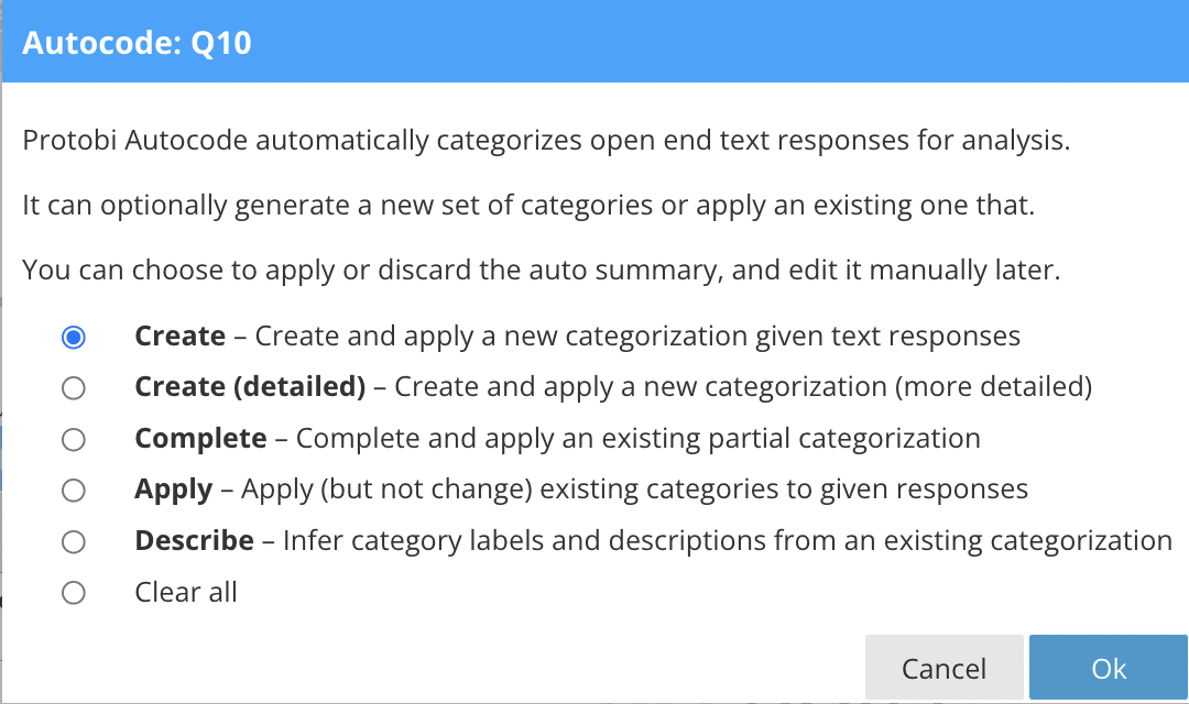
AI text coding in Protobi
Jun 06, 2025
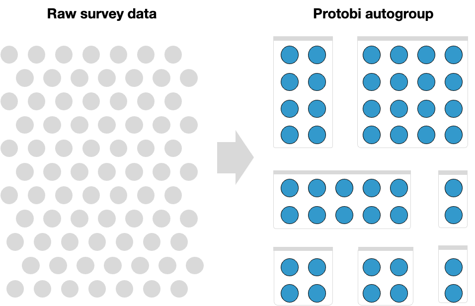
Autogroup neatly organizes your dashboard
Mar 12, 2025
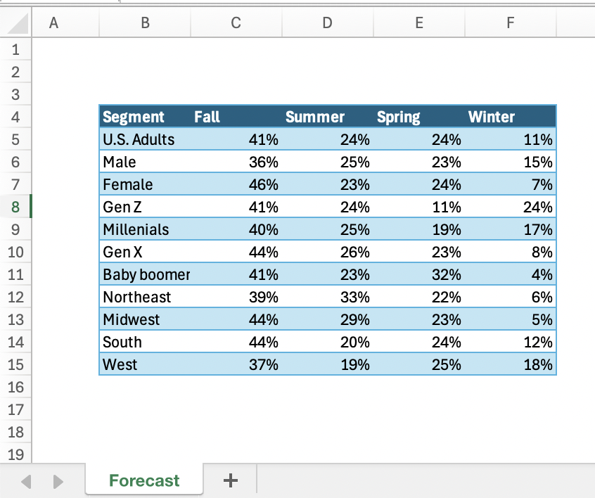
Create charts from Excel tables in Protobi
Feb 28, 2025
Protobi NHANES
Feb 19, 2025
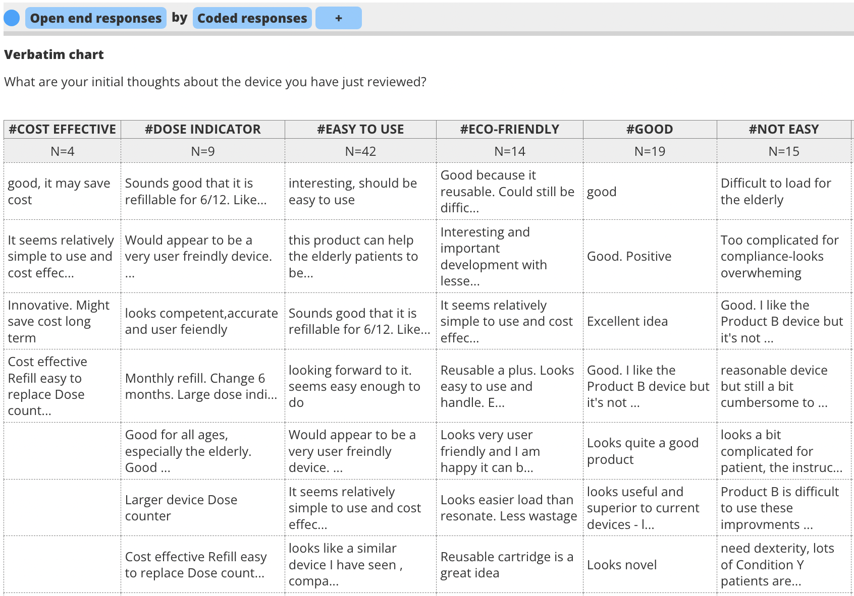
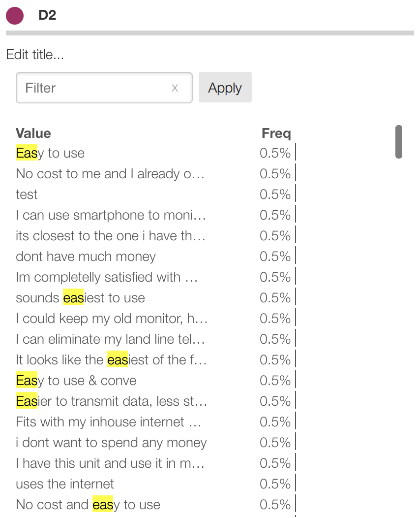
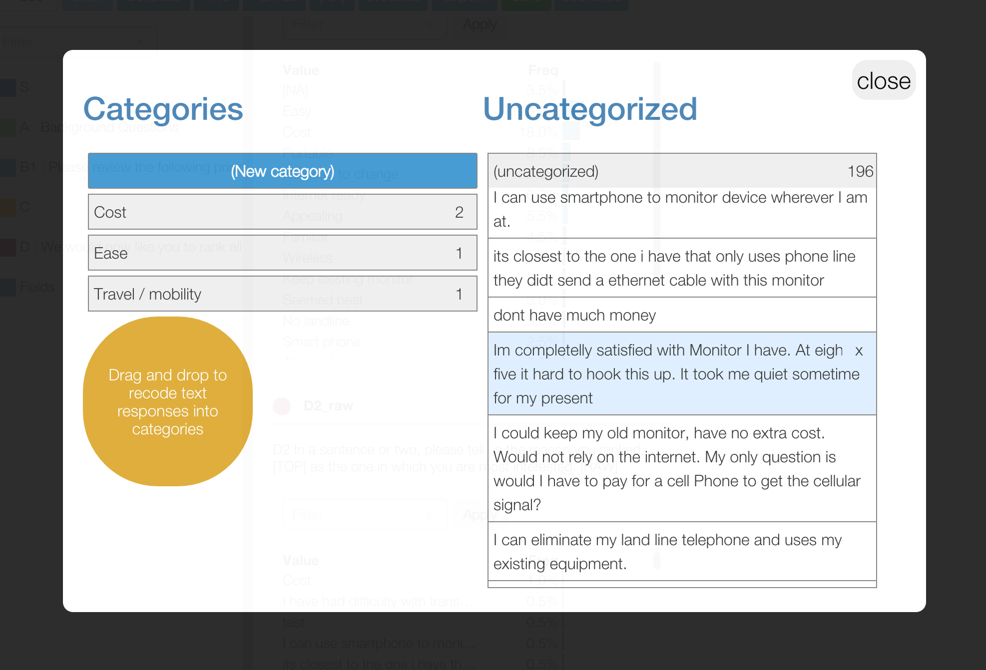
Sparse “Verbatim” tables for text open ends and unique responses
Jun 18, 2024
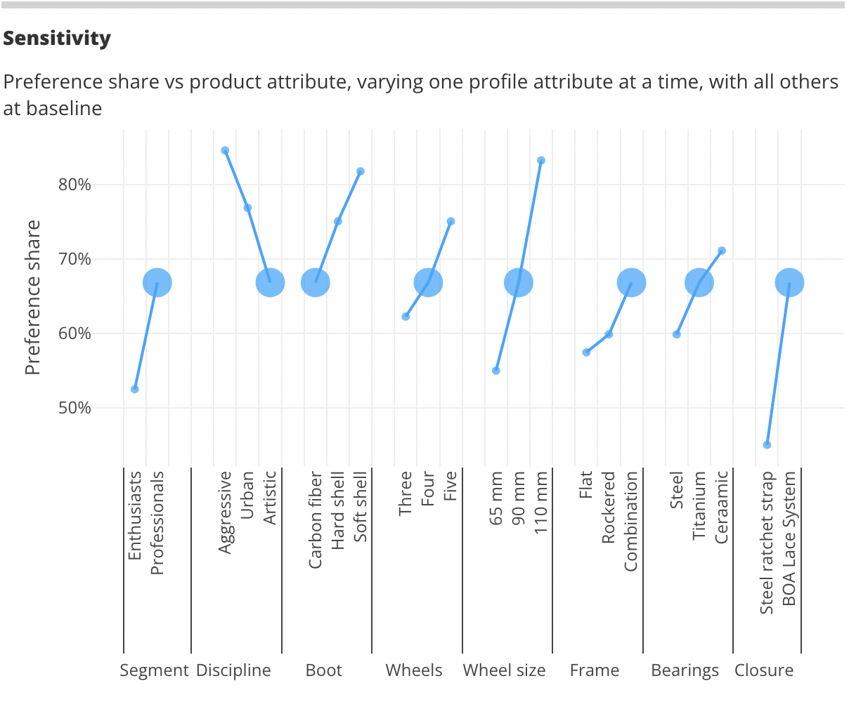
Conjoint simulators in Protobi
May 29, 2024
Carnegie uses Protobi to help colleges win students
Dec 07, 2023
Protobi is SOC-2 certified
Nov 30, 2023
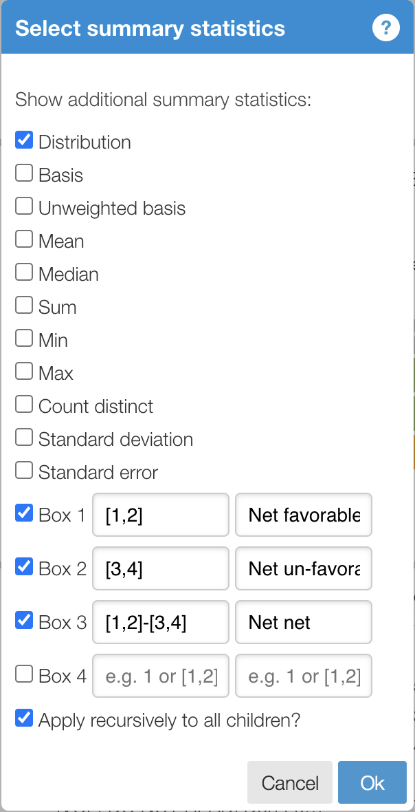
Net-nets and Net Promoter Scores
Feb 17, 2021
Print layout
Jul 20, 2020
Slide layout
Jun 28, 2020
Headlines
Jun 14, 2020
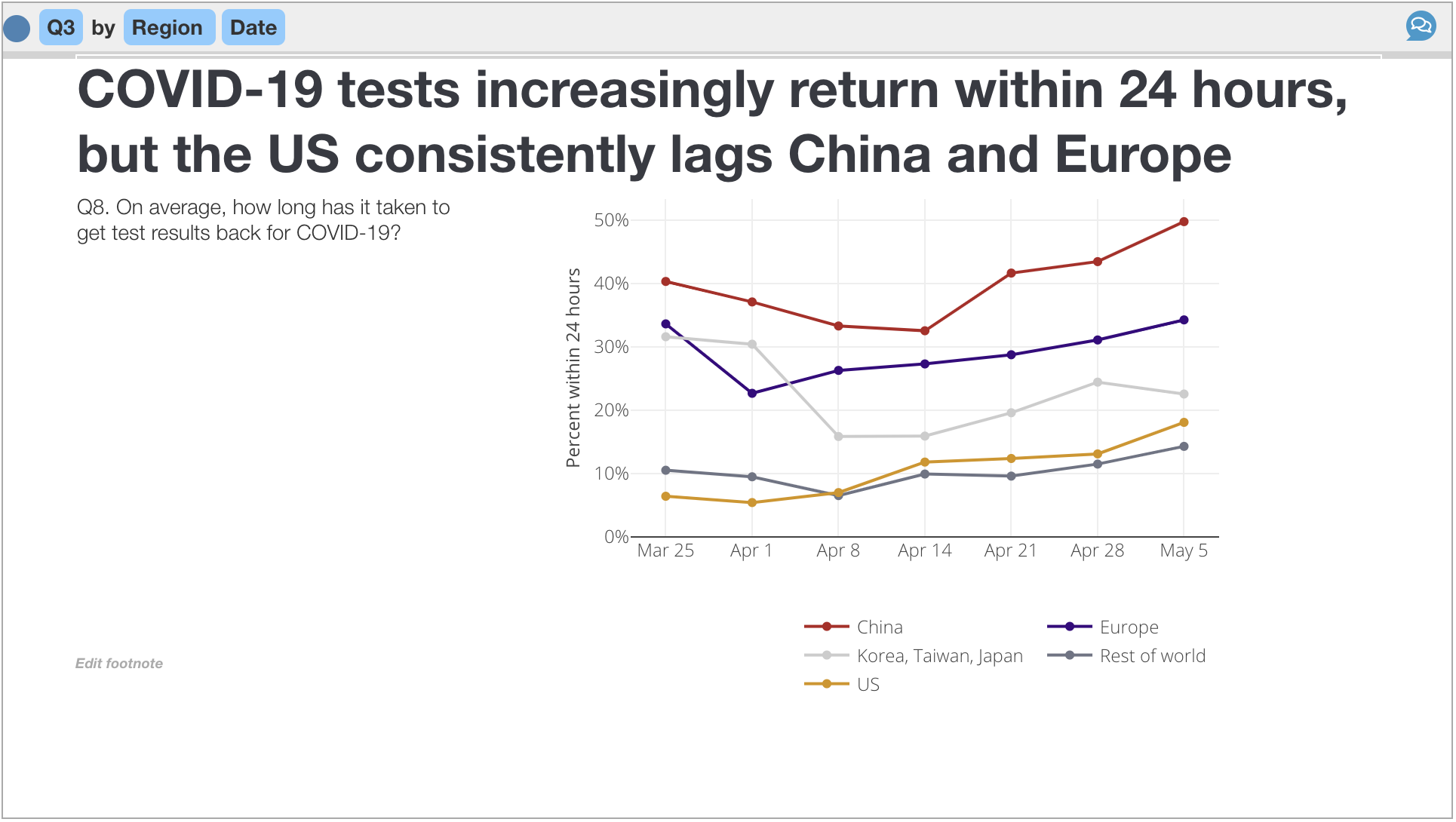
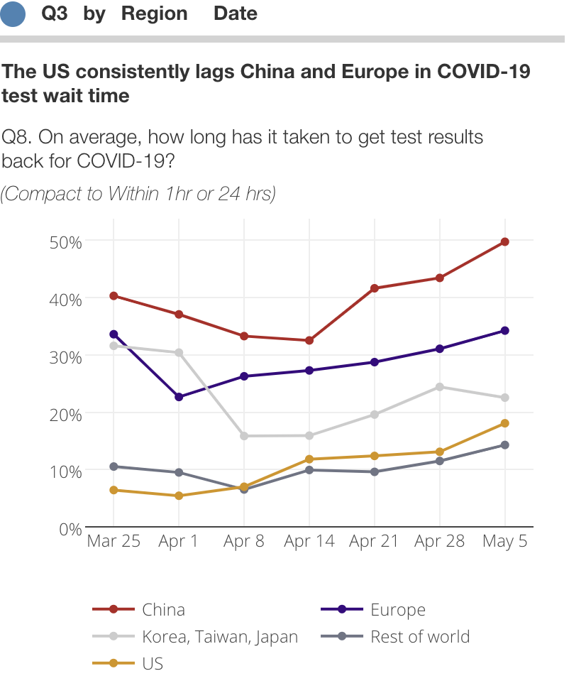
Sermo COVID-19 Barometer
Apr 30, 2020
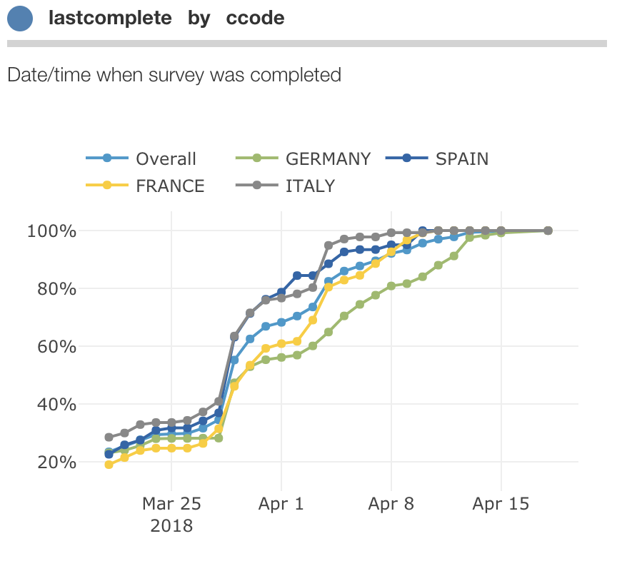
Comparing dates
Apr 14, 2020
Edit data ... in Protobi or externally
Oct 10, 2019
Design work sessions
Sep 20, 2019
Sentiment analysis in Protobi
Feb 14, 2019
Colors and branding
Jan 08, 2019
Process data in Protobi
Jan 06, 2019
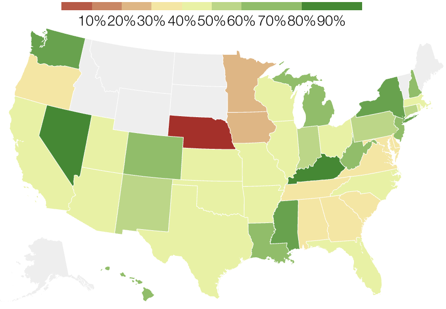
Stylized geographic maps
Dec 30, 2018
Flow diagrams
Aug 31, 2018
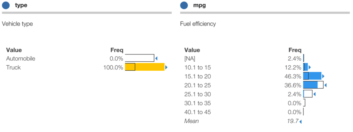
Recode special values
Aug 28, 2018
Extreme values: Winsorize, trim, or retain?
Aug 01, 2018
Verbatim coding and sample size
Jul 31, 2018
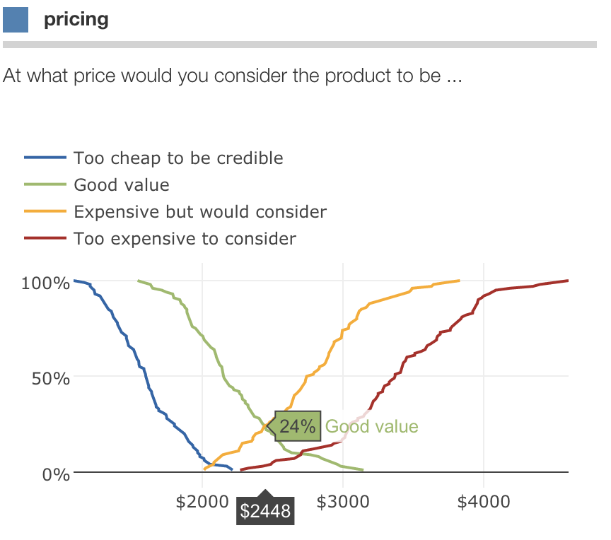
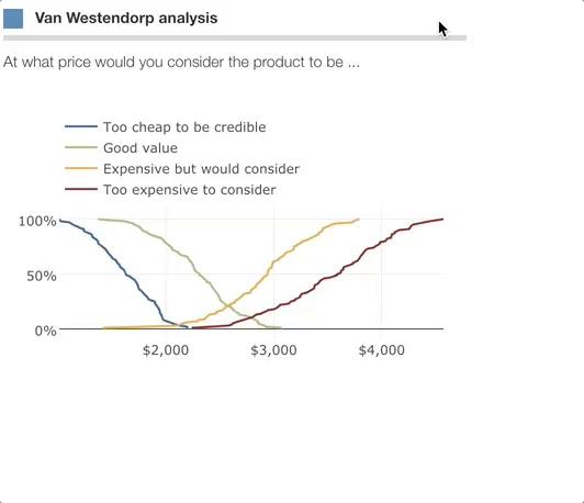
Van Westendorp Price Sensitivity Meter
Jul 27, 2018
Date values
Jul 24, 2018
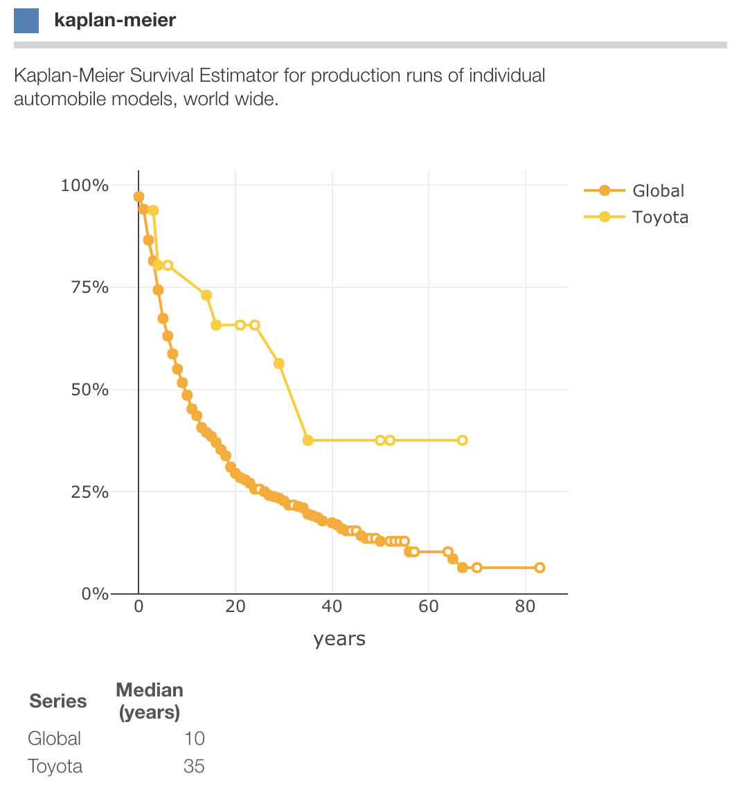
Kaplan-Meier Survival Estimator
Jul 18, 2018
Time intervals
Jul 17, 2018
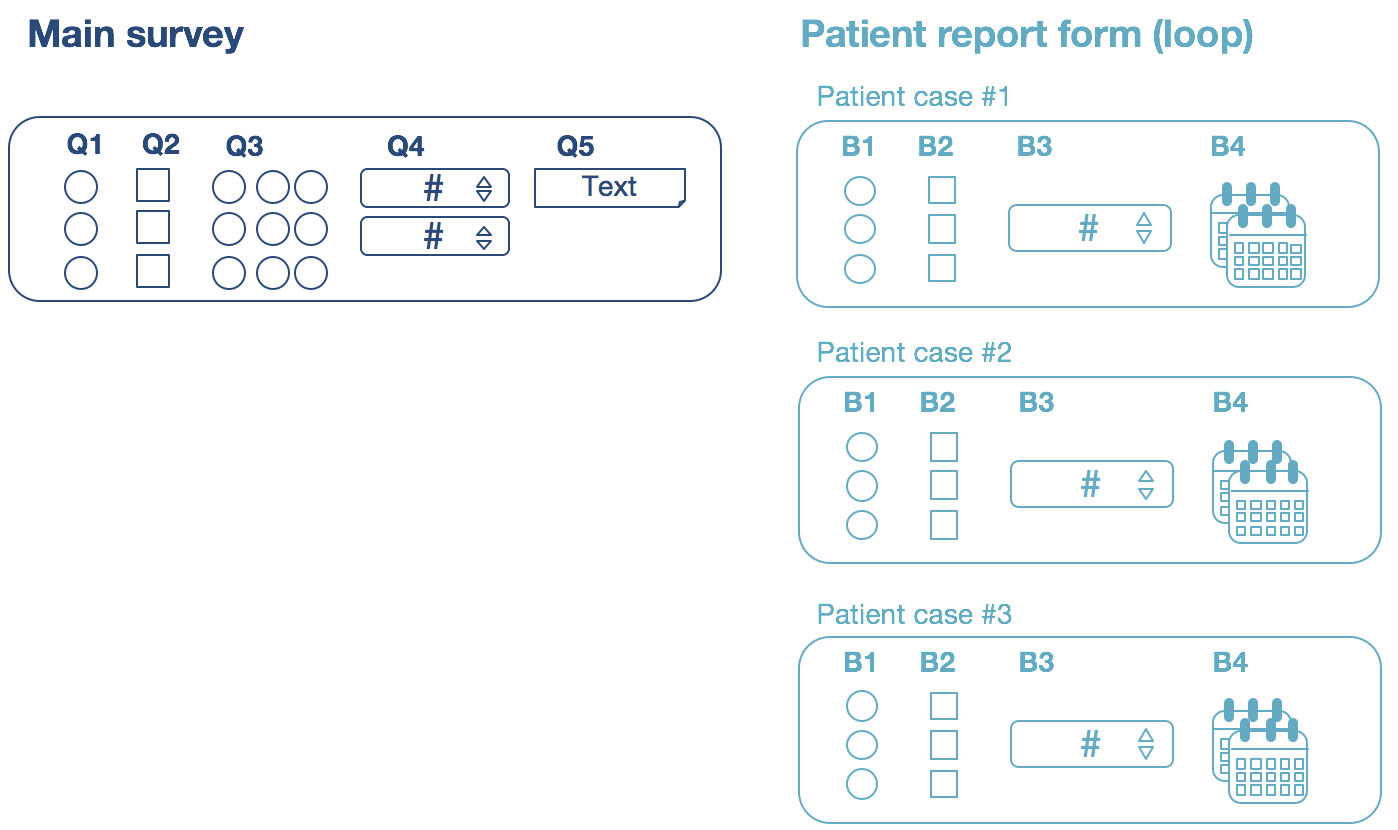
Loops in patient case and conjoint data
Jul 14, 2018
SERMO Dashboard Analytics
Jun 26, 2018
Ratios smart and simple
Jun 25, 2018
Translate and recode verbatims in any language
Jun 16, 2018
Find and identify straightline respondents
Jun 10, 2018
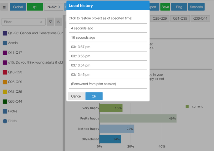
Local history means your changes are never lost
May 08, 2018
Create charts that look like your presentation
Apr 01, 2018
Resize elements
Mar 01, 2018
WordClouds ... not just for text anymore
Feb 11, 2018
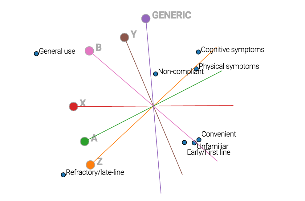
Perceptual mapping in Protobi
Feb 11, 2018
WordCloud
Feb 10, 2018
Pairwise testing with PairedTable
Sep 15, 2017
Top-box Tornado
Sep 14, 2017
Data processing in Protobi
Jan 14, 2017
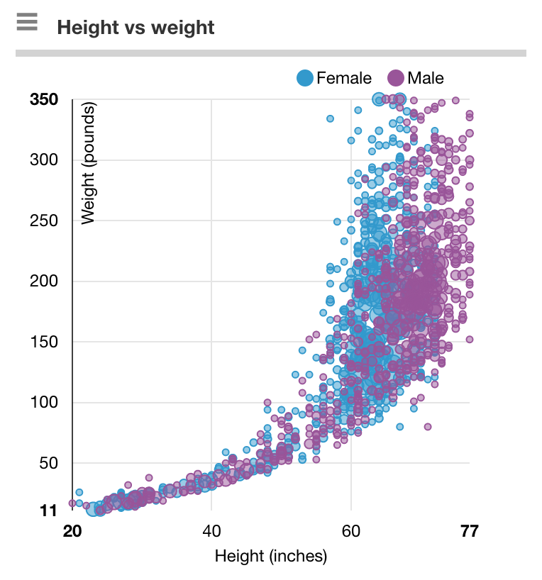
Height weight charts for grownups...?
Aug 17, 2016
Beyond the bar (charts)
Jun 17, 2016
Analyzing collections of ratings
Jun 14, 2016
All the news we print ... to PowerPoint
Mar 14, 2016
Quick survey quality tips
Dec 14, 2015
Liars, damn liars, ... or just outliers?
Jul 31, 2015
Empirical analysis of verbatim coding
Jul 29, 2015
The three Rs: Ratings, Rankings, ... and Rantings?
Jul 20, 2015
Optimal price in discrete choice models
Jul 15, 2015
Text verbatims
Jun 15, 2015
New capabilities
May 15, 2015
How is Protobi different...?
Apr 06, 2015
A new take on Perceptual Maps
Mar 06, 2015
Hello Excel
Mar 02, 2015
Hello PowerPoint
Feb 18, 2015
Style update: Contrasts
Dec 04, 2014
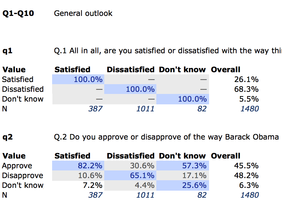
Nested Crosstabs
Dec 02, 2014
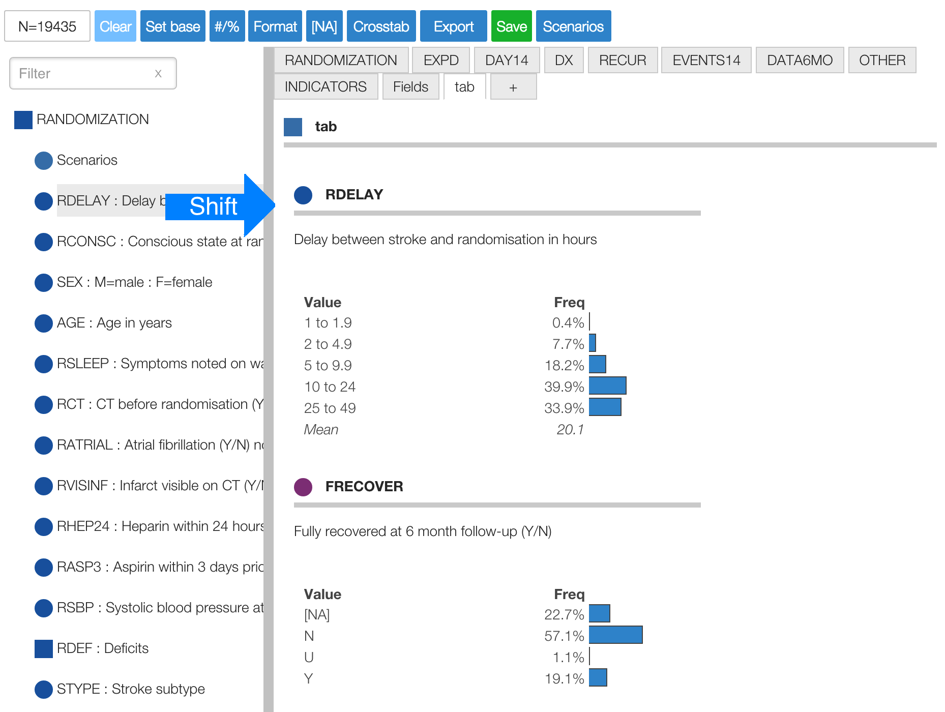
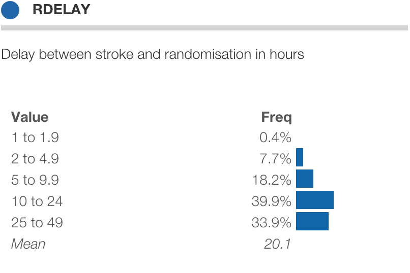
International Stroke Trial
Sep 16, 2014
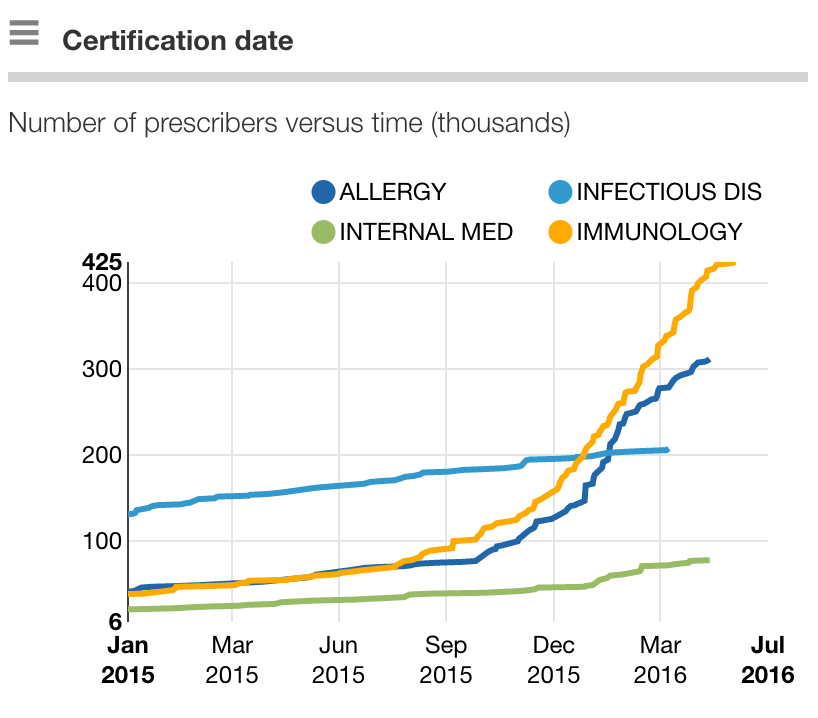
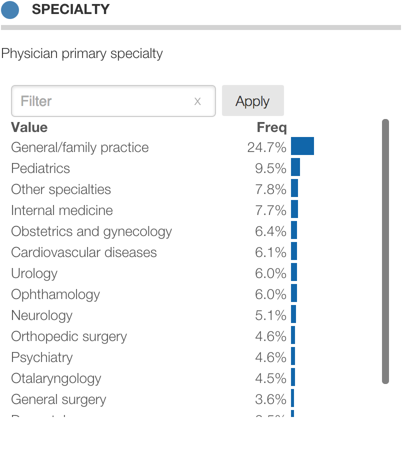
CDC NAMCS: A snapshot of US outpatient care
Sep 14, 2014
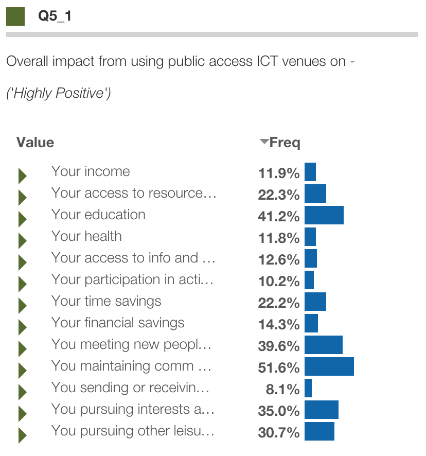
Connecting people for development: Why public access ICTs matter
Sep 04, 2014
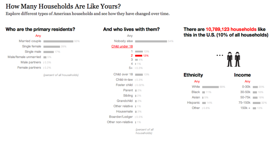
Estimate and profile segmentations
Sep 03, 2014
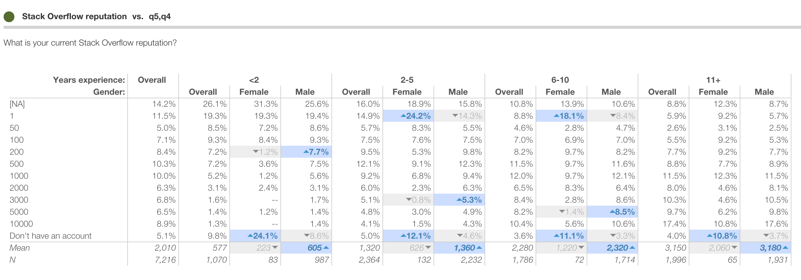
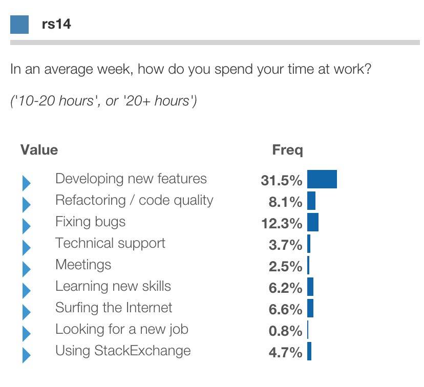
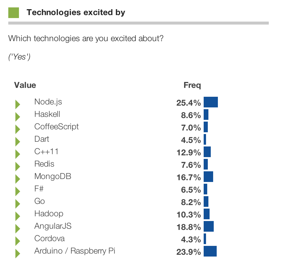
StackOverflow Developer Survey
Aug 16, 2014
Eurobarometer: Attitudes toward robots
Aug 01, 2014
Structure data for import
Jul 31, 2014
Configuring a map
Jul 28, 2014
Pew Research: Health, Wealth and Family
Jul 28, 2014
Advanced queries with Is, Or and Not
Jul 26, 2014
Instant online dashboards
Jul 25, 2014
Instant crosstabs
Jul 24, 2014
Introducing Protobi
Jul 14, 2014
Designing simple interfaces
Jul 01, 2014
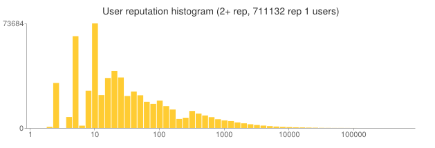
Long tail distribution of StackOverflow reputations
Aug 01, 2013
Open Vis Conf 2013
Apr 28, 2013
Bar charts for professionals
Jan 07, 2013
Power of a simple bar chart
Jan 02, 2013
Bob Caspe at Venture Cafe
Dec 27, 2012
Revenue per employee and biologic scaling laws
Aug 07, 2012
Segmentation and Information Theory
Jan 06, 2012