Analyzing collections of ratings
June 14, 2016
Pieter Sheth-Voss
Does your survey include a collection of related questions on a common scale? E.g.
- Ratings: "How strongly do you agree with the following...?"
- Frequencies: "How often do you do the following activities...?"
- Rankings: "Please rank these items from most desirable to least..."
Protobi includes useful tools—top-box summaries, stacked bars, crosstabs and clustering—that make it easy to analyze ratings, rankings, and other questions on common scales.
But the tips here you can do in Excel, R or even PowerPoint...
Surveys often ask collections of questions lke ratings, rankings, frequencies, etc. In the case of Likert-scales, whether to use 5-point, 7-point or 10-point scales, and whether to include a middle point are well-researched religious divisions in market research. But either way, we need to analyze and present them clearly.
Marginals
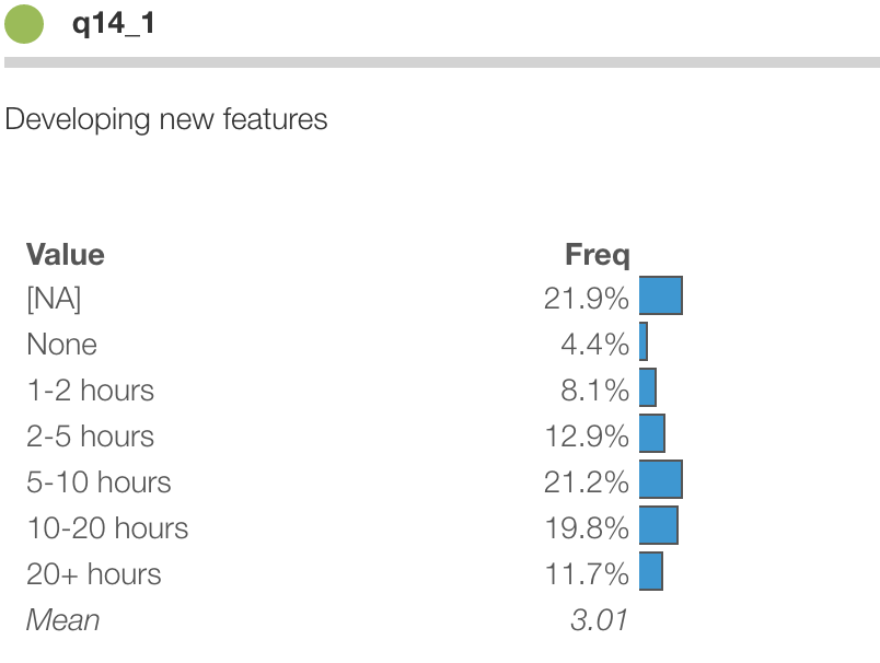
The above plot shows responses to a question in the StackOverflow developer survey about how much time programmers spend on different task each week. The scale ranged from "none" to "20+ hours".
One such item is below. This shows the marginal distribution of answers to one of the questions.
But how do you nicely show responses to lots of questions on the same scale?
Top box scores
One approach is to show means or "top box" percentages. Below are the top-2-box percentages, showing the percent of respondents who spend 10, 20 or more hours each week on each task:
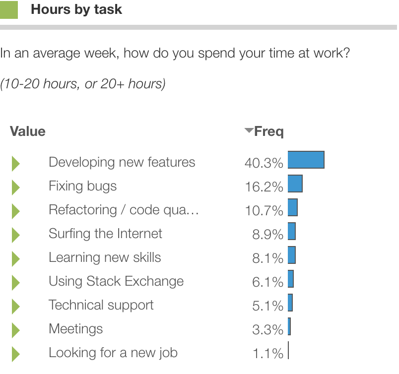
Top-box scores are great because they show a single number to focus on and see the bigger trends across questions. But do you show the top-1 box? top-2? top-3? What if you didn't have to choose?
Stacked bars
Another cool approach is to show them as stacked bars. This is illustrated in the graphic at top and in PowerPoint below:
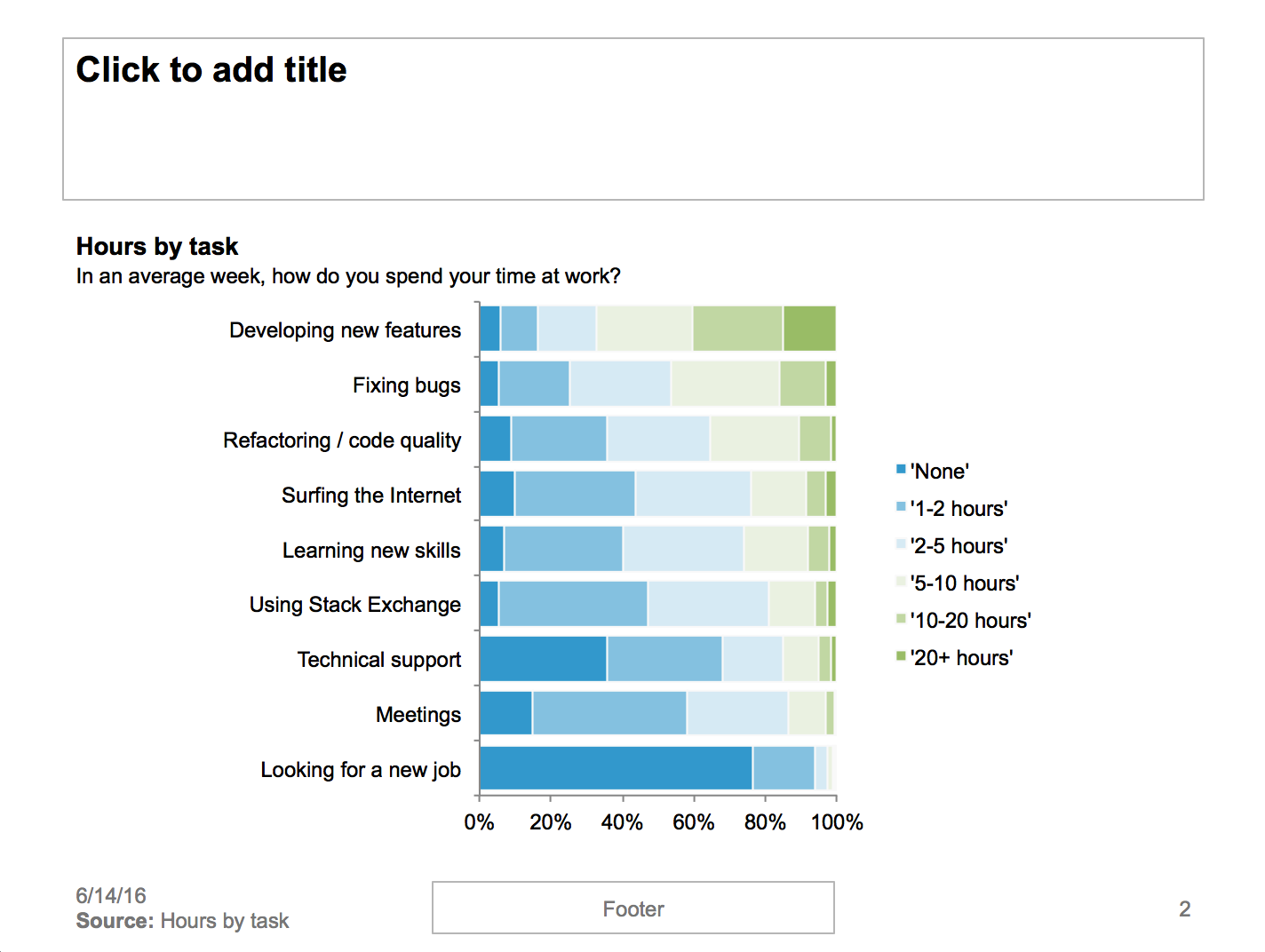
Note that the responses are shown concisely as stacked bars, with ordinal color scales.
Also note that the questions are sorted in descending order so that an overall pattern emerges. Here sorting highlights tasks that people spend a lot of time one versus tasks very few people spend much time on.
Colors
The example above Protobi's colors in a divergent scale using chroma.js.
Cynthia Brewer has developed a series of sequential, diverging, and categorical color scales based on user perception research:
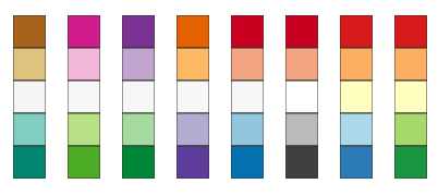
Divergent color scales use two colors and saturate to white or another neutral color in the middle. These can be effective for rating scales with opposing end points, and e.g. "Strongly disagree", "Somewhat disagree", "Neutral", "Somewhat agree", "Strongly agree". Sequential color scales may be unipolar, e.g. "Never", "Rare", "Sometimes", "Often", "Always".
Crosstabs
Often times we're not so interested in the marginal values across all respondents as we are in seeing trends, such as differences by country, by specialty, or segment.
Crosstabs can be useful. Here is percent of people spending 10+ hours/week on each task versus years of experience. Highlighted cells are those that are significantly different from the overall population.
We can see that senior developers spend relative more time on new features, whereas junior developers spend more time looking for new jobs and using StackExchange.
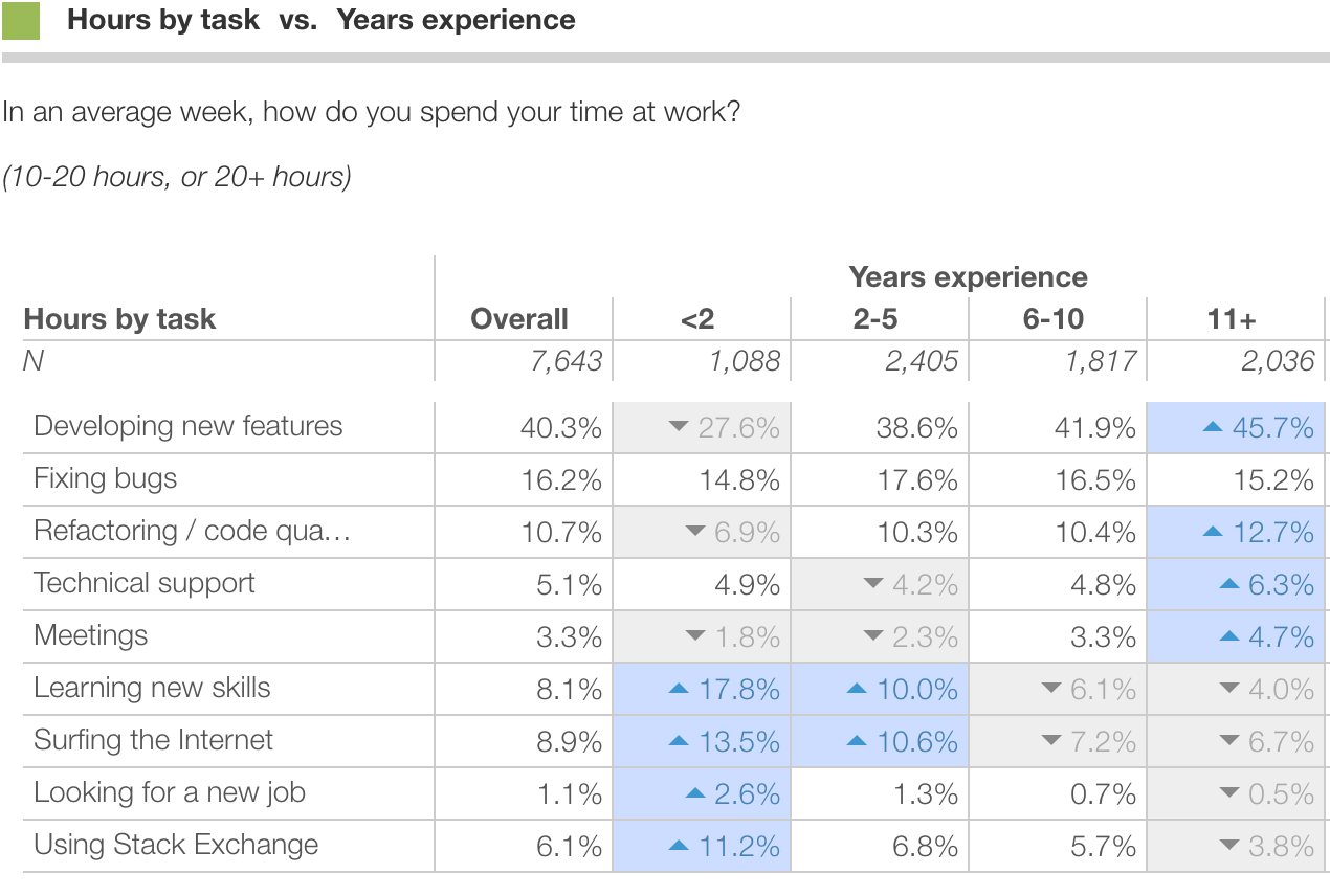
In this case, reducing each distribution to a single number such as mean or top-box percentages is invaluable as it allows us to concisely represent crosstabs of multiple items.
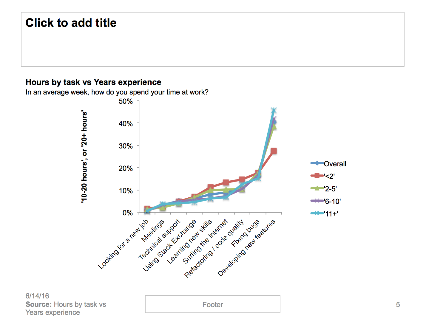
The same data can be displayed more visually. The chart below shows the percent of people spending 10 or more hours on each task versus years of experience. Here we can see there are more similarities than differenes in that all segments follow the same trends. But junior programmers spend half as much time on new features and double the time surfing the internet than more experienced peers.
Segmentation and clustering
Crosstabs are a great way to characterize ratings against another variable. But is there a way to create one variable that maximally conveys the different response patterns in a section of ratings?
There is. Cluster analysis such as k-means clustering and its bigger sibling Latent Class Analysis allow to you create one variable that conveys as much information about a response battery within a given number of segments.
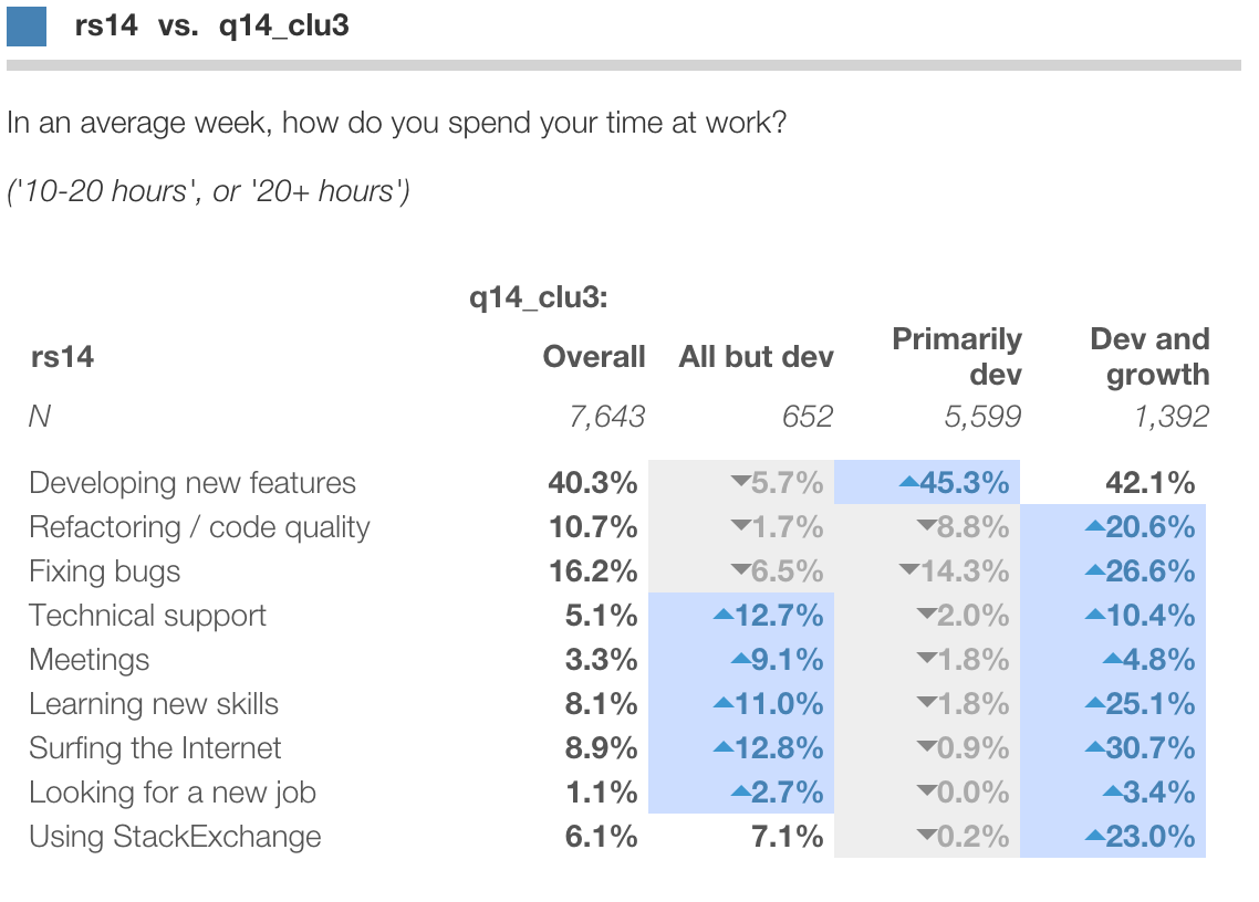
For instance, we can use cluster analysis to derive three categories of developers: "Primarily dev", "Dev and growth" and "Anything but dev". And use crosstabs to profile the resulting segments in terms of the ratings:
See this blog post for a discussion of how to create and profile segmentations.
Summary
Analyzing and presenting large collections of ratings is a common challenge in survey research. This post reviews a few useful approaches: marginal distributions, stacked bars, crosstabs and clustering.
Need help with your survey analysis? Drop us a line support@protobi.com

