Height weight charts for grownups...?
August 17, 2016
Pieter Sheth-Voss
Back-to-school season entails all the necessary checkups and health exams.
Seeing where the kids fell on the height weight standards chart, I noticed
that the charts all seem to conveniently stop at age 20. What would they look like if extended for adults?
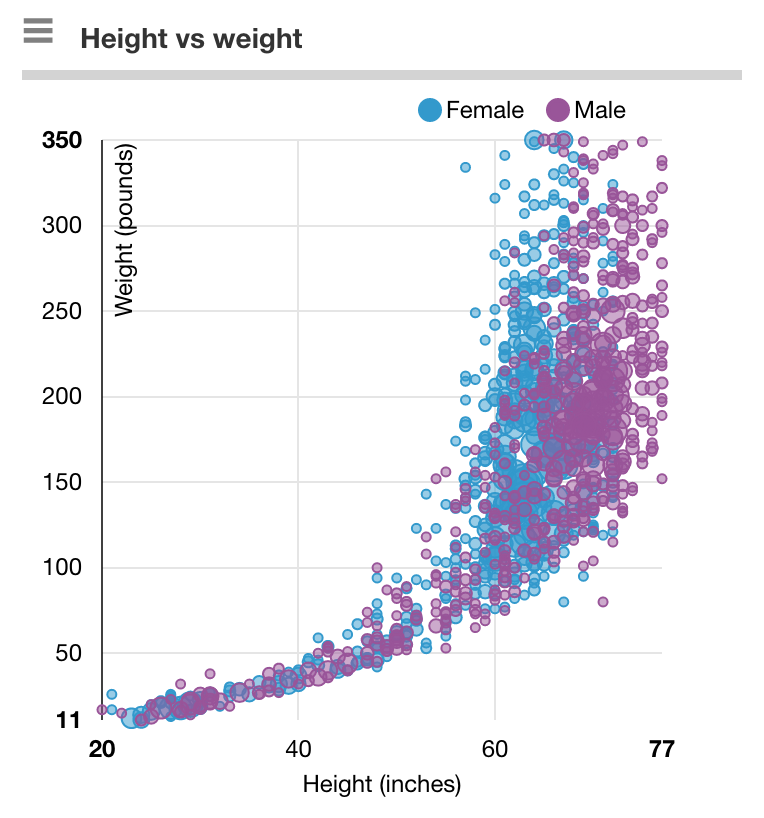
Forget the BMI charts that simply state ranges for normal, under- and overweight, what are the actual values? Summary charts of course exist, e.g. Halls.md:
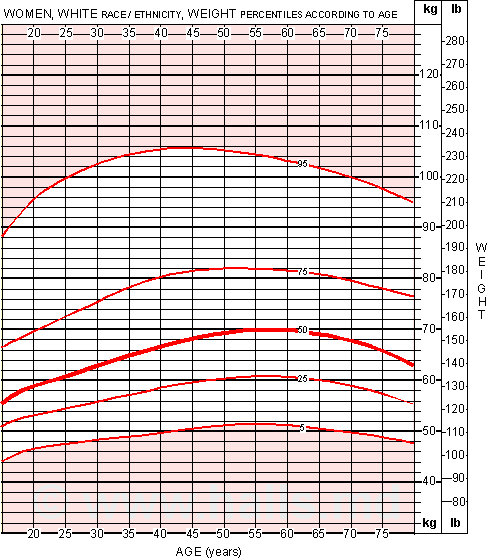
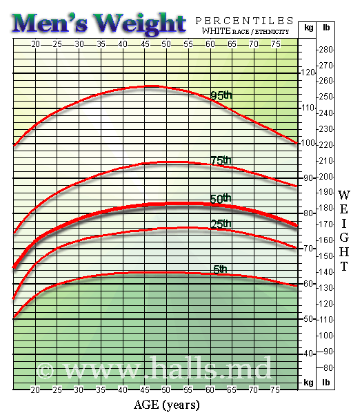
But sometimes it's fun and useful to see the actual data, the raw data, and be able to cut it by ethnicity, health history, etc. and see the entire continuum.
Plus this is a good example to demonstrate the new scatterplots in Protobi. These work at scale for large datasets and are interactive as is every chart in Protobi, automatically updating to the current sample and you can click to drill in.
The CDC National Ambulatory Medical Care Survey provides a broad sample of US outpatient visits. The case forms collect detailed vital signs on each patient, including height and weight. Using this we can plot the raw data. Access it here...
Note NAMCS is a sample of US outpatient visits, which might differ from a random sample of US persons in that visits to a doctors are often for a reason. But still most adults at least occasionally visit a doctors and this is a broad cross section of 76,000 patient visits.
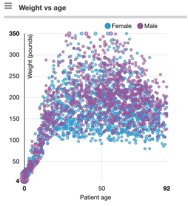
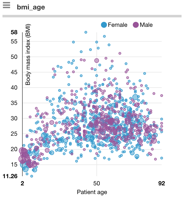
A striking feature is how close the kids are and how diverse are the grownups.
This appears even in the distribution of BMI. Here you can see that BMI is closely grouped for the youngest and oldest ,
while for adults age between 20 and 60 their BMI itself can also range from 20 to 60.
Another striking feature is the number of patients with weights above 280lb (114kg) where the standard height weight charts from Halls.md cut off.
So why don't we routinely see height-weight charts for grown ups? Perhaps charts don't make sense above age 20 given the tremendous diversity of weight in the adult population. Or we know and just don't want to be told.
Now let me see if I can find those running shoes...
