Flow diagrams
August 31, 2018
Flow diagrams can be a good way to visualize relationships between variables, like progression of treatment regimens by line of therapy.
One type of flow diagram is the Sankey diagram where the width of the arrows is proportional to quantity. Here's how to create one in Protobi...
Create a group of categorical variables
There are a few ways to create Sankey Diagrams in Protobi. One way is from an ordinary crosstab. Another is to identify a sequence of categorical variables and place them into a distinct group.
For instance, for a patient chart audit you might choose first-line, second-line and third-line treatment regimens. For this example we'll use three variables from an industrial survey screener: Region, Industry and Role:
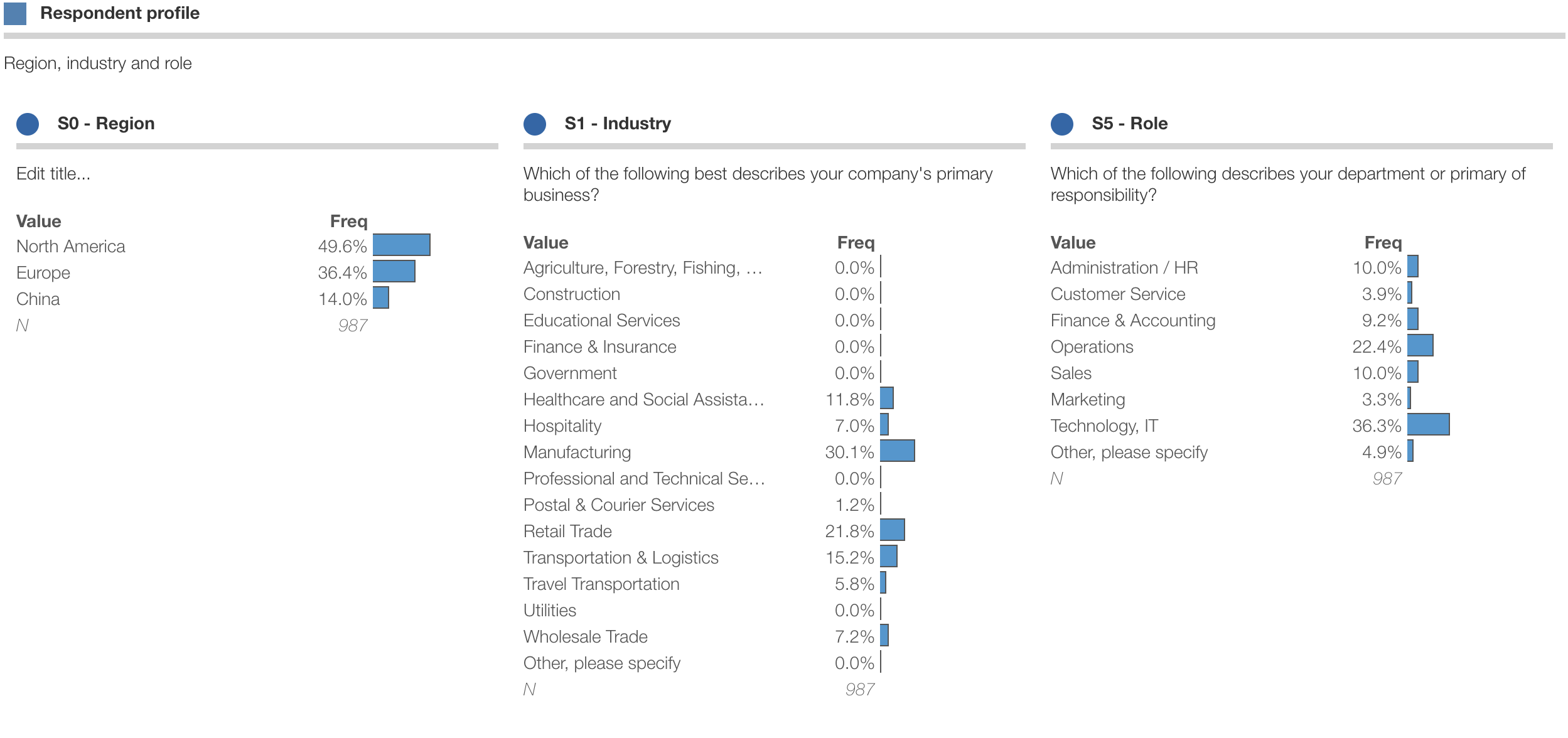
A simple way to create a group is to press the "+" tab to create a new tab, and hold the shift key while dragging elements from the tree into the new tab.
Set chart type
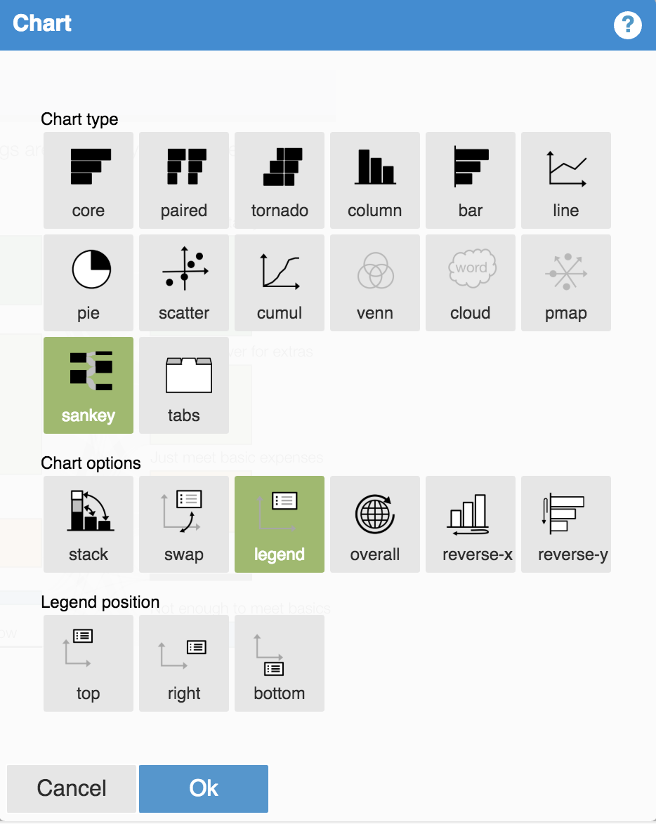
Press the square edit icon to bring up the chart dialog, and choose "Sankey":
Resize and organize
Voilá, you now have a new flow diagram. You can drag the blue resize handle to resize the chart. You can drag the squares to re-order them vertically.
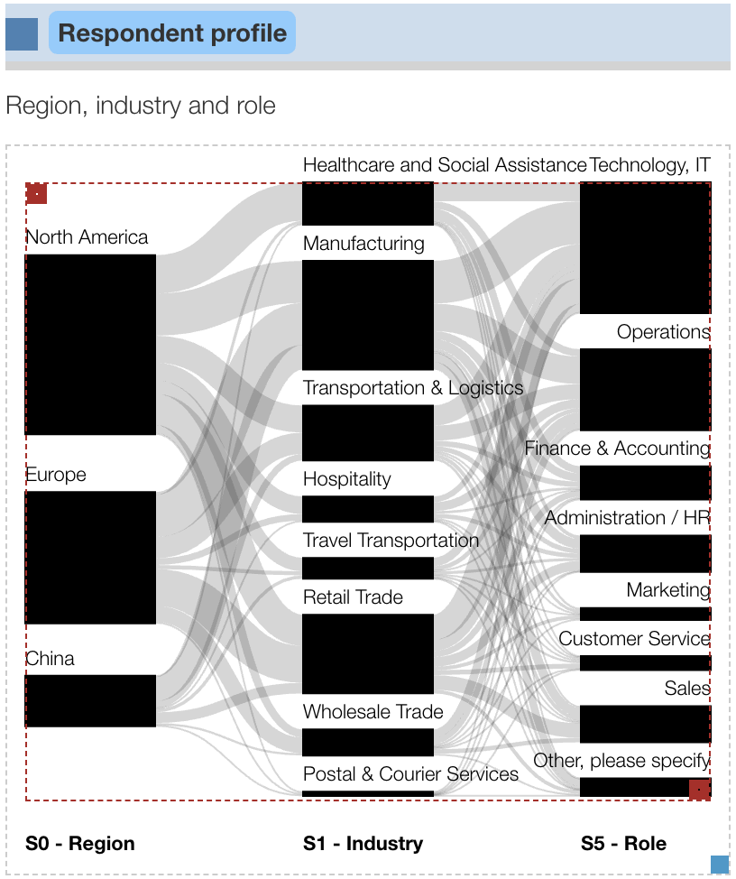
If the parent group has a format specified that applies to all the child elements, Protobi will choose initial colors automatically from the default theme. Here however we created a new group, and can choose the colors explicitly.
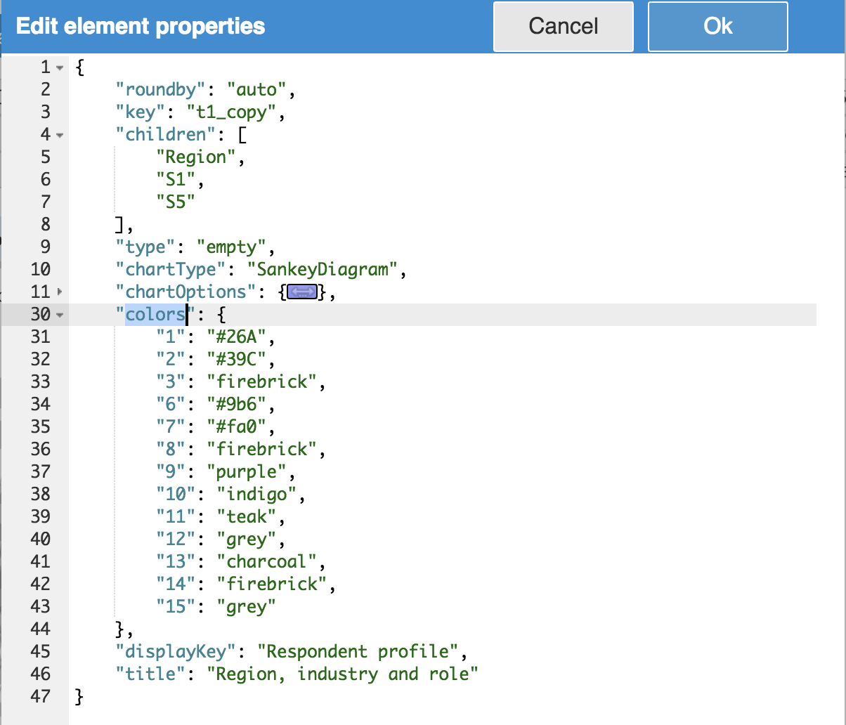
Press the square edit icon and choose "Edit JSON..." from the context menu.
Create a new entry "colors": { "key": "color", ...} to specify colors for
each child value.
Finished diagram
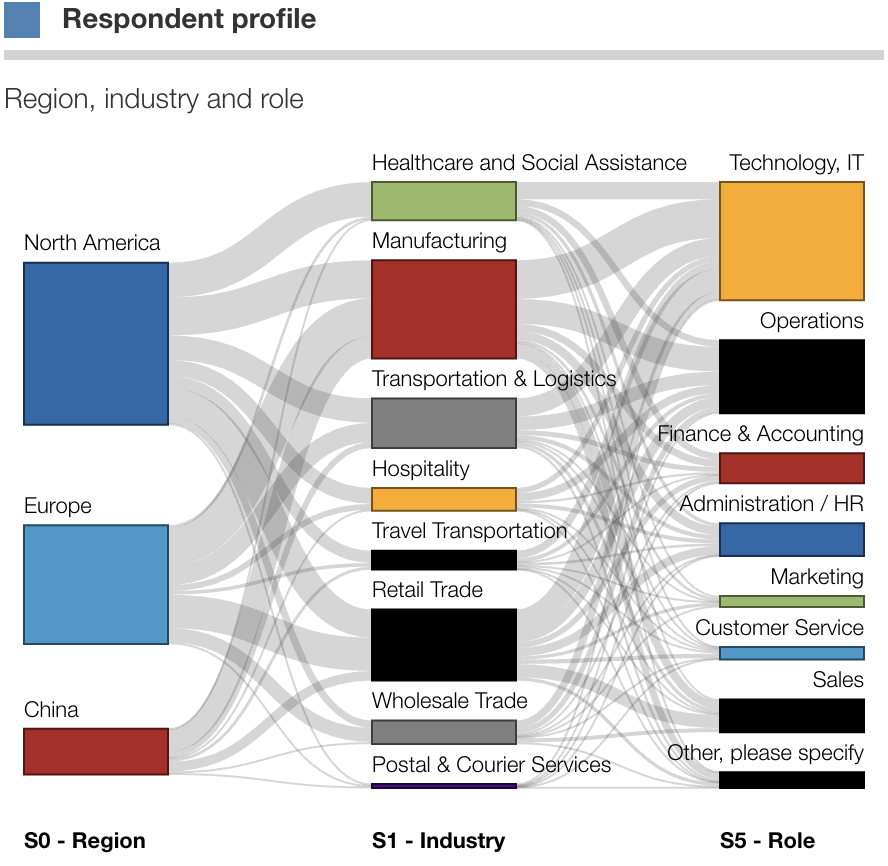
Below is the finished diagram:

Here we can visually see a few interesting features:
- respondents in "Healthcare" are exclusively from North America
- respondents from China are most often in "Manufacturing"
- sales people are most often in "Retail Trade"
