Conjoint simulators in Protobi
May 29, 2024
You can include conjoint simulators within your Protobi workspace, including built in chart types for:
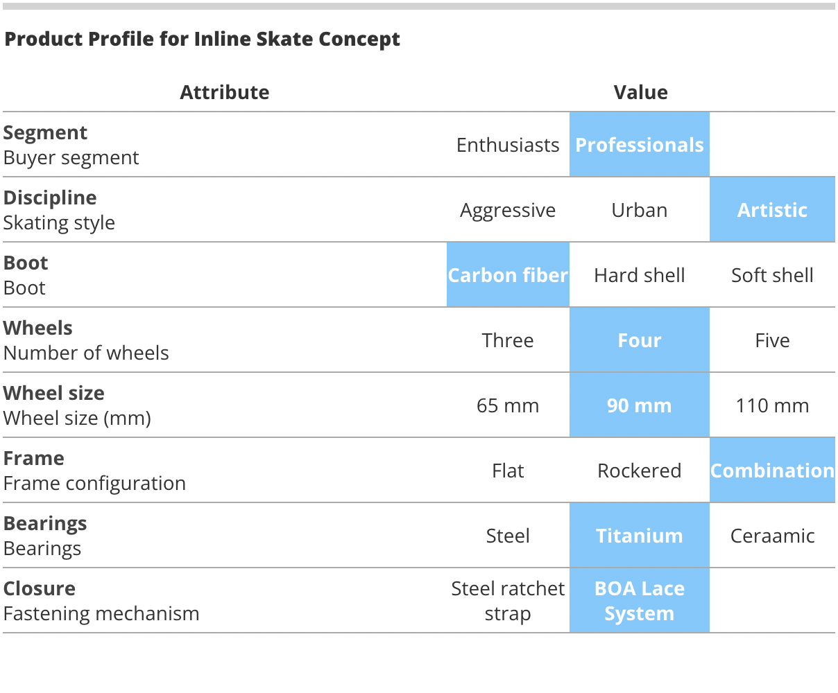
- Selector widget to let the user select a baseline scenario.
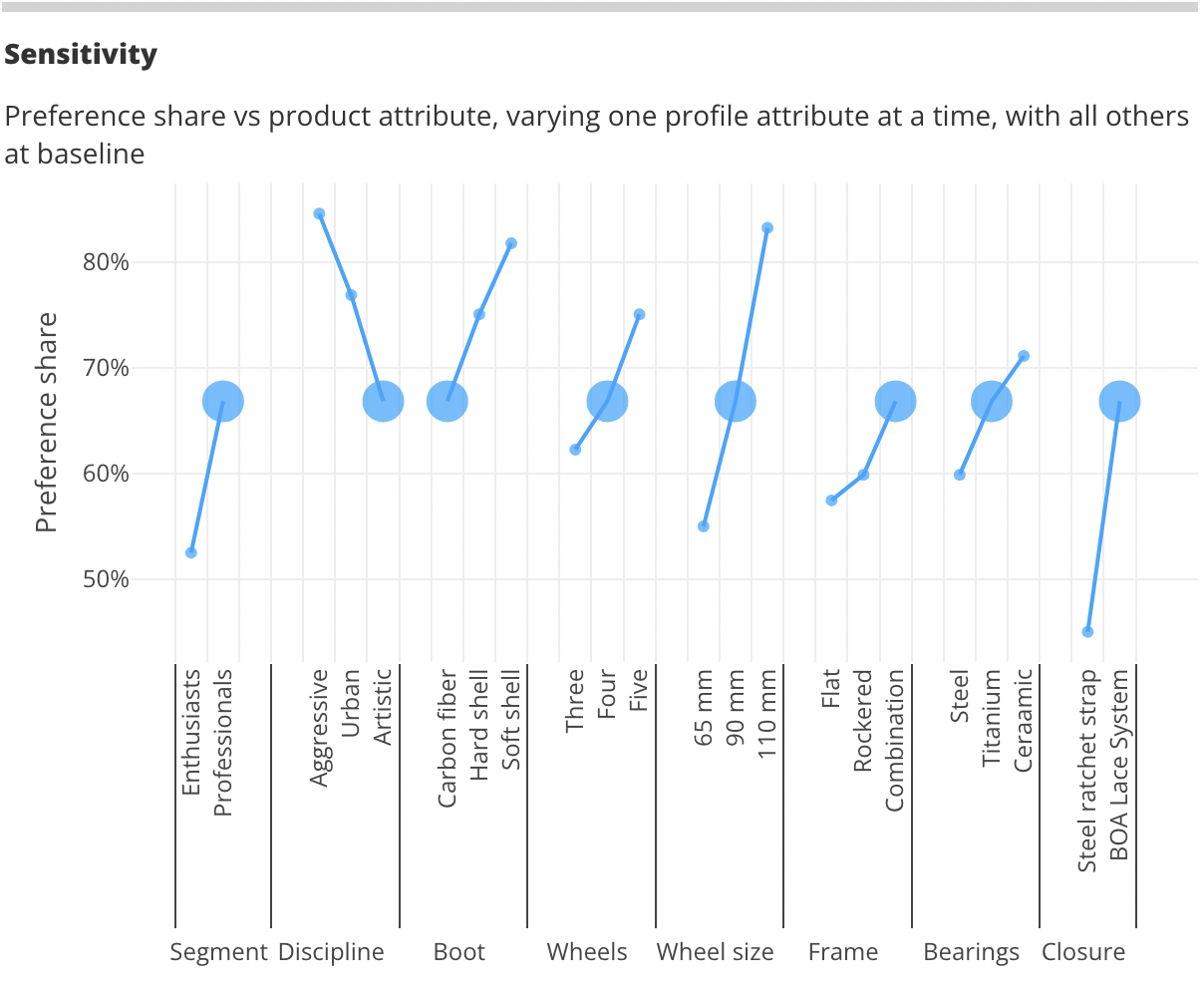
- Sensitivity chart to see impact of varying each attribute on preference share.
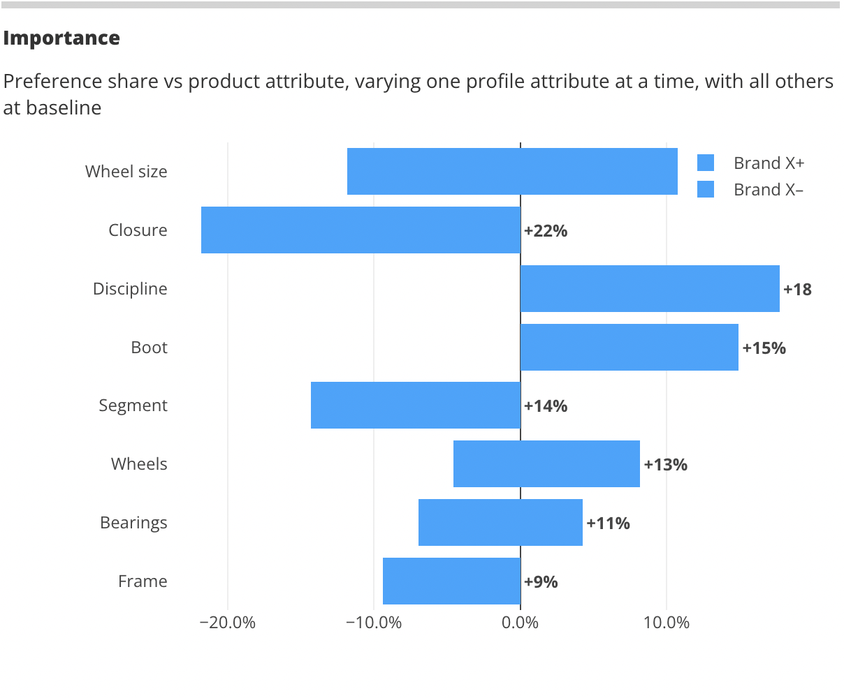
- Importance chart to show the total impact of each attribute on preference share.

Selector widget
There is a new chart type"ConjointSelector"(shown above) that lets users to see all of the possible outcomes for each attribute and choose a baseline scenario by clicking on values.
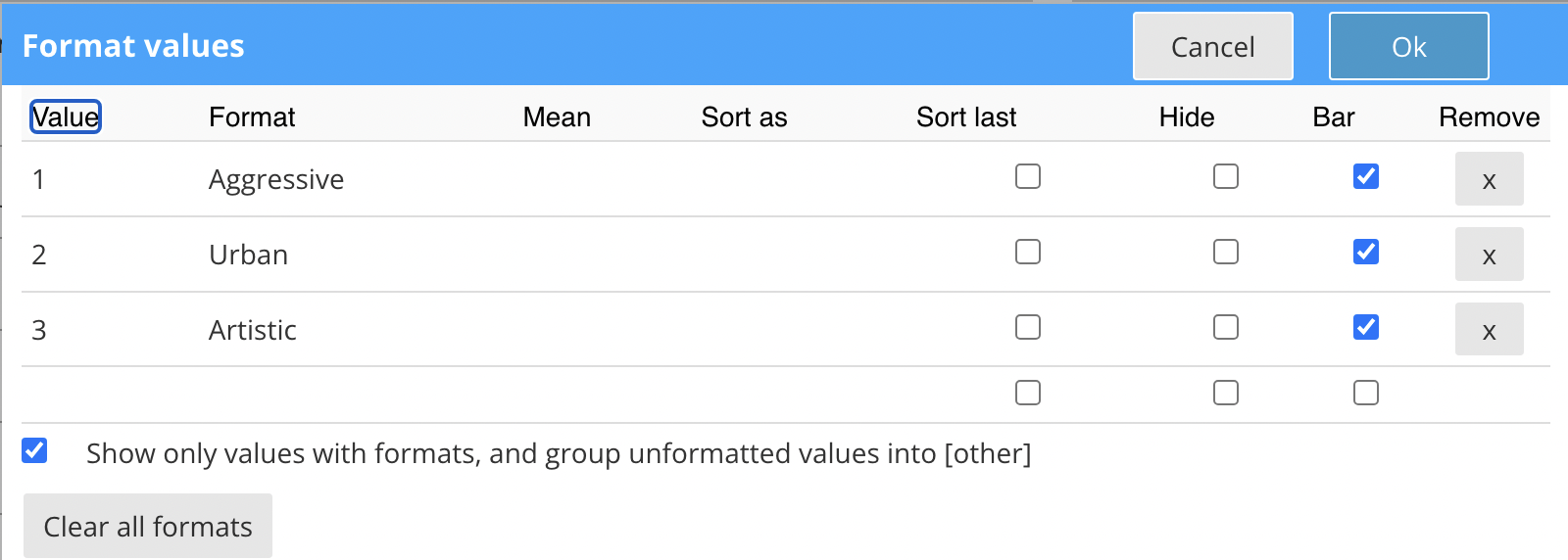
The Selector widget is simply a group of elements that represent each attribute in the conjoint model. The possible values of each attribute are defined by the formatted values.

The standard Protobi Selector widget lets the user define exactly one value for each attribute. It is also possible to extend this widget to include prohibited pairs, nested attributes, adaptive values, etc.
Sensitivity chart
A typical component of a conjoint simulator is the Sensitivity chart that shows how preference share would change
if each attribute were varied one at a time.

The standard sensitivity analysis model can be powered a variety of ways:
- From raw utility parameter estimates for each attribute and value
- From a list of enumerated scenarios in an Excel or CSV file
Importance chart
Another typical deliverable in conjoint demand analysis is the Importance chart which sorts each attribute
in order of descending total magnitude of impact on preference share.
We're always amazed by the creativity that each team brings to defining, estimating and presenting conjoint models. The standard built-in widgets above can handle a wide variety of cases "right out of the box" and this might be just your style. But we can also work with you to create your own tailored version. Contact us at support@protobi.com and we can get you set up.
