Create charts from Excel tables in Protobi
February 28, 2025
You can also include charts in Protobi based on external data that directly read data from Excel ranges, independent of respondent-level data. This feature can be particularly useful when you want to include secondary data (e.g. Census data) or aggregate calculations (e.g. tempered projected preference shares) based on your firm's proprietary algorithms.
How it works
Protobi charts can read data ranges directly from Excel either by address (e.g. 'forecast'!B4:H15) or named ranges (e.g. forecast_scenario_1). You can upload the Excel data as often as you wish and the results are available immediately in the project when it is opened or refreshed.
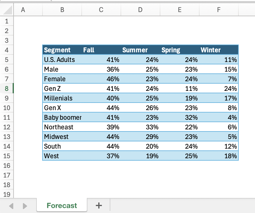
Create an Excel workbook with the data you'd like to show. Place the data into rectangular ranges:

Upload Excel to Protobi
Upload an Excel workbook to Protobi as a **document ** (i.e. a grey card) and give it a name that ends with “.xlsx” , such as aggregate_data.xlsx.
At this stage you could specify a named range for that data such as “forecast”.
Specify data range for an element
In your dashboard, create an element in Protobi and specify the source data. Select "Edit JSON..." and enter the attribute data.
"data": {
	"source": "xlsx",
	"resource": "aggregate_data.xlsx", // name of grey card
	"range": "'Sheet1'!B4:F14", // or range name, e.g. "forecast"
	"titleRow": true
}
Format chart
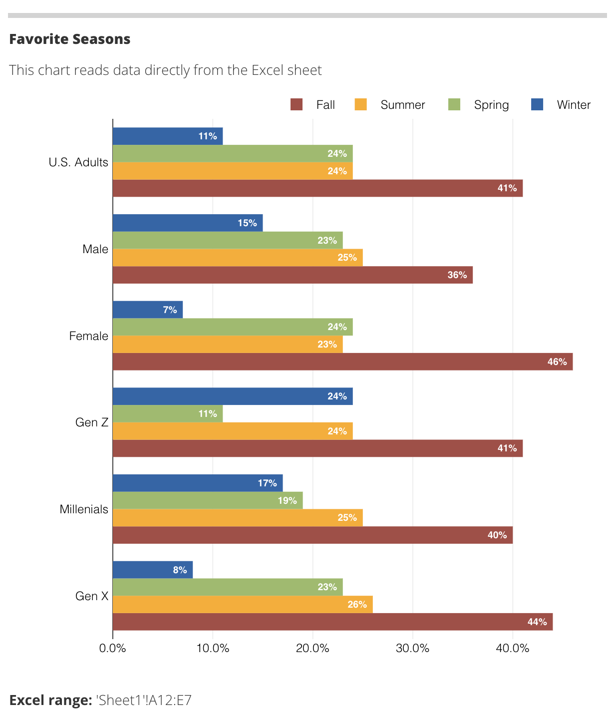
The image below shows the chart in Protobi, reading data from that range:

From here you can customize the number formats, axes, etc. by pressing the gear icon in the element header.
Export chart to PowerPoint
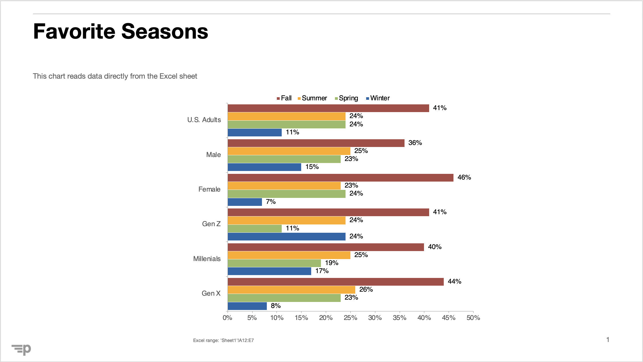
Elements based on Excel data export PowerPoint slides with native chart objects like any Protobi element:

Try it in your project
Our support team is here to help. Reach out at support@protobi.com.
