Ranked choice voting analysis
June 11, 2025
Visualize Ranked Choice Voting
June 11th, 2025
This article demonstrates how to present Ranked Choice Voting analysis in Protobi.
About ranked choice voting
As more cities and states adopt Ranked Choice Voting (RCV), making the results understandable and transparent becomes critical. Whether you're building dashboards for election officials, public explainers, or large survey datasets, how you visualize the outcome shapes how people understand the decision process.
Ranked Choice Voting allows voters to rank candidates in order of preference. If no candidate gets a majority in the first round, the last-place candidate is eliminated, and their votes are redistributed based on voters’ next choices. This process repeats until someone crosses the 50% threshold.
Visualizing ranked choice voting (RCV) presents a unique challenge, with multiple rounds, candidate eliminations, and vote redistributions to convey. Different outlets have tackled this challenge in creative ways.
After reviewing real-world examples—from The New York Times, FairVote and the Civic Design Center—we have created a catalog of best practices and tradeoffs to design a new visualization in Protobi .
The Goals of Ranked Choice Voting Visualization
Before diving into formats, it's worth identifying what a good RCV display should do:
- Clearly show who won and how they got there.
- Track how votes moved through each round.
- Make space for inactive or exhausted ballots.
- Be accessible to both general audiences and power users.
Visualization Styles in Practice
A range of media outlets and civic organizations have developed innovative approaches to displaying RCV results. Each method offers unique strengths and limitations, depending on the intended audience and context. Below is an overview of several prominent styles observed in real-world examples.
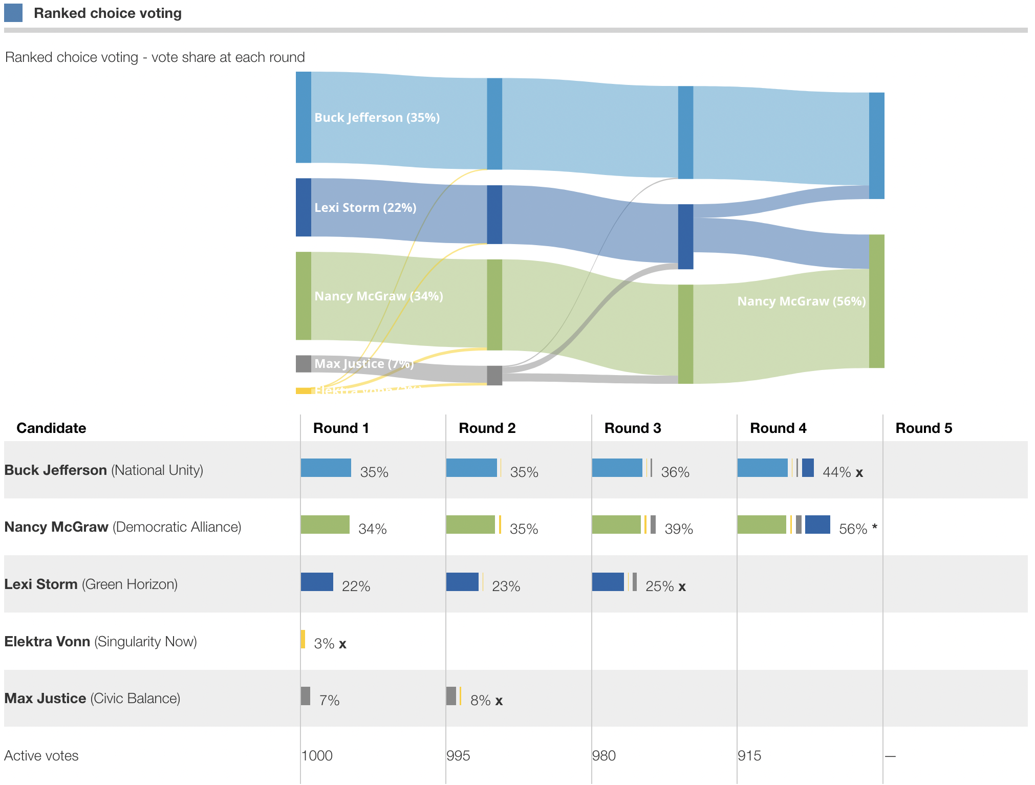
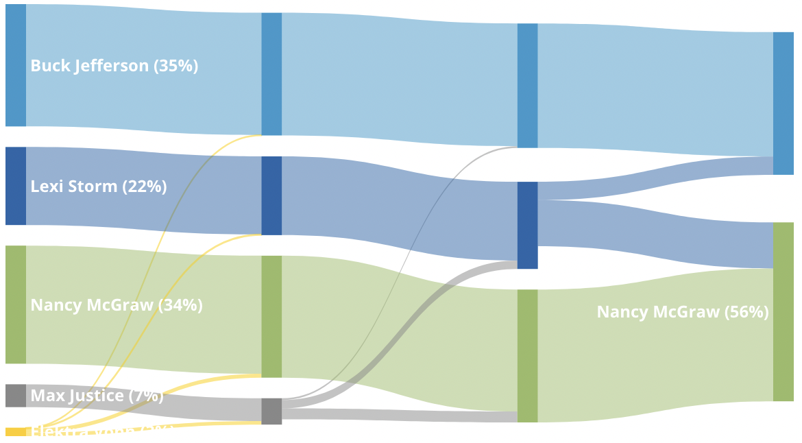
Sankey Diagram
The New York Times
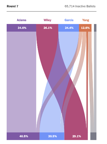
Economist
Advantages: The Sankey diagram provides a visually engaging way to trace the flow of votes between candidates across rounds. It allows readers to follow second- and third-choice transfers and clearly distinguishes inactive or exhausted ballots.
Limitations: Less accessible and harder to transfer to mobile devices due to its reliance on color coding.
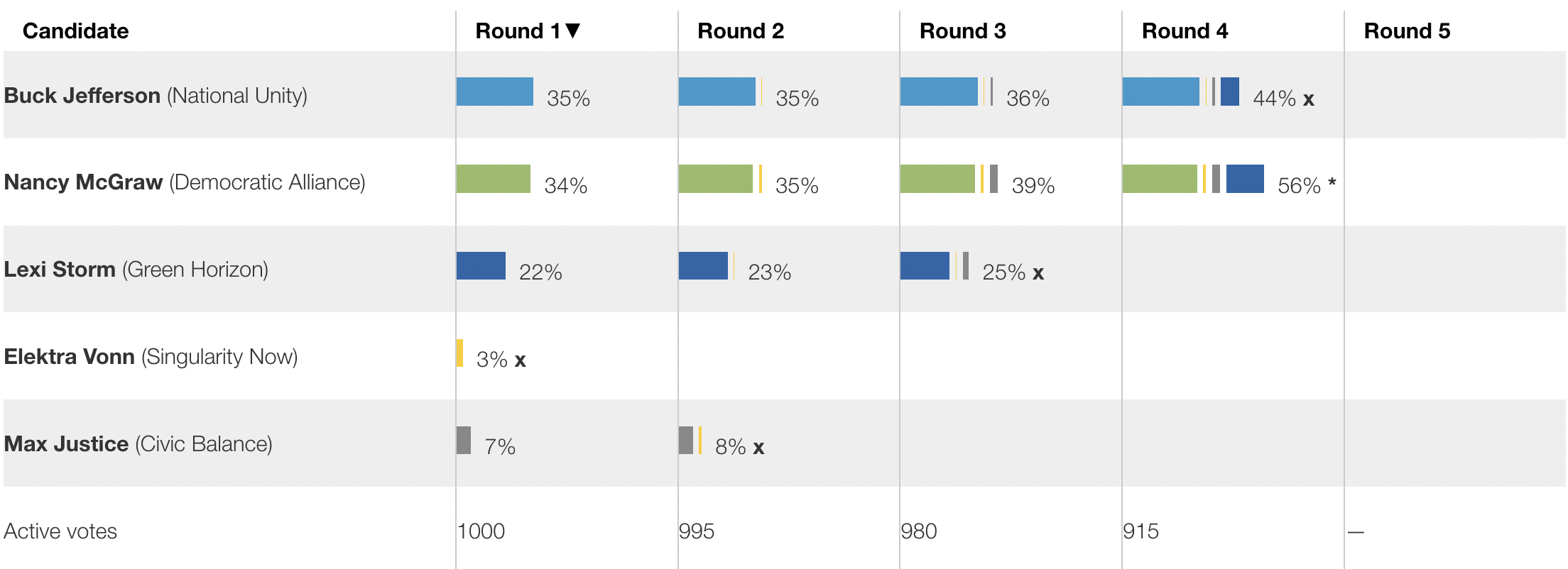
Transfer Tables and Bar Charts
Fair Vote
Advantages: These charts show how each candidate’s vote share evolves across rounds, highlighting the impact of eliminations and transfers. They are particularly effective in emphasizing how lower-choice rankings influence final outcomes.
Limitations: While numerically precise, they do not illustrate the origin of transferred votes, and full interpretation often requires reviewing multiple charts in tandem.
Elimination Round Summary
The Wall Street Journal
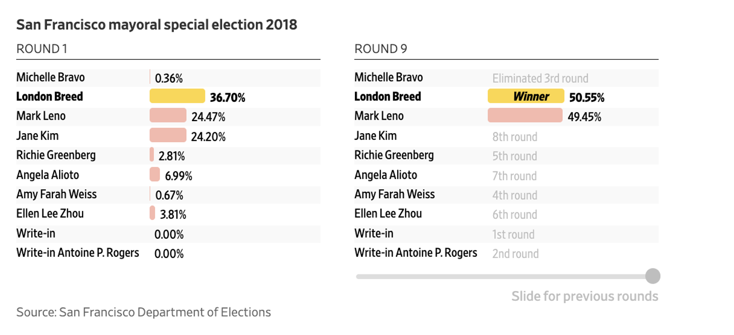
Advantages: Clearly indicates the round in which each candidate was eliminated, allowing readers to follow the sequencing of the race without requiring detailed charts. Highlights the winner and provides a side-by-side comparison of first-round and final-round standings.
Limitations: Does not show how votes transferred between candidates or how exhausted ballots affected the outcome. Lacks vote totals by round, offering limited insight into the mechanics of RCV beyond the elimination order.
Best practices
The Center for Civic Design outlines clear guidelines for presenting RCV results They recommend starting with the winner, then showing each round using stacked bar charts and plain-language explanations. Key practices include labeling eliminated candidates, showing vote transfers, displaying inactive ballots, and maintaining consistent candidate order. This approach is best for educational tools and interactive dashboards that prioritize clarity and transparency.
Bringing it to Protobi
Following these best practices and design choices while implementing interactive and custom features, Protobi lets you display RCV results through two complementary views
Stacked Bar Chart Round-by-round votes appear as bars, with transfers stacked in color-coded segments.
- Hover to see the source of transferred votes.
- Toggle between counts and percentages to match your audience.
- Exhausted ballots shown explicitly to clarify drop-off.
Sankey Diagram
- For datasets with fewer candidates, Sankey diagrams trace the flow of votes more fluidly.
- Useful for presentations where vote transfers are central to the story
Final result
The final result appears below. It is interactive and styled consistent with other Protobi charts:
- Updates to reflect current sample as you drill into subsets of respondents
- Toggles between showing percents and counts of votes
- Optionally hides bars so that the table shows just numbers
- Resizes by dragging margin and size handles
- Applies selected color theme
- Exports to PowerPoint
Create your own new chart types...
To see how this chart was made—and how you can create your own custom RCV visualizations—check out our step-by-step walkthrough in the next post.