Surveys often ask for time intervals, with start and end dates:
- When did you buy the product? When did you finish it?
- When did the patient start and end each line of therapy?
- When did respondents start and end different programs?
One thing we can do is to look at the data. Another is to look at how survival data is summarized in clinical research…
Visualizing intervals
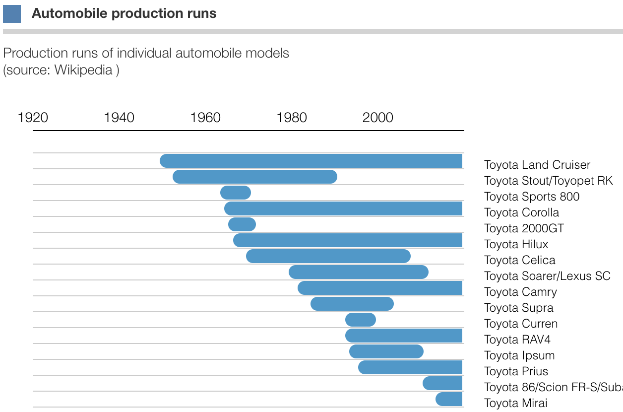
The chart above is visualization of production runs for a number of Toyota models
using Protobi’s IntervalChart.
Each line represents a single model, with start and stop dates:
- The Toyota Land Cruiser was first produced in 1951, and is still in production today, 67 years later.
- The Toyota Stout was first produced in 1954, but stopped in 1989 after 35 years.
Some runs are complete, these we show these with round endpoints. Some runs are still continuing at the time of this analysis, these are shown cut off with a straight end.
Here the runs are sorted in ascending order of start date. These could be ordered by end date, duration run, etc.
Scanning a chart like this is useful to just see what the data looks like.
Distribution of durations to-date
We can calculate the duration for each automobile model, and display it as a statistical distribution.
Here we can differentiate between production runs that are complete (for whom the data is final) versus those intervals that are still ongoing.
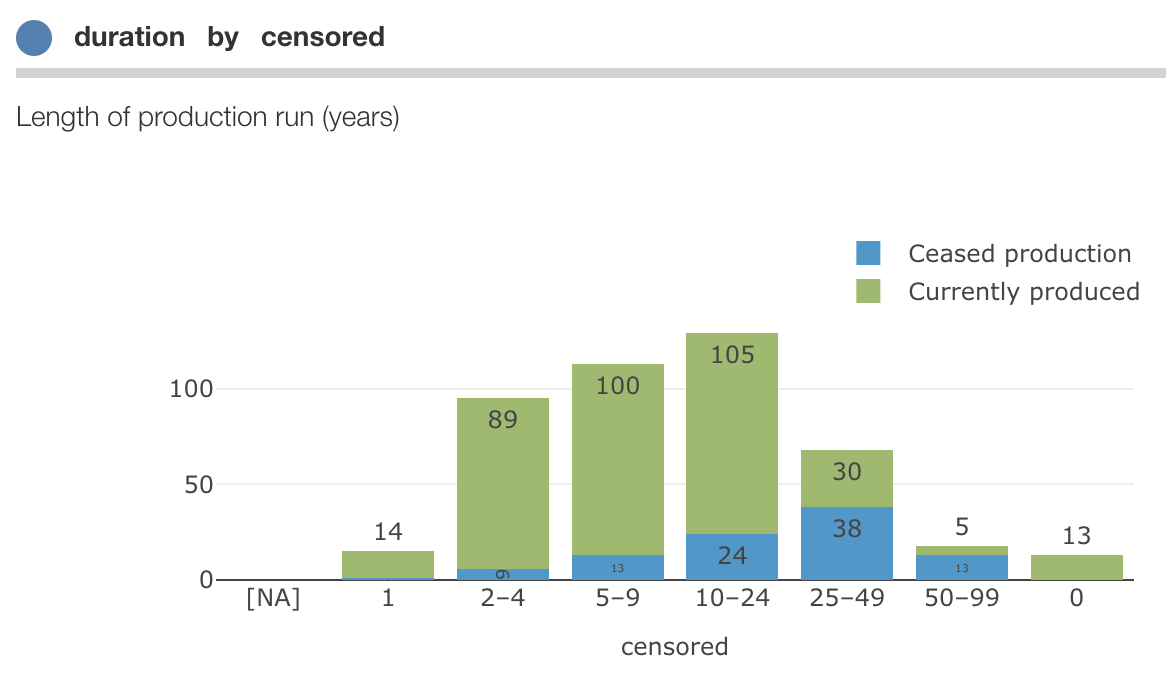
Here we can clearly see that many production runs are still ongoing. So a simple mean or median of run lengths to-date would seriously under-report the expected production runs.
For right censored data, a useful way to summarize the data is the Kaplan-Meier Survival Estimator