Protobi blog

Each Protobi element can be arranged like a PowerPoint slide.

This lets you see how it will export to PowerPoint, and potentially streamline the workflow from analysis to presentation.

For instance, here is an element with a headline in slide layout:

And here is the element as it exports to PowerPoint with the default Protobi template:

read more

You can use Protobi not only to find the story but to tell it. The new headline, slide layout, and notes features may help.

Each element can now show a headline in bold text. This can be a place to put the main takeaway from the chart as in this example:

read more

Protobi is proud to support the Sermo COVID-19 Barometer, a weekly in-depth survey of practicing physicians around the world about their experiences, perceptions, and treatment practices related to COVID-19.

In total, Sermo’s COVID-19 Real Time Barometer observational study has polled over 20,000 physicians in 30 countries, including the United States, Canada, United Kingdom, France, Brazil, Russia, China, Japan and Australia. All data published to date and study methodology can be found here at https://sermo.com/blog.

One of the many interesting metrics from this survey is the percent of physicians who believe their region is at or has passed the peak of the outbreak.

The series of charts below shows how US physicians have changed dramatically over the past six weeks. The most recent wave is shown first, scroll down to see how this has changed over time. Notice that US physicians’ current perceptions are far more optimistic than just four weeks ago.

April 28, 2020 (Wave 6)

Percent of physicians who believe their region is at or has passed the peak of the outbreak, wave 6

read more

A data file shows a student’s application was filed on “14-Apr-2020”. So, was that application filed on or before April 14?

That seems like it should be an easy question to answer .. obviously yes, right? But if you’re in the US, your browser might say “No” .

Interpreting and comparing date values is surprisingly nuanced. There are many common date string formats, these formats vary by country, browsers differ in how they parse date strings, and they even consider the user’s time zone, so results may vary depending on when and where the date string was parsed.

This article details some practical complexities and presents a simple function to convert date strings you might receive in a data file to a clean date string you can consistently use for comparisons.

read more

Clean/revise survey data

Sometimes you need to change the data from your survey, for all sorts of good reasons. This article shows a few different ways to do that…

{filename}

read more

Protobi design work sessions get you working with your data right away.

{filename}

As soon as you have partial data, book time with our support team and we can step through the survey with you, question by question, by screenshare.

Together, we’ll tailor the view to support your analysis, and save a lot of time. In the process, you’ll also become expert by learning through doing, as the work sessions also serve as training sessions in disguise..

read more

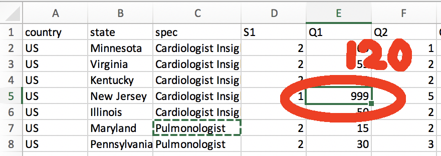
Valentines Day candies can send a lot of confusing messages. You can now evaluate them in Protobi using sentiment analysis …

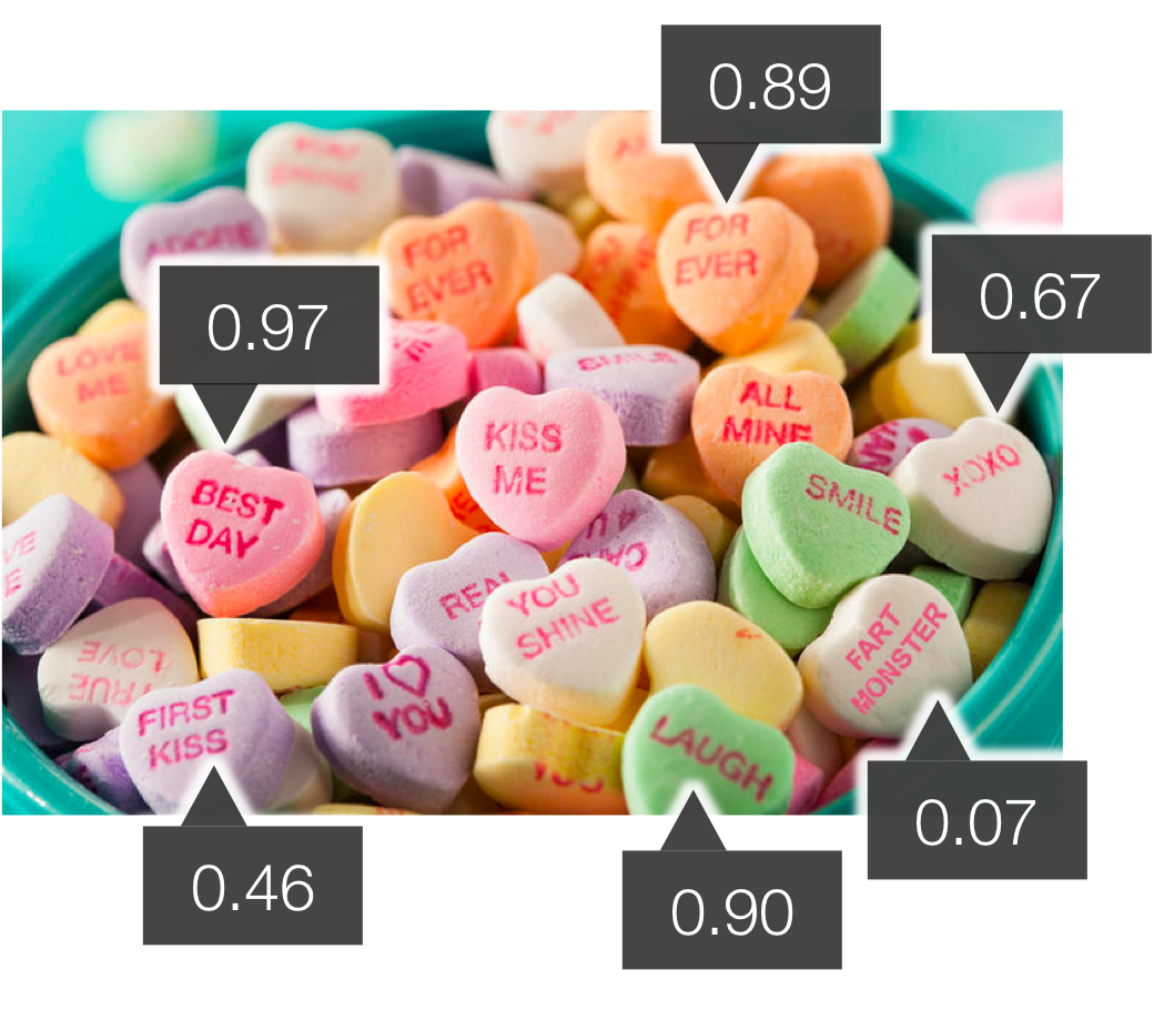
Above is a stock photo of classic candy hearts, annotated with automated sentiment analysis scores in Protobi. Protobi lets you score text verbatims using leading AI libraries from Indico and ParallelDots.

In real-life we imagine you’d use this to evaluate open-end survey responses. But the candy hearts provide a good example to show the strengths and limitations.

How it works

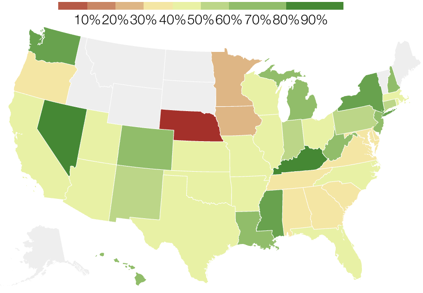
These libraries score text on a scale from 0 to 100%, where 100% is very positive, 0% is very negative, and 50% is neutral. 
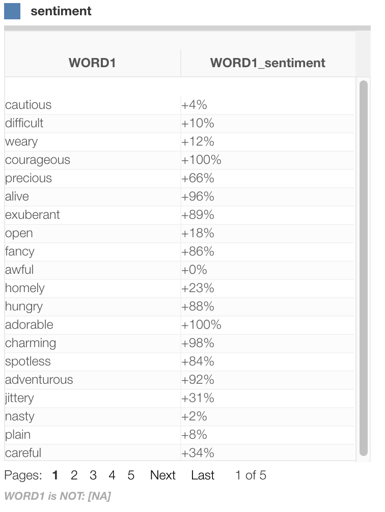
Here’s one example scoring a random list of adjectives:

At heart, computerized sentiment analysis is a bit simplistic from a human perspective. It scores the words within the text and returns an aggregate summary score. The computer doesn’t really get in the mind of the author to divine the actual sentiment.

Strengths

Generally sentiment analysis is reasonably good at identifying as positive words most people would consider positive:

“True love” (98%)
“Best day” (97%)
“Laugh”: (90%)

And conversely identifying as negative words most people would consider negative

“Fart monster” (2%)

Automated sentiment analysis can be effective at quickly sorting through lots of verbal expressions and extracting general trends.

Limitations

The scores in the image above are literally taken from the algorithm. We assume it’s giving the following ratings because the computer simply doesn’t understand the experience:

“XOXO” (67%)
“First kiss” (47%)

For instance it rates the following as having a high sentiment even though might be totally not what this is conveying:

“You’re really nice…” (98%)

And it rates the following as having a low sentiment even though might intend to communicate quite the opposite:

“You’re not half bad” (32%)

And it may completely miss subtle British-vs-American interpretations, at least according to this Guardian reporter on English-to-English: “quite” explained who explains that in British English, this is not a high compliment:

“Quite good” (98%)

Available for beta testing

Sentiment analysis is currently available in all projects. Contact support@protobi.com

read more

Part of the fun of delivering Protobi to clients is showing it in your colors and brand — or better yet, in theirs.

Your firm and your client firm each have a brand guide that specify colors and logos. There’s probably a page that looks a lot like this:

You can set custom logos, splash images and colors for each project. See the Protobi tutorials “Colors” and “Logo and splash images”

read more

In even the best designed surveys, you may need to do additional data refactoring and cleaning :

  • remove respondents
  • merge in translations
  • combine waves
  • stack patient cases, choice cards, etc.
  • define a new segmentation

You can do serious data processing in Protobi itself. Your code stays all in one project, with change history, and applies whenever you update your data file.

Prefer to work locally in R, Python or SPSS or other language? Protobi REST API also makes it easy to get work with your favorite platform.

See the Protobi Tutorial “Process data in Protobi”

read more

Protobi provides a number of ways to summarize location data in geographic maps.

Geographic maps

The most direct method is a chloropleth map, which shows geographic regions in a map projection and colors the regions according to a metric:

The above map shows US states, but it’s also possible to show other divisions such as country, county or ZIP.

read more

Flow diagrams can be a good way to visualize relationships between variables, like progression of treatment regimens by line of therapy.

One type of flow diagram is the Sankey diagram where the width of the arrows is proportional to quantity. Here’s how to create one in Protobi…

read more

Ever review your data and wonder “What?! How did I get a mean of 2.13 on a 2-point scale?”

Surveys sometimes code special values like “Not asked” or “Don’t know” as integers like 9, -9 or 99. These can definitely throw off your analysis.

Here’s how to fix them in Protobi…

read more

Sometimes your data has outliers. Trimming and Winsorizing are two ways to mitigate the effect of extreme values on your analysis. Two more alternatives are to recode or simply retain them.

read more

Coding verbatims into concepts is a common task in text analytics. But how many concepts should you expect to find given your sample size? How big should your sample be to identify 20 concepts?

That may sound abstract, but when budgeting research that’s the bet we make with actual dollars. It’d be good to know the odds.

05010015020005101520Respondent #Cumulative # Unique Codes

This article suggests a new way to predict how many distinct codes you may expect to see in N survey responses. Such a curve might be used to inform sample size selection before fielding research, or during analysis to benchmark the results.

read more

The Van Westendorp Price Sensitivity Meter (PSM) is a non-parametric chart used to summarize stated consumer price preferences. It allows product managers to see the intersection between prices customers perceive as good value versus prices customers perceive as expensive.

Here's how to create it in Protobi using cumulative line charts...

read more

Your survey data might have one or more columns with date values. There are lots of ways you can parse and analyze dates in Protobi.

read more

How do we describe the distribution of time intervals when some aren’t yet complete?

The Kaplan–Meier Survival Estimator is a non-parametric curve that describes the empirical survival function given observed interval to-date.

Importantly it is designed to handle “censored” data where the intervals are observed before they are known to be complete.

read more

Surveys often ask for time intervals, with start and end dates:

  • When did you buy the product? When did you finish it?
  • When did the patient start and end each line of therapy?
  • When did respondents start and end different programs?

One thing we can do is to look at the data. Another is to look at how survival data is summarized in clinical research…

read more