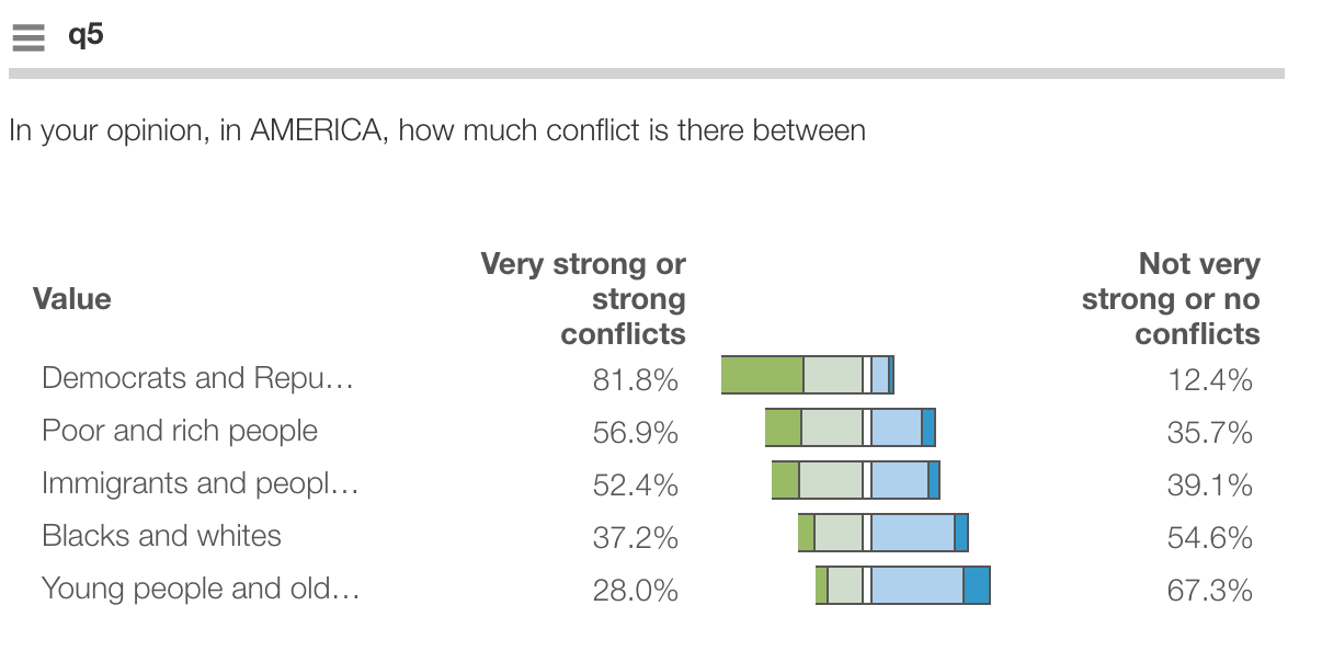
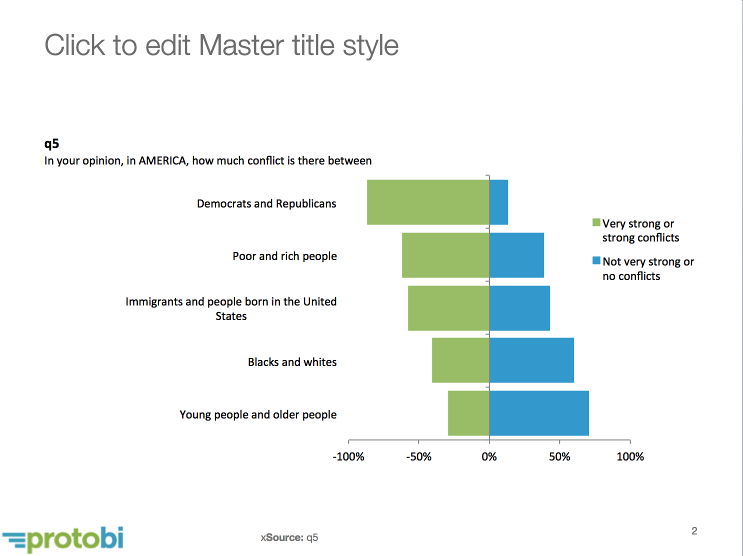
A TopBoxTornado plot is a concise way to present top- and bottom-box scores for multiple ratings on Likert-type scales.
Market research surveys often ask respondents to rate multiple items
e.g. “How much do you agree with the following statements?”.
The response scale may be 5-, 7-, 10- or 11-point scales.
An effective way to present the results is to look at top-box scores, showing percentages for the top one, two or three scale items, e.g. “Somewhat agree or Strongly agree”.
Sometimes though the client also wants to know the bottom-box score too. The tornado plot is a visually interesting way to show both top- and bottom-box. The middle scale points (and any missing/NA values) are hidden in the middle.
Export to PowerPoint
These also export to PowerPoint as native Office chart objects:
Create a TopBoxTornado
To create a TopBoxTornado chart in Protobi, press the blue square edit icon for a group of rating questions and select Edit… .Then in the JSON, specify a chartType attribute:
    {
        "chartType": "TopBoxTornado"
    }
The default is to show the bottom-two box scores on the left and the top-two box scores on the right,
using the format attribute to identify the boxes and sorting them to identify top vs bottom.
You can override the defaults by specifying a chartOptions attribute as well:
    {
        "chartType": "TopBoxTornado",
        "chartOptions": {
           "left": [1,2],
           "right": [4,5],
           "leftTitle": "Very strong or strong conflicts",
           "rightTitle": "Not very strong or no conflicts",
          "leftColor": "purple",
          "rightColor": "gold"

    }