Protobi blog

Surveys can contain “loops” where a subset of the survey is repeated several times per respondent. This is typical in new product assessments, employee satisfaction surveys, patient case research, and observational trials.

You can choose whether to see survey loops “flattened” or “stacked”. Which is best depends on your analysis goals.

read more

We're excited to support SERMO Dashboard Analytics! Protobi Viewer is now available with every SERMO RealTime and full length survey globally.

See the intro video:

Your survey design and data are automatically configured and ready to explore. To learn more log into your SERMO Client Portal or visit SERMO Dashboard Analytics with Protobi

read more

Your survey asked quantities as absolute counts. But now you need to report them as percentages. Here’s how to calculate ratios and correctly preserve percentages, frequencies and means:

read more

Yay! You’ve fielded a global survey in multiple local languages.
Yikes! Now you need to analyze all those local-language verbatims…

Protobi works with Google Translate so you can start reading and even recoding those text verbatims in multiple languages to analyze right away.

read more

Straightliners. You know they must be somewhere in your sample … respondents who give the same answer to every question in a section.

If you could see the answers for one respondent for one section, it’d be easy to spot. But how do you quickly identify all straightlines? It’s pretty easy to find them in Protobi using this one trick…

read more

As you work, Protobi saves all your changes locally, and your latest version survives closing the browser. You can work on your own copy and push changes up to the server when you’re ready for colleagues to see. Work from an airplane or ferry, then sync your changes when back online.

Select “Local History” from the toolbar context menu (or press Shift+Z). You’ll see a timeline of your most recent changes. Select a timestamp to restore your project as it existed at that moment:

read more

Interactive analysis is great for exploring the data, testing hypotheses. Collaborating online is great for finding the story with colleagues and clients. But in today’s business world, analysis still has to go into PowerPoint to tell that story to the broader organization.

Protobi lets you create visualizations that look more like your presentation than your survey. And export into your own PowerPoint template as editable chart objects.

read more

Dynamically resize any chart in Protobi with the mouse. For any selected element, a resize handle appears when you hover.

read more

You can show pretty much any distribution as a WordCloud. For instance, you can show the states where survey respondents are located:

read more

Perceptual maps can be a useful way to concisely visualize associations among multiple variables. Protobi can create a perceptual map based on principal components analysis for many types of crosstabs.

read more

Create Wordle-style word clouds in Protobi for text verbatims

read more

You’ve asked each respondent to answer multiple questions. Now you want to know if respondents’ answers to this question are significantly different than their answers to other questions.

Protobi’s new PairedTable allows you to compare different questions across the same respondents (rather than compare the individual questions for different subsets of respondents). This uses pairwise comparisons for stronger statistical tests.

This uses pairwise comparisons for stronger statistical tests. It uses pairwise t-tests to compare means and McNemar’s test (with small sample corrections) to compare percentages.

For more information, see the Paired table tutorial

read more

A TopBoxTornado plot is a concise way to present top- and bottom-box scores for multiple ratings on Likert-type scales.

read more

We love bar charts and their simple utility in the New York Times and Wall Street Journal. But other chart types also have their role in finding and telling the stories in survey data, and our client work often entails creative custom visualizations…

read more

Does your survey include a collection of related questions on a common scale? E.g.

  • Ratings: “How strongly do you agree with the following…?”
  • Frequencies: “How often do you do the following activities…?”
  • Rankings: “Please rank these items from most desirable to least…”

Protobi includes useful tools—top-box summaries, stacked bars, crosstabs and clustering—that make it easy to analyze ratings, rankings, and other questions on common scales. But the tips here you can do in Excel, R or even PowerPoint…


(hover to expand)

read more

Click here for up-to-the-minute New York Times top stories …in PowerPoint!

As powerful and ubiquitous as the mobile/web has become, PowerPoint is still the platform for business analysis today. Interactivity and rapid collaboration are awesome, but business findings are presented in slides, to be presented, distilled and synthesized, as insights crystallize into decisions.

So we’re pushing the boundaries of PowerPoint on the web, making it easy to export data as slides with native charts and tables. Using your company’s template. And even to instantly update the charts and tables (leaving your text untouched) as new respondents come in.

Which got us to wondering, if all other business results must be presented in PowerPoint why don’t executives ask to see the New York Times in a slide deck? Maybe just no one ever thought it was possible!

So for fun we combined the NYTimes Top News API to test our shiny new library to generate PowerPoint with native charts, images, tables, real time data and user-defined templates.

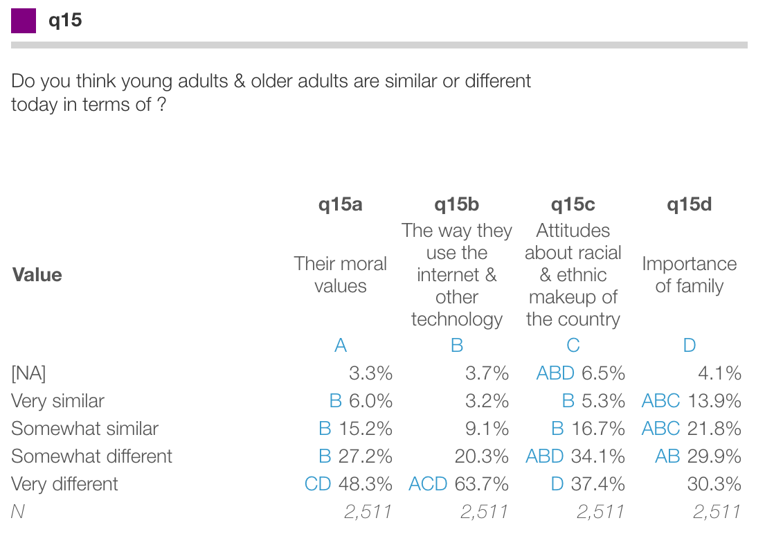
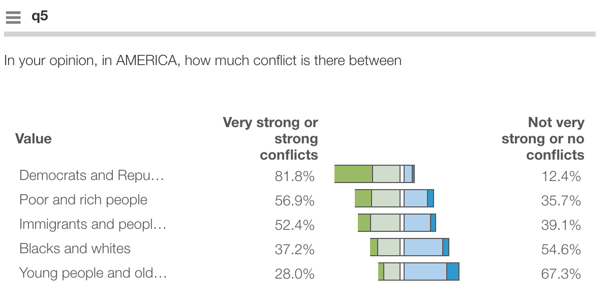
More to the point, Protobi can export your entire survey… be it in Survey Monkey, TypeForm, Qualtrics and Confirmit Surveys seamlessly to native PowerPoint charts and tables.

read more

logo

A key task in any survey is identifying outliers that can mar an otherwise great analysis. Outliers can arise for many reasons – honest mistakes, careless entries, or outright bogus answers. Protobi makes outliers stand out so identifying them is as easy as shooting fish in a barrel.

read more

How many ideas might you expect to find in customers' responses to open-ended survey question? Here's an interesting empirical analysis of text verbatim coding from a recent survey, looking at actual data compared to expected values under Zipf's Law and Heap's Law.

The survey question was "Why did you choose the product you selected?". Respondents provided free-text responses. 200 responses were coded in Protobi using the new verbatim coding widget by a professional analyst.

read more

Verbatims from open ended survey questions are a rich source of insight for market researchers, and a great way for your survey to tell you something you didn’t already know. But surveys often don’t include them, as analyzing text responses has historically been a hassle.

What if coding text verbatims were fun and easy? Would we ask them more often? Might we learn more of what the market is often very willing to tell us?

If you have a current survey with text verbatim responses, let us know. We’re running a study you might be interested in…

read more

How do you find the optimal price for a good or service? Obviously, it depends what you mean by optimal. And pricing is a hugely complex problem. But if your goal is narrowly defined to maximize expected profit based on a discrete choice logit model, this page has an elegant new solution.

We present a simple analytic formula for the optimal price in a discrete choice pricing model. Here, the optimal price is the one that maximizes the expected revenue (or profit), balancing the revenue versus the likelihood of purchase. This formula allows the optimal price to be quickly calculated precisely for each individual customer, for further analysis and action.

read more

Protobi now enables drag-and-drop recoding for text verbatims!

read more

Thanks to our users for awesome suggestions in a recent series of user labs! Key themes:

  1. using Protobi to create client deliverables on rapid timelines and
  2. presenting Protobi as a client deliverable.

This release introduces several new capabilities:

  • Copy elements rather than just move them
  • Find-and-center an element by double-clicking on it in the tree.
  • Save scenarios in a new toolbar button
  • Evaluate scenarios as a segmentation for crosstabs
  • Define new segmentations logically using Mongo-style constraints.
  • Define new segmentations functionally using Javascript expressions.

read more

A frequent question prospective clients ask is “How are you different from Tableau?”

On the surface, Protobi and leading BI tools are similar in that both create clickable graphs and tables from data. Beyond that they’re radically different tools for different purposes, and even coexist quite nicely.

read more

Was encouraged to participate in the MIT Big Data Hackathon at Hack/Reduce in Cambridge, MA this weekend by a friend Ashwini Kumar, principal engineer at Senscio Systems. The very idea of signing up to work into the wee hours amongst the super talented people one would imagine would be there seemed both intense and pretty intimidating. But he’d been to these before and assured they are really positive sessions from which you learn a lot you’d never expect. Plus my kids thought the idea was cool. So I was in. And wow, they were right.

read more

“Hey, is there any way we can see this data as a perceptual map? I’d love to show this to the marketing team tomorrow.” Thus was the question posed by a smart client who likes to present synthesized findings rather than just raw data.

The next question was “How can we make this easier to see?” Together we worked out a new take on Perceptual Maps to make more fun…

read more

You can now export Protobi visualizations as Excel workbooks with statistical tests. Set a crosstab banner and generate an entire deck of crosstabs. Use it for your own advanced analyses or send it directly to a client. Export Protobi to Excel

read more

“This is great! How can I export visualizations to PowerPoint for my clients?” We hear you!

Click the 'Export' toolbar button to export selected elements

You can now export Protobi visualizations as PowerPoint presentations:

  • Charts are native PowerPoint chart objects
  • Data is embedded as Excel worksheets

read more

Style update showing baseline distributions as black outline

We’ve updated the look of Protobi!

  • Current distribution as a single solid color
  • Baseline distributions as a thin black outline

This is based on end user feedback from user labs with our clients and theirs. As before:

  • Blue triangles show statistically significant differences
  • Gold bars show active filters

A key strength of Protobi is its ability to show statistical contrasts, comparing one subset to another. The design challenge is how to make this is clear, intuitive, and aesthetic. We think this strikes the balance.

read more

Heading 1

Nested crosstab of StackOverflow reputation versus gender within years of experience

You can now run nested crosstabs within Protobi! Hold the Shift key when dragging to nest an additional elements in the banner.

  • For an individual tabs, drag an element onto another
  • For global tabs tabs, drag an element to the Crosstab button.

Nested crosstabs are useful to untangle confounding across multiple factors.

read more

International Stroke Trial: distribution of delay from stroke to randomization.

The International Stroke Trial (IST) was one the biggest randomised trials ever conducted in acute stroke. Patients were assessed at randomisation, at the early outcome point (14-days after randomisation or prior discharge) and at 6-months.

There is an incredible lack of transparency in clinical trial results today. A team at the University of Edinburgh has been working to change that, and has made the individual patient-level data available for public use, to facilitate the planning of future trials and to permit additional secondary analyses. Explore the data in Protobi.

read more

Every year the US Center for Disease Control (CDC) conducts the National Ambulatory Medical Care Survey (NAMCS), a national patient chart review with outpatient physicians. This annual survey collects details for over 32,000 patient visits from 3,000 doctors in 15 major specialties.

read more

Global Impact Study: Q5-1 Value of Public Access Venue for Internet Connectivity

Libraries, telecenters, and cybercafés play a critical role providing information and communication technologies (ICTs) to a diverse range of people worldwide. However, their ability to contribute to development agendas has come into question in recent times.

The goal of The Global Impact Study was to measure the impact that funding of Public Access Venues (PAV) for internet connectivity has had, in eight countries: Bangladesh, Botswana, Brazil, Chile, Ghana, Lithuania, the Philippines, and South Africa.

read more

Stack Overflow released the results and data for its 2013 annual survey of members. With 7,643 respondents it provides a fascinating glimpse what developers are working on, what they’re excited about, their Stack Overflow activity, salary and careers. Explore the data in Protobi.

read more

Eurobarometer Attitudes, Robot image 1 Eurobarometer Attitudes, Robot image 2

The European Commission recently released original data for its 27-country Eurobarometer survey on public attitudes towards robots. Click here to explore this dataset in Protobi.

read more

Pew Research Gender and Generations Survey in Protobi

Pew Research recently released its Gender and Generations Survey survey. This survey of US adults covers a range of demographics and attitudes, including health, wealth, household makeup, and family/work/life activities. Click here to explore the data visually in Protobi.

  • Click on responses to drill in, e.g. to compare how people who consider themselves “Very happy” or “Extremely happy” versus those who do not.
  • Drag-and-drop variables to create crosstabs, e.g. vs “Q2. How would you rate your own health?” .

Contact us at inf@protobi.com to create an in-depth view of your research data.

You can download the data directly from Pew Research. Note: The Pew Research Center bears no responsibility for the analyses or interpretations of the data presented here.

read more

Pew Research Gender and Generations Survey in Protobi

Pew Research Gender and Generations Survey is now available in Protobi. This survey of US adults covers a range of demographics and attitudes, including health, wealth, household makeup, and family/work/life activities.

It’s actually fascinating to explore, to see what does and does not correspond with self-rated happiness.

read more

Pew Research Gender and Generations Survey in Protobi Protobi is now available for individual research professionals and firms who work with survey data. And in free public beta for open collaboration. Sign in and try it!

read more

The OpenVisConf hosted by Bocoup at the Boston Science Museum on May 16-17, 2013 was that rare conference that was amazingly worth attending. The speakers were the very people who create those awesome works we’ve all admired and forwarded, or wish we’d known about. Let alone the attendees. Here are my key takeways.

read more

Numbers are more than just important to the Wall Street Journal. And for a wide variety of cases, the simple bar chart is well suited. Dona Wong’s Wall Street Journal Guide to Information Graphics provides a clear and concise guidelines to presenting business data clearly to people who use it.

<img src=”/images/blog/2013-01-07/wong.png” style=”width: 100%”%>

read more

A key source of inspiration for many modern app developers is Bret Victor’s musings, sketches and prototypes. Gabriel Florit, a designer at the BostonGlobe.com, shared some of his work in a Boston Data Visualization Meetup that he summarized succinctly as “I saw Bret Victor’s talk, Inventing on Principle, and I built something.”

At Protobi, one of our inspirations is Bret Victor’s reimagination of a New York Times infographic as an elegant sequence of interactive bar charts. Wouldn’t it be great to instantly create an interactive graphic like this from any dataset, big or small? And embed it in your blog, website, or marketing report.

read more

Heard Bob Caspe, an experienced entrepreneur and adjunct professor of business at Babson, speak at the Venture Cafe at the Cambridge Innovation Center. A brilliantly engaging speaker, with a smart crowd in the room. Key takeways:

read more

Out of curiosity, I wanted to see how a particular firm would compare to other publicly traded firms should it go public as expected, on a number of ratios, including revenue per employee.

read more