“This is great! How can I export visualizations to PowerPoint for my clients?” We hear you!

You can now export Protobi visualizations as PowerPoint presentations:
- Charts are native PowerPoint chart objects
- Data is embedded as Excel worksheets
We’ve kept the interface minimal:
- Select one or more elements (or groups)
- Click the “PowerPoint” toolbar button
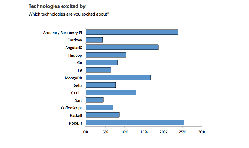
The presentation mirrors your online view:
- Values shown as percents or counts
- Subset matches your current and baseline scenario
- Baselines shown only if different from the current scenario
This works for marginal distributions and for crosstabs as well.
Footnotes show the current/baseline scenarios and provide a hyperlink to the online source data.
The look and feel of the graphics parallel the Protobi online style but are their own native graphics, so we’ve taken a few liberties to make them feel like PowerPoint charts in their own right. For instance, numeric values are plotted on the horizontal axis, and baselines get their own bars.
The charts are “theme friendly” You can copy the slides into your own presentation, and the charts will use the colors in your template.
We’re adding the ability to import your own PowerPoint template to apply your own custom color themes and colors, exporting crosstabs as tables, and providing additional progress feedback for larger PowerPoint runs.